Application interface design standard
The following section collects best practices during the building of an application. The proposed solutions will allow you to create clear, ergonomic and functional forms, lists and other GUI elements that will increase the attractiveness of the application you are creating.
Layout
It is common practice to use page templates. Within the application, specify the types of pages (e.g. dashboard, details , 360 view, reports, etc.).
Below is an example of a manager's dashboard - the page contains the most important cumulative information that directly relates to the user.
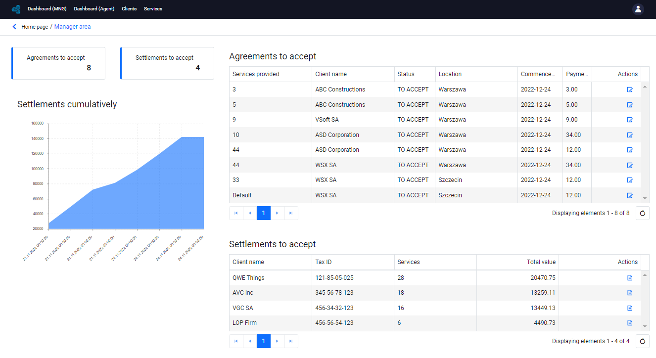
- Divide the information into sections and separate them clearly (you can use containers and headers for this purpose).
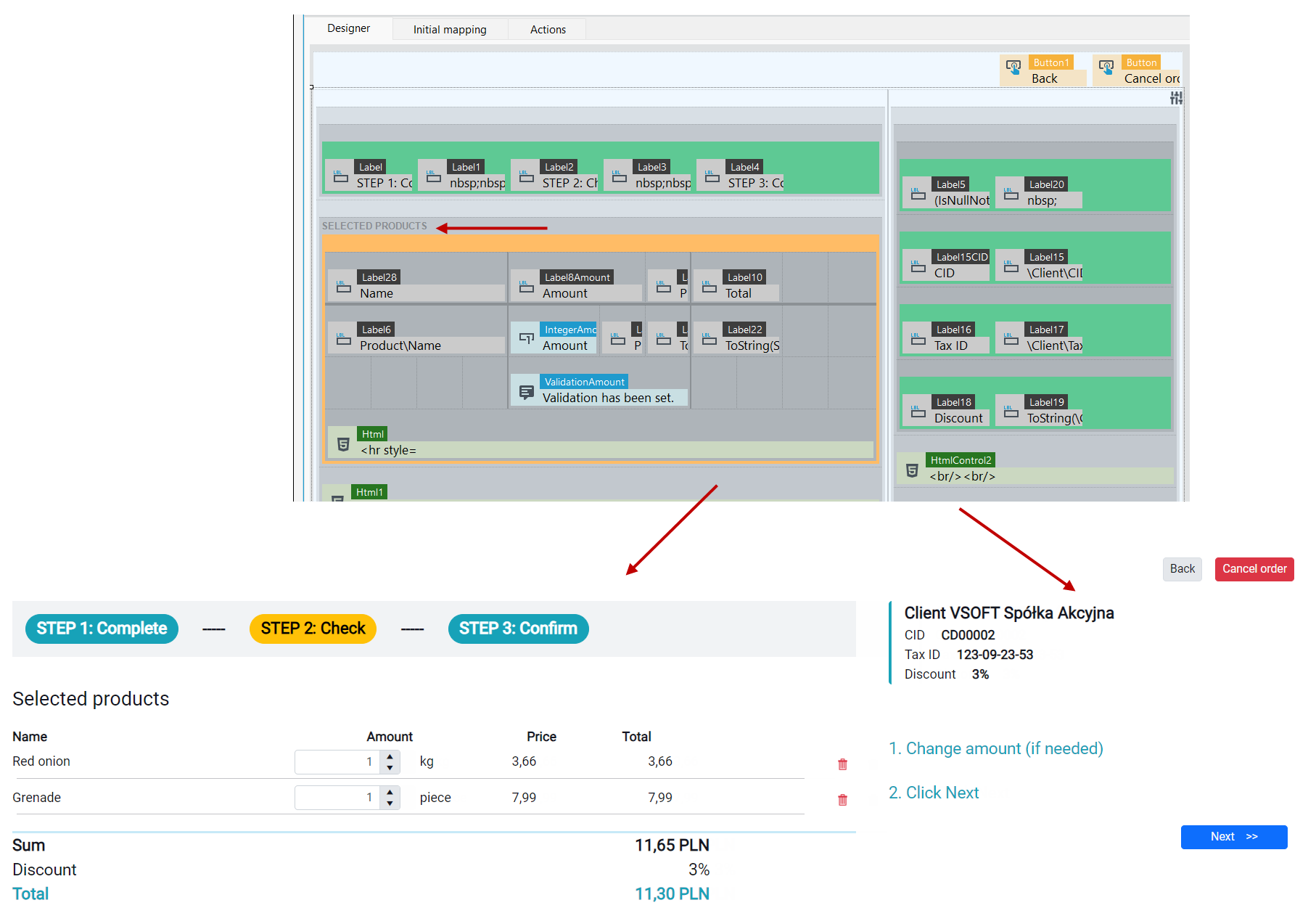
- The various components of the form should contain thematically convergent data.
- In case of a large amount of data, use:
- Sections - are appropriate for data that the user may need right now.
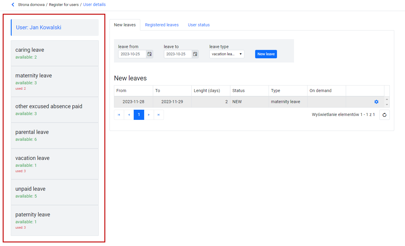
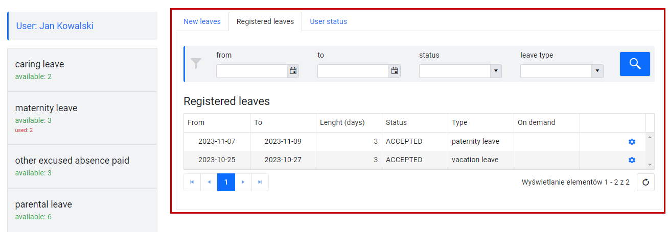
- Tabs - appropriate for separated data (the user will find everything he needs within a tab).
- Separate pages - unrelated sets of data (e.g., working time management, editing address data).
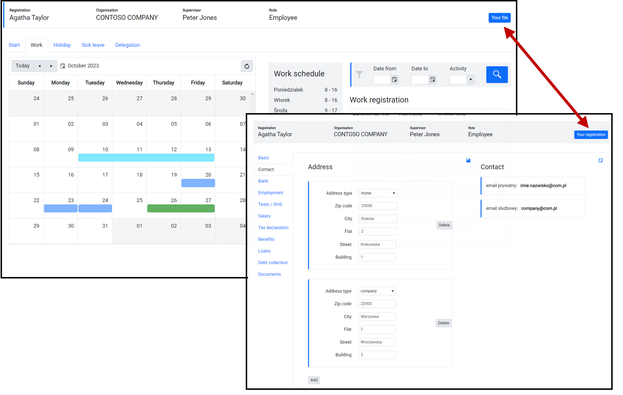
- Avoid building "high" screens ( >2 screens ). In this case, use: tabs, separate wizard-like pages.
Navigation
- Navigation should be clear, repeatable and predictable - define a navigation scheme and apply it throughout the application.
- Navigation guidelines should be considered when creating the window templates described above.
- Location of main actions:
- Main actions are actions that apply to the entire page and should be located in the action panel on the form.
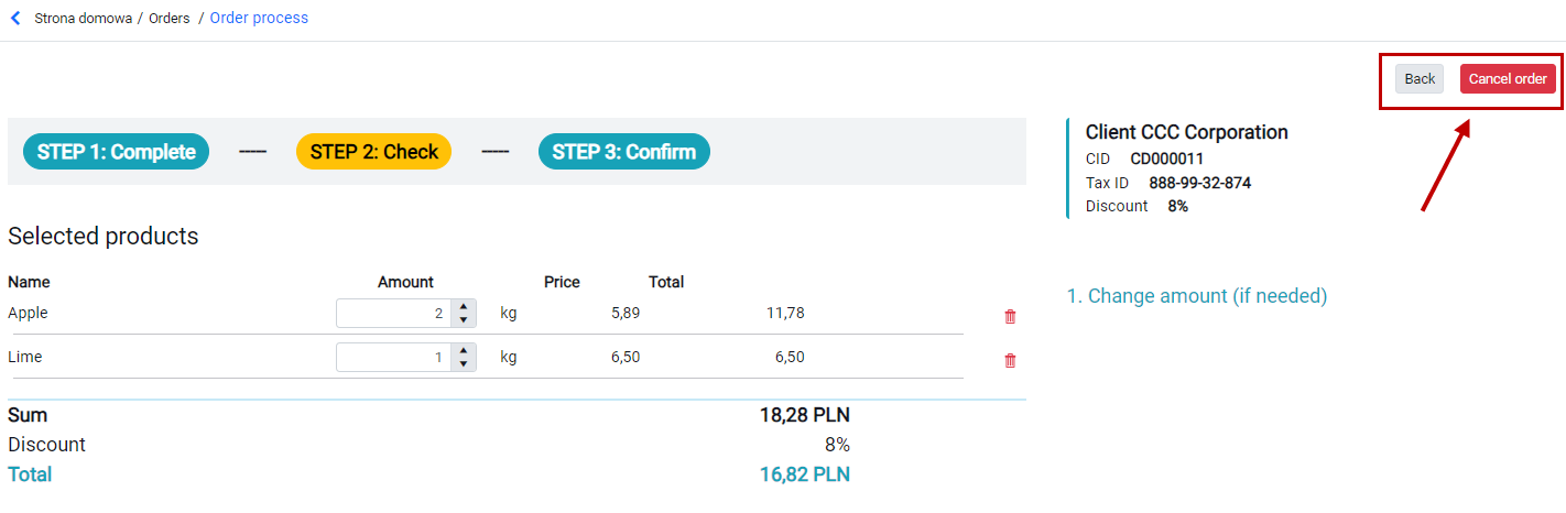
- The above actions should be visible at all times. A good solution is to dock them at the top of the page.
- If the actions are not docked, it is recommended to show the action panel above the form.
- For pages with content that causes a scroll, it is good practice to repeat these actions below the form.
- Location of local actions.
- A local action is an action that relates to a part of the form.
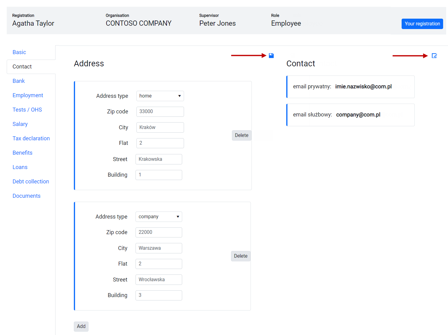
- The location of the action should cooperate with the style of the section (frame, background) to which it relates so that it is clear what the action is about.
- The location of the local action in the section should be repetitive (e.g. upper right corner).
Action button style.
- Styles should be used consistently taking care to underline them according to their meaning/function.
- Standard - basic, technical actions.
- Primary - actions highlighted, expected, causing progress in the ongoing process.
- Success - positive actions (acceptances), end some process (e.g., approve an order) or initiate some significant event (e.g., Send a request).
- Negation - rejection / cancellation type actions, process interruption actions, or actions with a negative meaning in the business context (e.g. Refer for vindication).
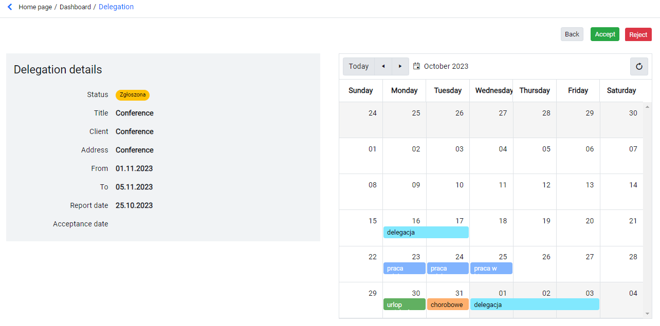
- The order of action buttons in the action panel.
-
If you have several action buttons next to each other, make sure that their order is repeated.
-
On the left side, we use actions that pause the ongoing process, undo it or navigate BACK.
-
In the middle, neutral, technical actions (e.g., save, update data).
-
On the right, progress / expectation / highlight actions.


Save
- It should be clear on the page of what the save action is about.
- Do not use more than one save action on the page forcing the user to wonder what will be saved.
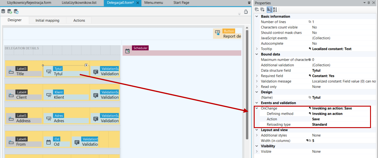
- If there is a need to save a change in the value of a particular control "here and now" (its value influences the behavior of the form), a save should be applied to the control's onChange event.
Editing
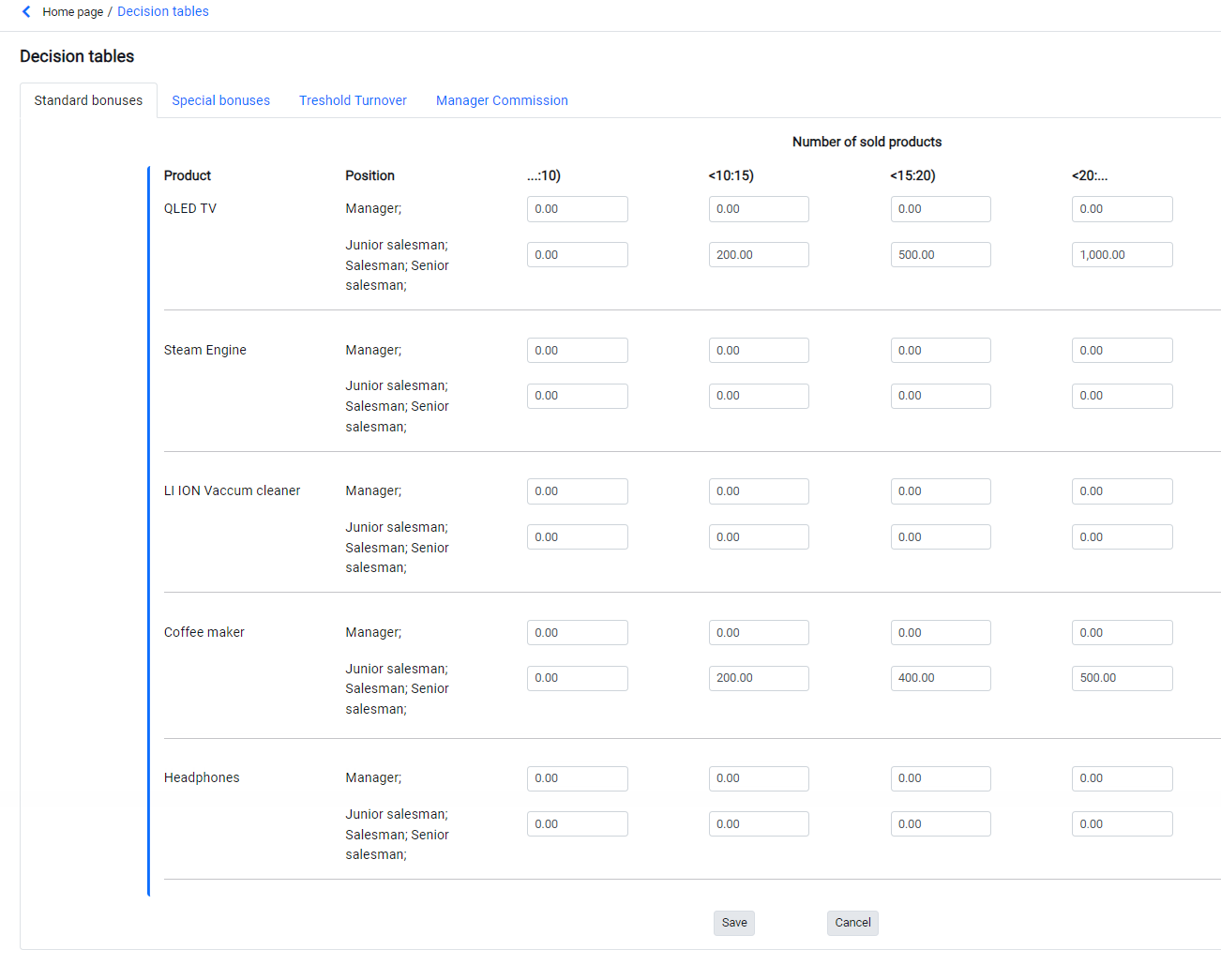
- How to edit a "large" form should depend on the context.
- Below is an example of creating an object element (e.g., an application) where the user will complete all/most of the fields - all fields are editable.
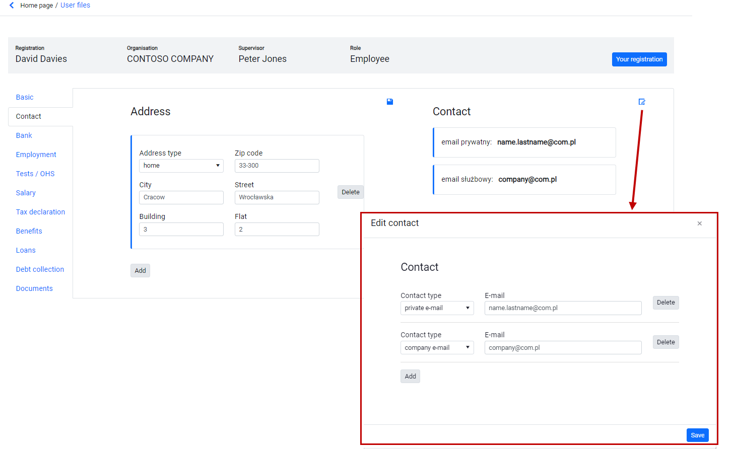
- Enter editing of an already existing element - you can apply section-level editing using a popup window or a separate form page.
- Do not use the form in edit mode for each entry to the object details. Edit mode should be available if there is a business case for it. Otherwise, use read mode with an on-demand edit option.
Read mode - two methods
- Textbox R-O (read only) - use for small forms where you have more space available
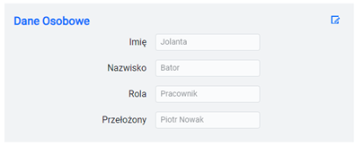
- Label - use to save space.
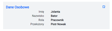
- You can adopt a mixed convention according to specific/your own criteria.
- Select and apply consistently throughout the application.
Icons, symbols
- Use symbols for obvious and typical actions, understood by the user (save, edit, accept).
- An atypical action, commonly used in an application, can be treated like a typical one (e.g., "download PDF" in a document handling system where the action occurs on multiple forms).
Support atypical actions with additional action button text.

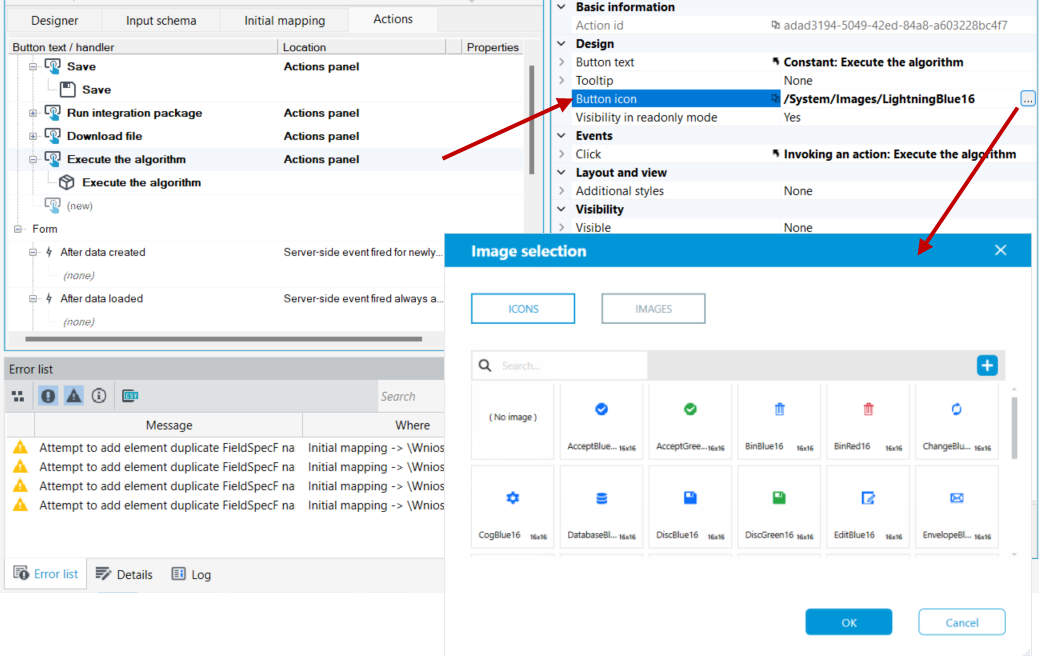
- Use tooltips in every situation.
Context of usage of the pages (forms)
- Build data-driven forms that match the user's business need. Aggregate the data needed by the user at a given stage of the process or activity, eliminating the need to switch between pages.
- Separate the data into separate pages if they do not form a coherent whole in the business context.
- Design dedicated pages that provide the user with the information they need.
Example 1
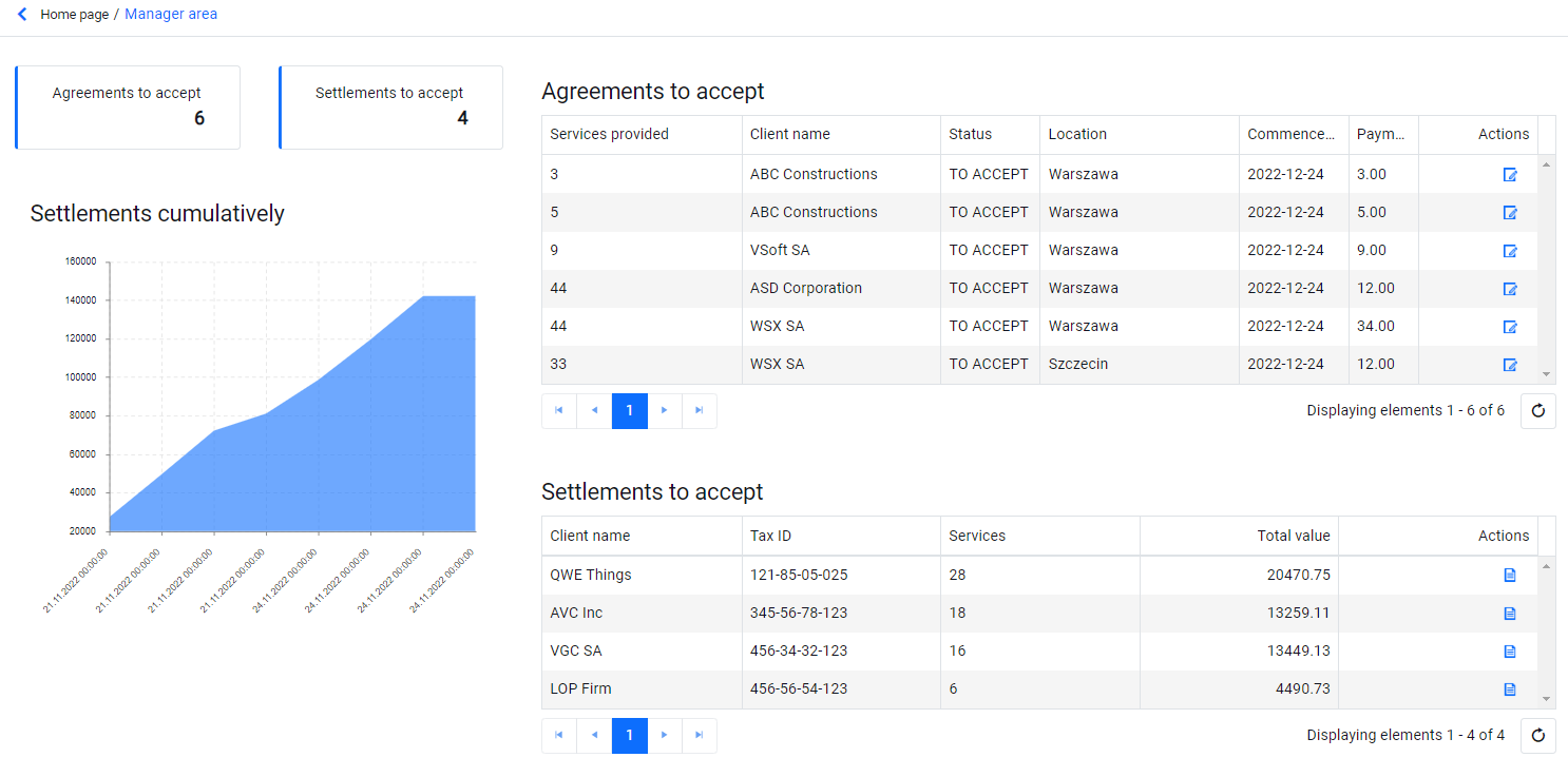
A manager's dashboard presents statistics and values under his control. This form is meant to provide information about "what needs his attention and action," but taking that action itself doesn't have to be done through this particular form.
Example 2
The employee form contains two contexts:
- Working time registration - a collection of functions for recording work activity or absenteeism.
- File - a collection of information and documents for the employee (addresses, contact, salary, loans, Social Security, etc.).
Scope of information presented
- Remember that everything is information - icon, color, size, alignment - use them in moderation emphasizing only what can help / support the user in the business process being implemented.
- Select a data set that represents value to the user at the time of the activity.
Object identification
- It is worth ensuring that relevant information about the supported entity is available at all times.
Example 1 - When handling a credit application, show customer identification data (first name, last name, PESEL, CID, etc.) all the time.
Example 2 - When assigning shipments to a courier's vehicle, show the vehicle data (type, model, registration number, carrier).
Controls
List
- Use a limited number of columns - horizontal scroll on the list is a big impediment.
- Maximum number of rows - so that it is possible to display the entire list with header, filter and pagination on one page.
- If the list will contain a few records (e.g., < 5) resign from pagination (e.g., a list of loan guarantors when there can be no more than 5).
- Specify the width of the columns relative to the expected content.
- Use column content alignment:
- texts to the left
- numerical values to the right
- dates to the left
- Filters - use filter layout to take up as little space as possible.

- Use short descriptions/abbreviations for filter fields to avoid collapsing lines (define tooltips with full field descriptions).
- Place actions related to the entire list in the list toolbar.
- Place record-related actions directly on the record (icon).
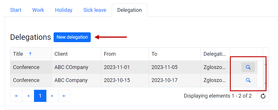
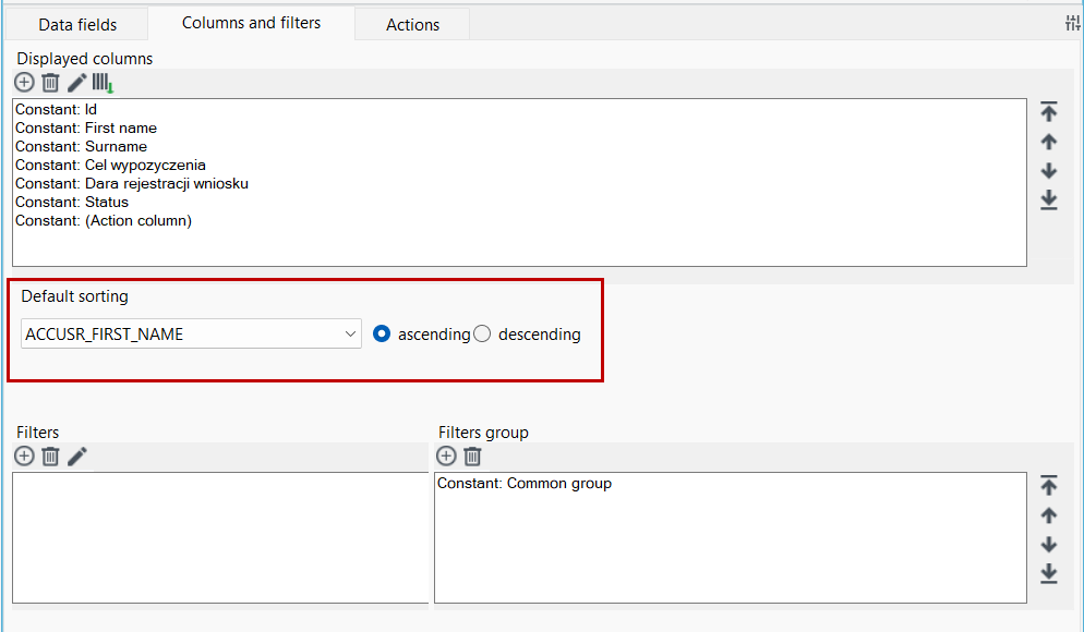
- Use data sorting options. The application designer should know what the list should sort by by default and apply such sorting settings. For more see: Selecting columns and sorting.
Repeater
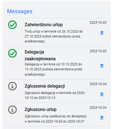
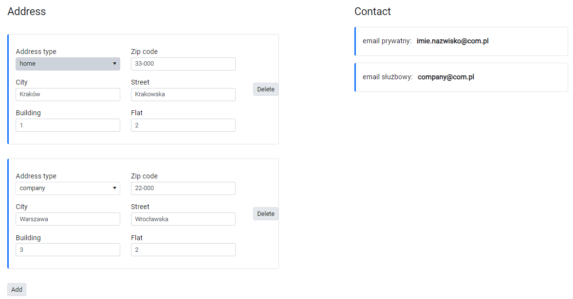
- Use a repeater to display a finite number of items so that it is possible to handle them within a single page.
- Separate repeatable elements in a visible way (containers, separators).
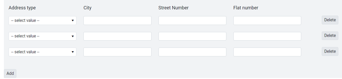
- For one-line elements, do not use additional separators for repeatable elements.
- Use the First row as a header option to save space on the form.
Popups (a form opened in a popup window)
- Place actions docked at the bottom of the form window. So that they are available all the time.
- For the action that finalizes the desired operation within the popup window, include an additional JS action with a function that closes the popup window.
Example: the SAVE / ACCEPT button in the popup window should cause the window to close.
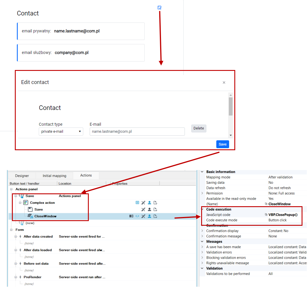
- Always refresh the appropriate page element after closing the window, so that changes are immediately visible.
Button
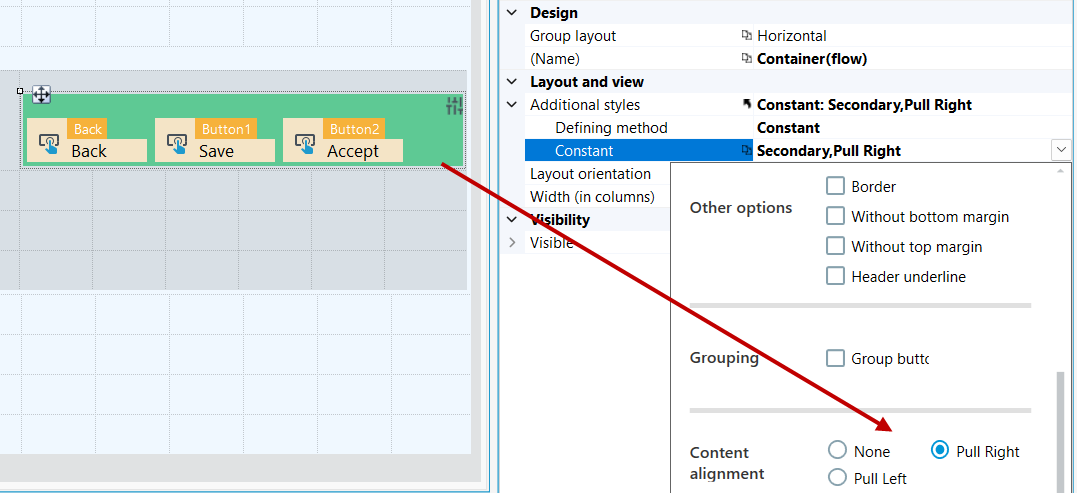
- When placing several buttons next to each other on a form, use Container (flow) to optimize the spacing between buttons.

- If you want to place a button aligned "to the right" of any object, use Container (flow) - this will allow you to make the button's position independent of the width of the column of the container on which the button is embedded.
Group
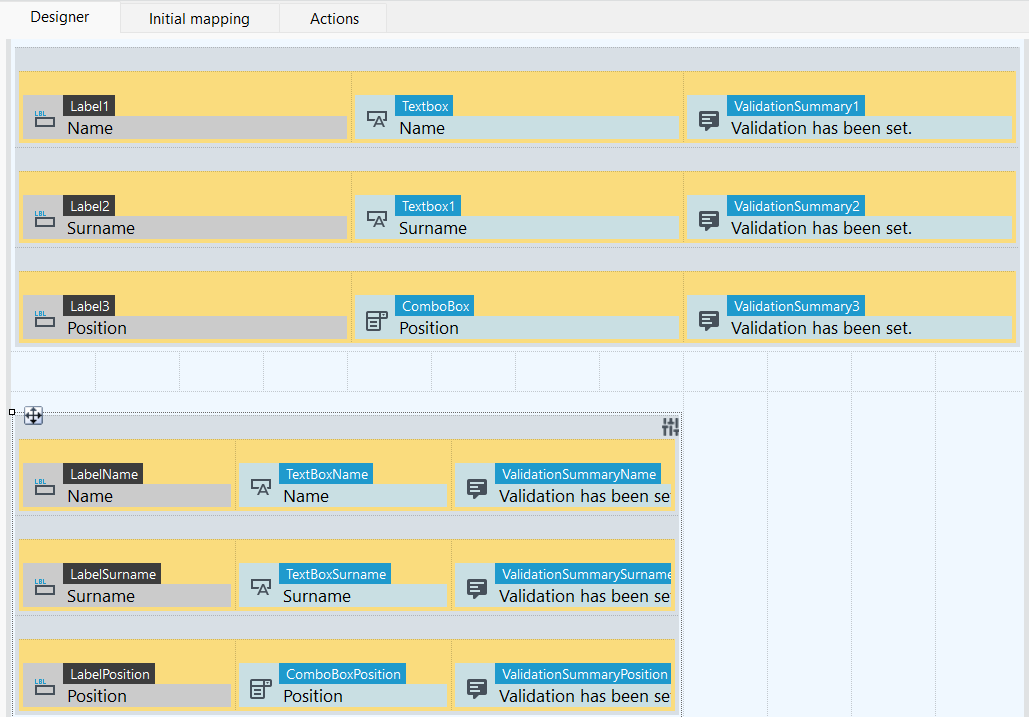
- Depending on the expected content of the edited fields, modify the default group layout (4-4-4) to make better use of the page space.
DatePicker, masked Textbox
- Specify width in columns according to expected content.

Numeric textbox
- Use the spiner option where adding units makes sense
- Field Total number of dependents - use correct
- Field Amount of debt - use incorrectly
