Container - a basic component of the form layout
A container is a basic component of form layout that is used to group controls. An extensive set of styles, including options for defining margins, paddings, and background, is available for containers and the form.
By arranging containers on the form and configuring them, we can determine the appearance of the form.
It is recommended to use containers in order to organize the form elements more clearly.
Both the container and the form have a tabular structure and consist of a grid with a maximum width of 12 columns. The width of the containers and controls placed on the form can be controlled to fit within a 12-column form.
Most controls, including containers, fill all available space.
However, some controls, despite their specified width, take up the minimum amount of space needed.
- In the example below, an 8-column container has been added to the form, meaning that the container occupies 8 columns of the form.
- You can add another container or controls to within a container, and its width is defined in relation to the container to which it is added.
- In the example below, controls such as Label, Hyperlink, Image, Check box or Button are displayed differently, although they are all 4 columns wide. They only occupy the necessary space on the form and are not stretched to the full width of 4 columns. An 8 column container occupies the entire space provided.
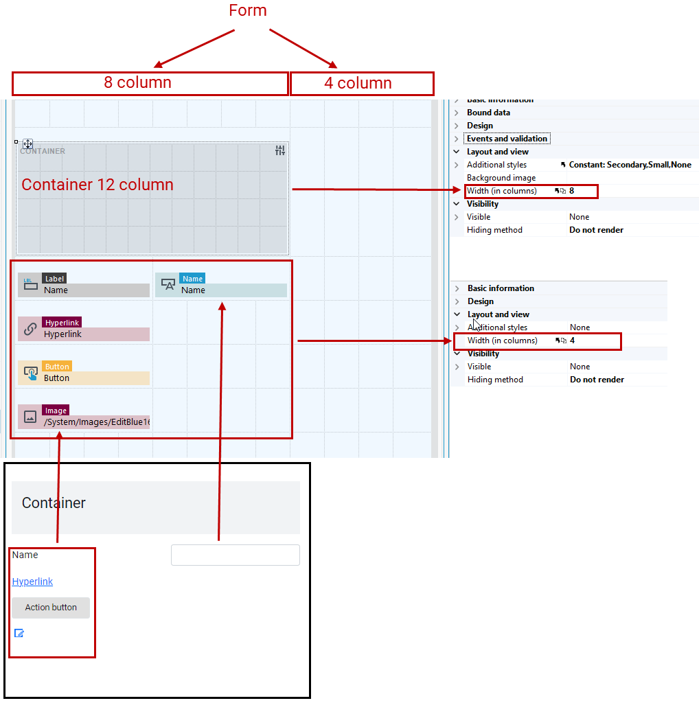
Basic container parameters:
- You can place containers side by side or add a container to a container.
- Adjust the container width using the Width property, with a maximum of 12 columns, the same as the form.
- By default, a container has 4 rows.To remove or add rows to the container or form, select the appropriate option from the context menu. Right-click on the container or form and select Row...
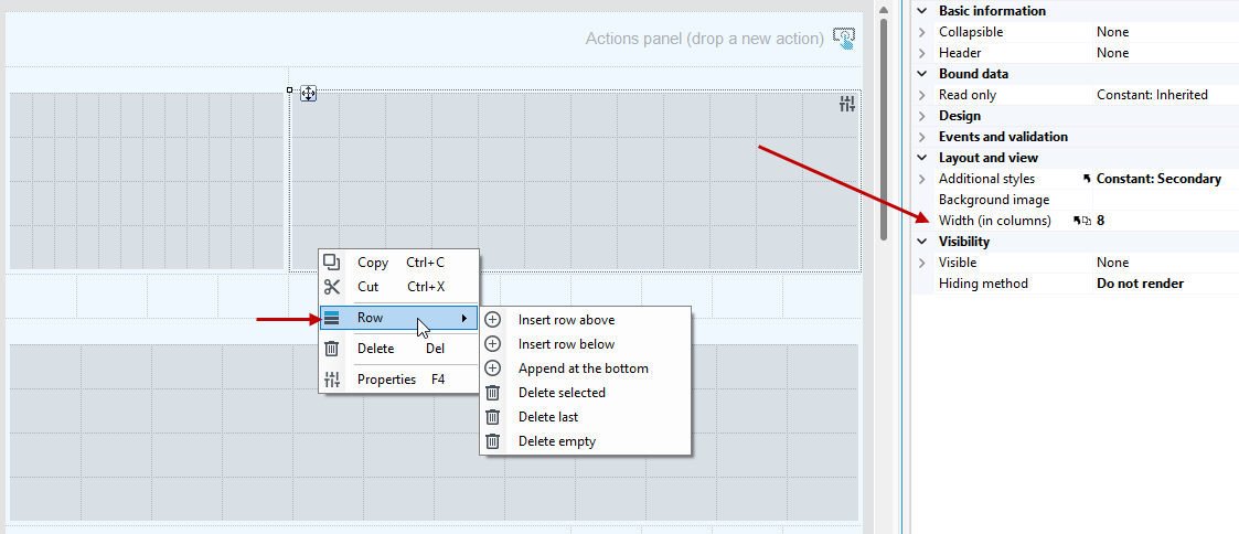
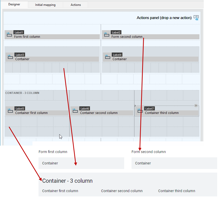
- The form and container can have a 1, 2, or 3 column layout. In the example below, the form has a 2-column layout with containers and controls arranged in both columns. The container below spans the full width of the form grid (12 columns) and has a separate 3-column layout.
- Column layouts adjust the width of draggable controls relative to the container or form column
To access form or container styles, select the component and choose the button in the upper right corner or the Additional styles option from the Properties panel.
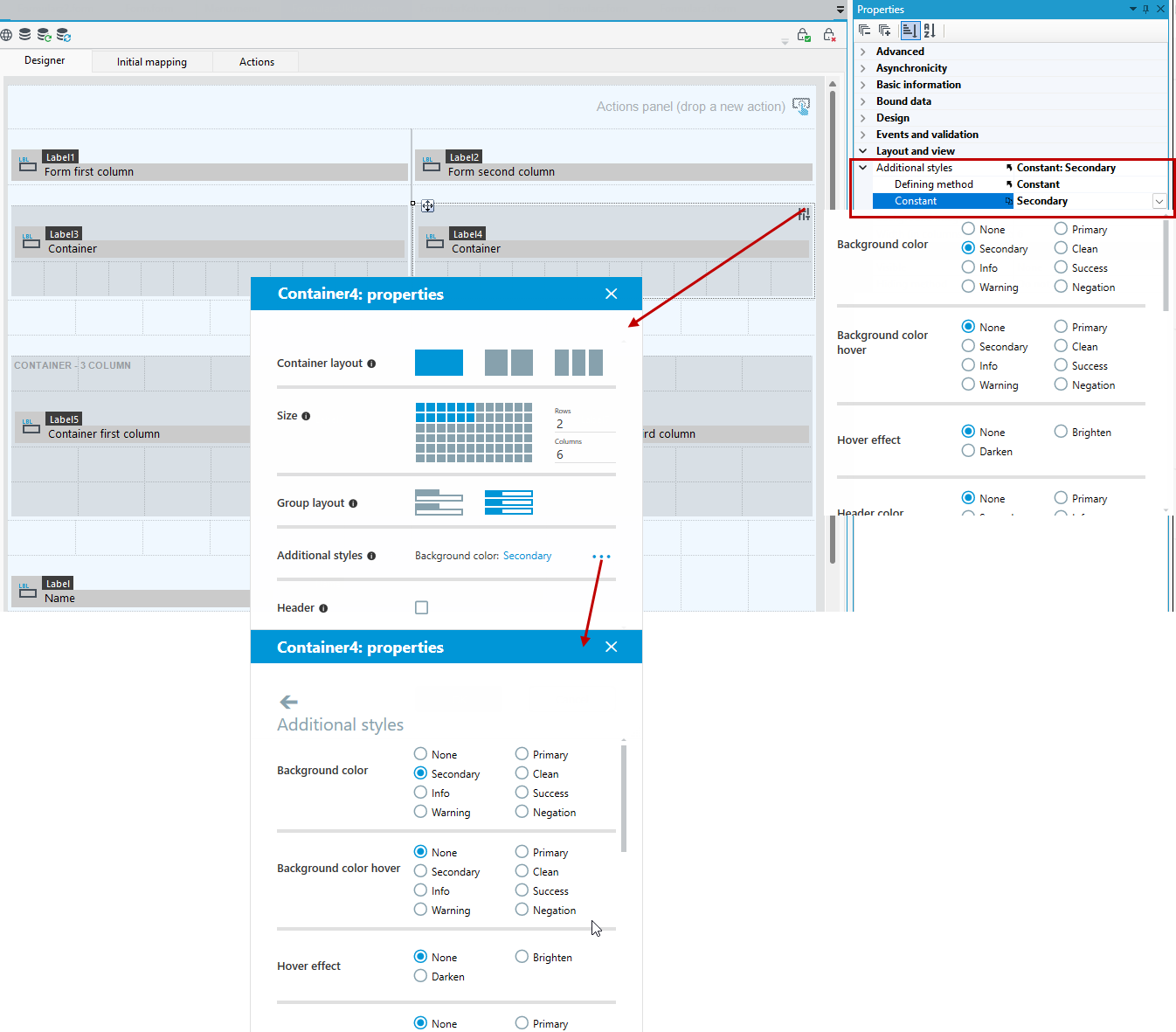
Container styles
The styles available for the container are described below. Some of these styles are also available for the container flow.
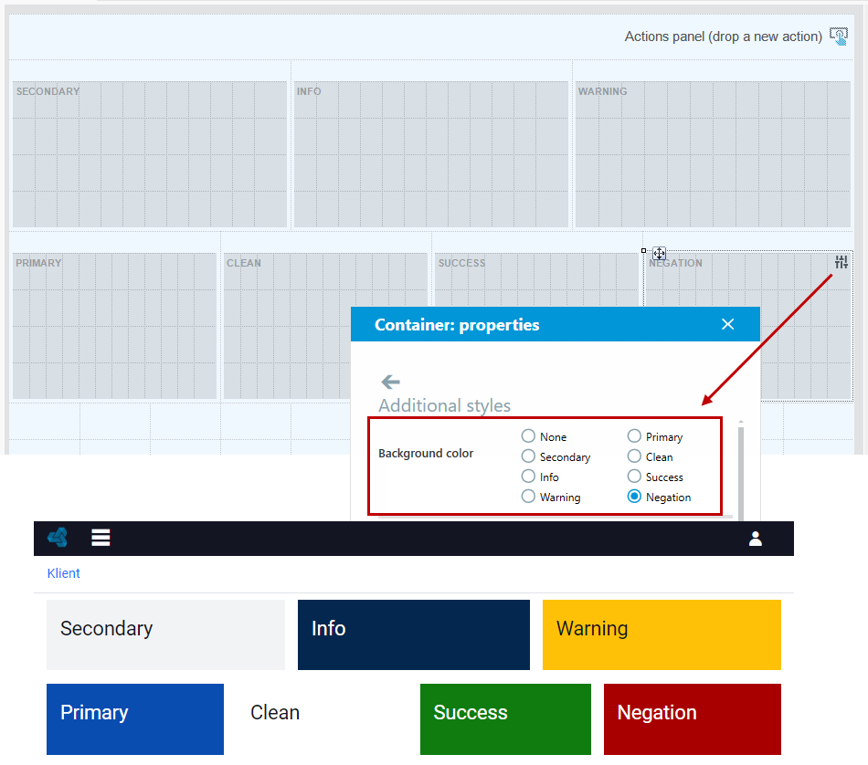
Background color
The background color is a basic parameter for container styles. Built-in background color styles can be used.
To set a custom background for a container or form, you can use graphics or icons. For additional details, refer to the section on setting container backgrounds see Setting the background of containers.
If the color of the container header is not selected in the style, it will be adjusted according to the standard settings built into the system.
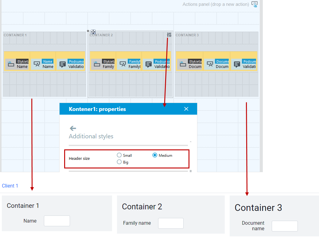
Header size
You can define the header size of a container or form.
Remember that different header sizes in different containers will make the entire container area larger.
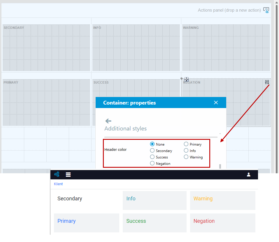
Header color
You can define the color of the container or form header.
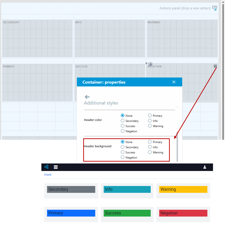
Header background
When defining the header background, remember to choose the right style for the header color. If you select None in the Header color option then the header will be displayed in the standard color.
Highlighting
By selecting an option, you can add a colored bar to the left side of the container or form.
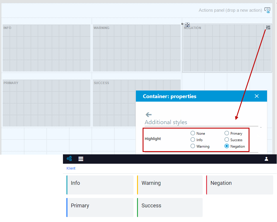
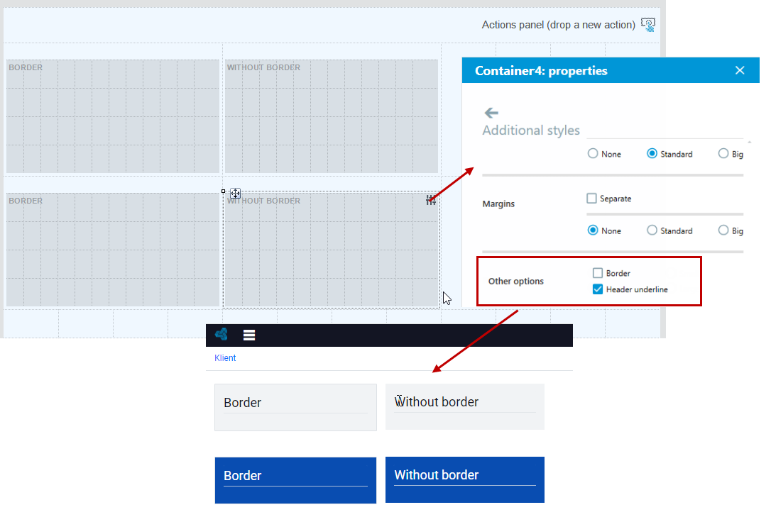
Header highlighting and border
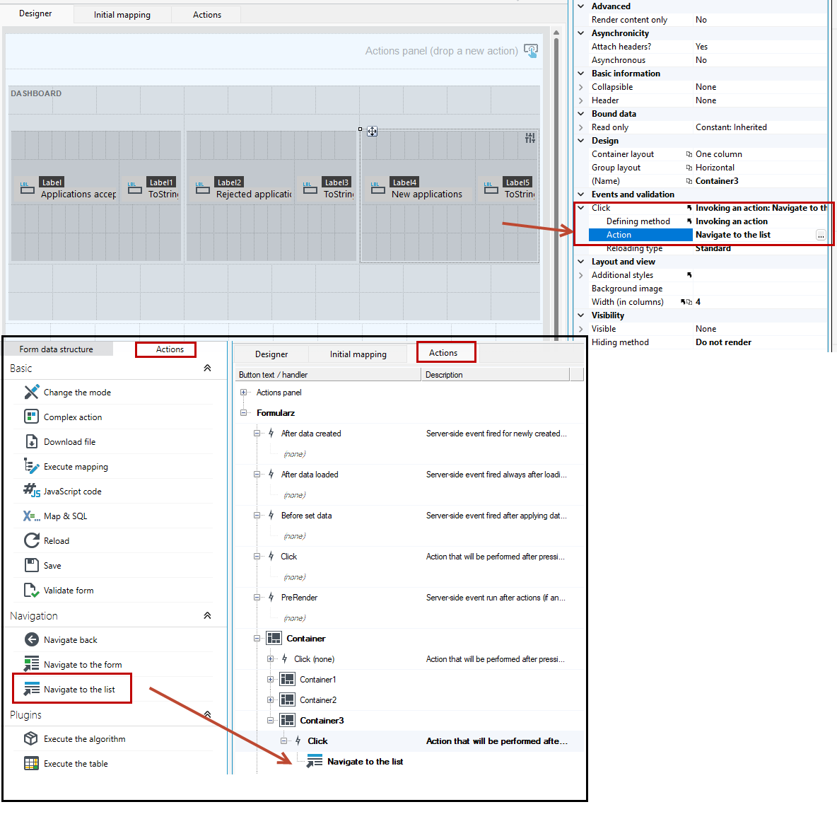
Container as an interactive element
The container can also be used as a clickable, interactive element. When you click on the container, the selected action will be performed, (for example, when you click on an element, you will be redirected to a list or form). The container flow also has styles to configure it as a clickable object.
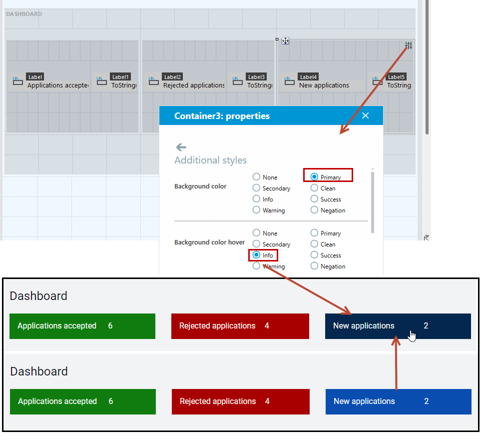
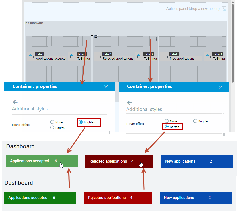
In addition, you can define the container's styles, such as: the background color when you hover over the container, and the hover effect (Brighten or Darken).
Styles: Background color hover and Hover effect can be used only when an action is assigned to the container on the Click event.
- Drag the container onto the canvas of the form.
- Select the container and on the Properties panel in the Click section, choose an action to perform.
- You can also in the Actions panel, drag the desired action from the toolbox to the designated container on the Click event.
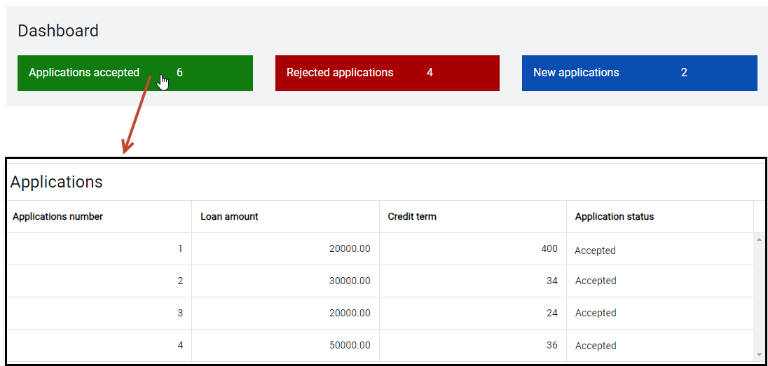
For example, clicking on the Applications accepted item (container) on the form will take you to the corresponding list of applications.
Once you have added an action to the event, you can use the following styles:
- Background color hover
- Cursor hover effect: Lighten or Darken.
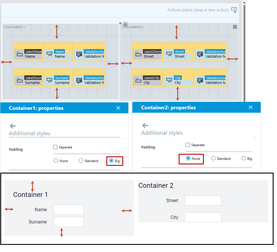
Padding
Padding otherwise known as the inner margin is an element that you can configure on both the container and the form. It represents the space between the content of the container and its edges.
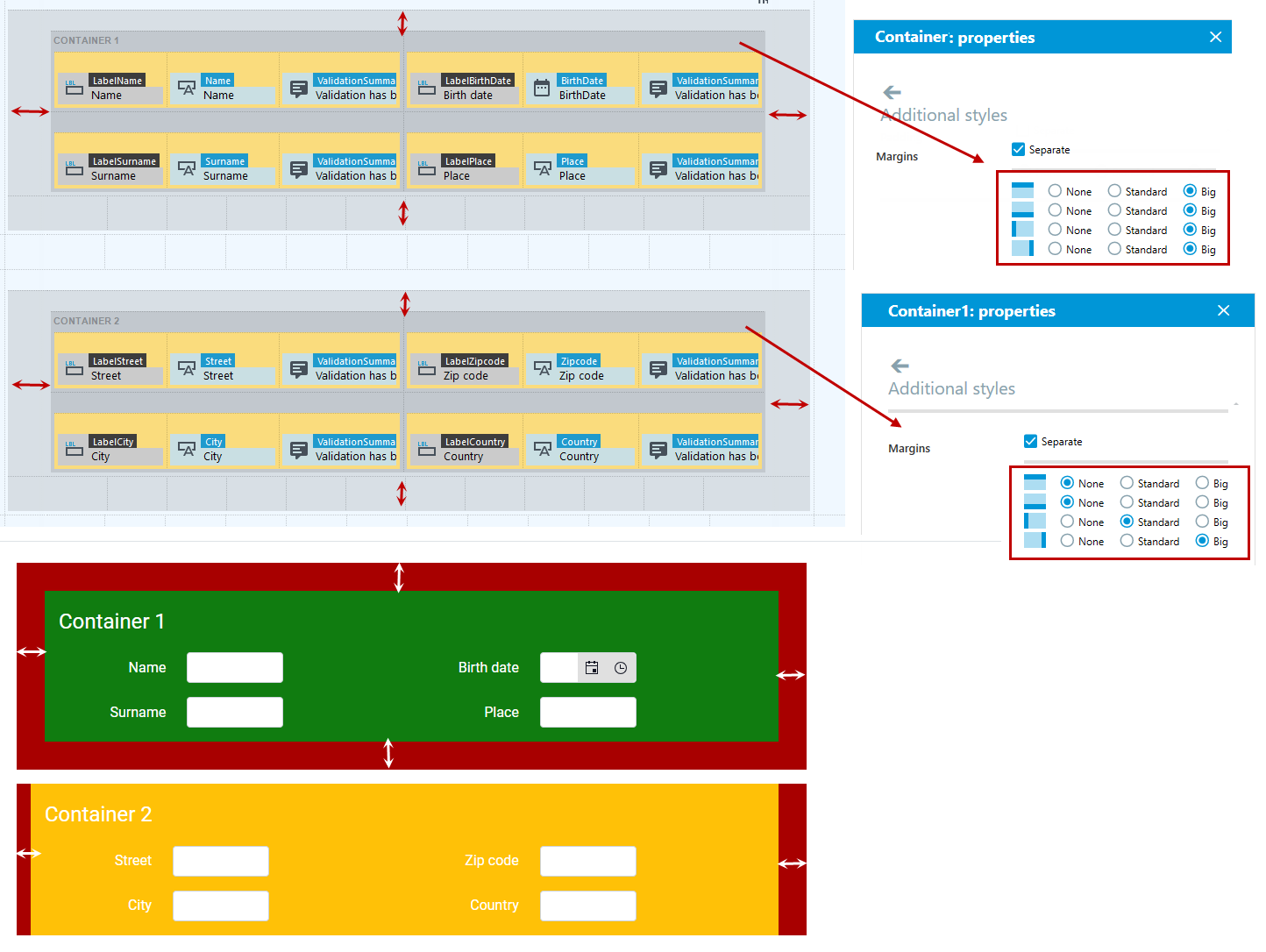
Margins
The Margin style allows you to specify the outer margin.
Margins can be used to achieve a sticky effect.
Row spacing
With the Row spacing property, you can control the size of the spacing between the rows of a container or form.
It's important to note that changing the row spacing within a container will affect the size of the entire container. For example, selecting a larger row spacing will increase the size of the container.
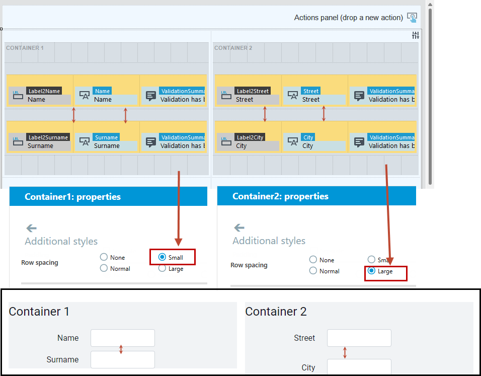
Depending on whether you set the row spacing option on the container or form, you can achieve different effects.
- In this example, the row spacing on container 2 has been set to Large, which enlarges the container. On the form, however, the Row spacing style has been set to None, resulting in container 2 and container 4 being joined together.
In the case of the form, the line spacing applies to the elements used on the form, such as controls and containers.
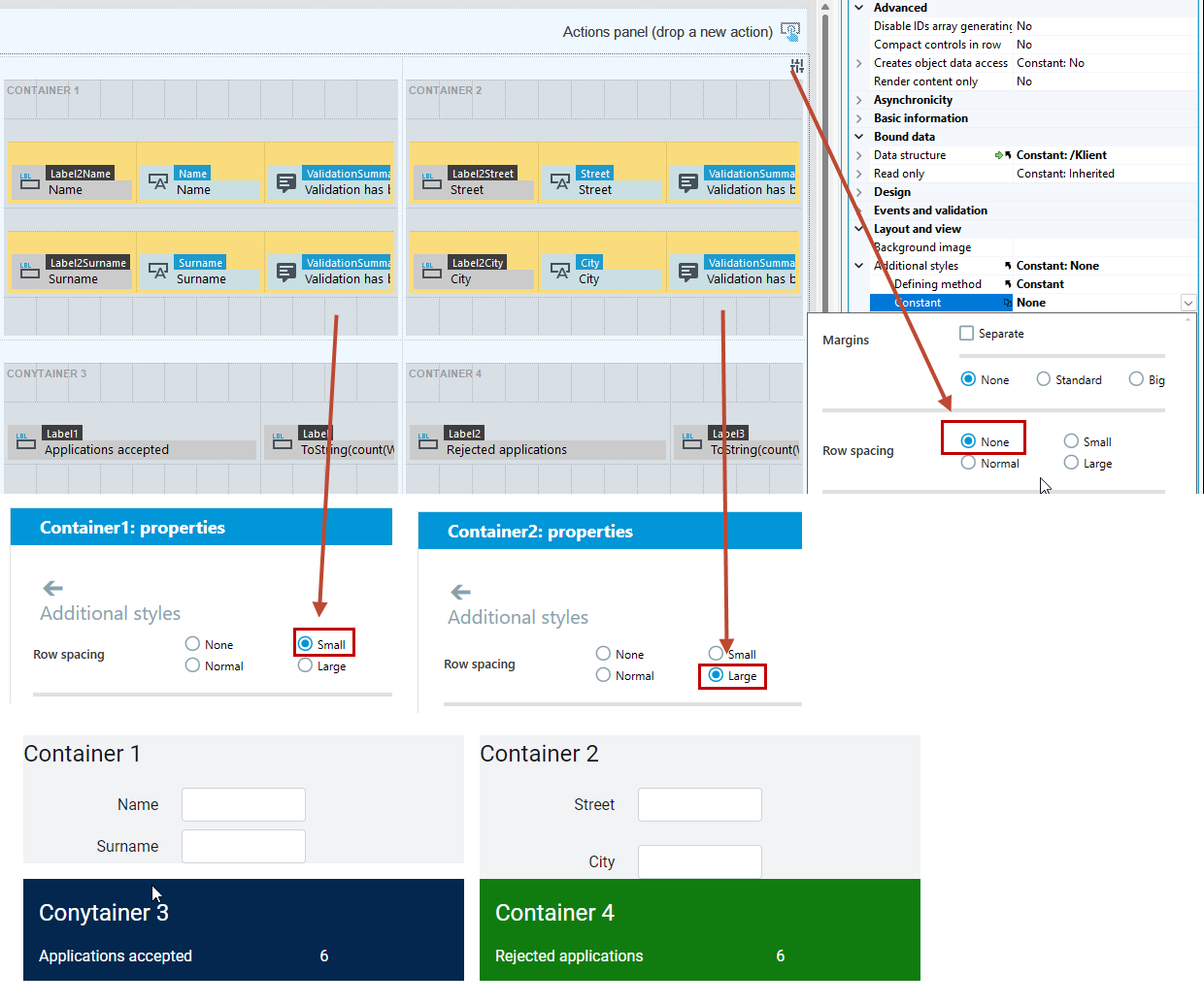
Controlling the margin setting can also achieve the effect of concatenating containers.
Item spacing
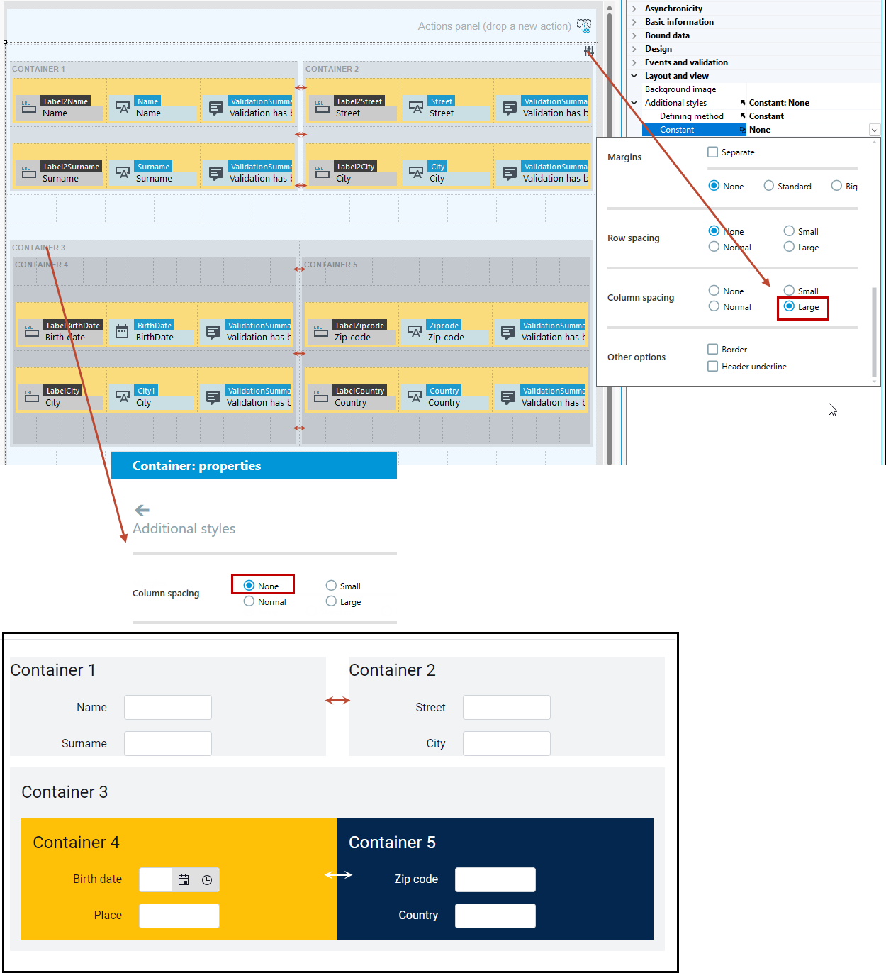
The Item spacing property allows you to control the size of the spacing between the columns of a container or form.
- In this example, the spacing for the form's containers has been defined as Large, while for containers 4 and 5, which are inside the container, it has been defined as None, resulting in these containers being joined together.
See also
Use of custom graphics and icons