Controls
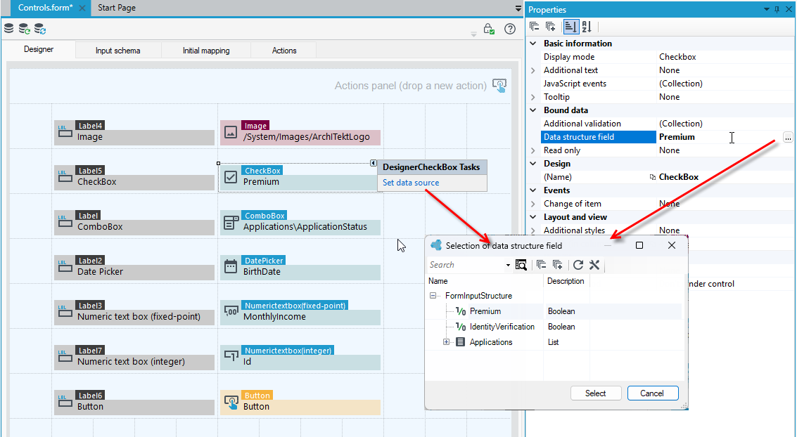
When designing a form, you can add fields directly from the form data structure, but also you can add controls and then point them to the data source on the Properties panel.
- Go to the Toolbox panel and the Controls tab.
- All the controls you can use on the form are collected here.
- Similar to data structure fields, drag a control to the workspace.
- On the Properties panel, you can configure the control and also connect its data source.
- You can also select the button within the control and then Set data source, which immediately opens a window with possible fields to select from the data structure for the control type.
General properties of controls
The Properties panel contains all the general properties of a control, as well as those that are specific and characteristic of the control type. Among the general properties of controls that appear on most items, we can distinguish:
Basic information
- JavaScript events – Adds events that will be invoked in JavaScript.
- Tooltip – Tooltip that appears after hovering with a mouse over an object.
Bound data
- Additional validation – Opens collection editor which allows for defining additional validations.
- Required field - Defines if the field is required or not.
- Validation message – Message that appears when the field is required and a user entered no value in it.
- Read only – Defines whether the field is read-only.
- Data structure field – Data structure field which values will be displayed.
Layout and view
- Additional styles – Additional styles to control. Selected styles combine.
- Width (in columns) – Number of columns taken by an item.
Visibility
- Disabled (for Button control) – A disabled button is unusable and un-clickable.
- Visible – Specifies if the field is visible. If this property is not defined the field will be visible.
- Hiding method - Specifies the way in which the field will be hidden in case of meeting the condition of hiding that is definded in the property Visible.
Events and validation/Events
- Click – Action that will be performed after pressing the button.
- Change of item – Changing the item value event handling.
- JavaScript events – Adds events that will be invoked in JavaScript.
- OnChange – Server side event performed after changing the value of the text field, see: Adding an action as a button or event
- Change of item – Support of task of changing relational item.
- Item delete (in Relational Data Field control) - Support of task of changing relational item.
- Adding an element (in List control)– An event on adding a new list element.
- Remove element event (in List control)– Event fired before element remove.
- Reloading type - Specifies how to send the query to the server:
- Standard - reloading of the nearest (according to the hierarchy) asynchronous container or the whole page (in the absence of the container)
- Always refresh the entire page - reloading the entire page.
- Any asynchronous container - business name of the asynchronous container (it is possible to indicate several containers seperated by their names with a comma, semicolon, colon or space).
- Action panel - refresh the main panel actions.
Other properties are control-specific and are described in the sections dedicated to the description of each control.
Basic
Below we describe controls from the Basic group.
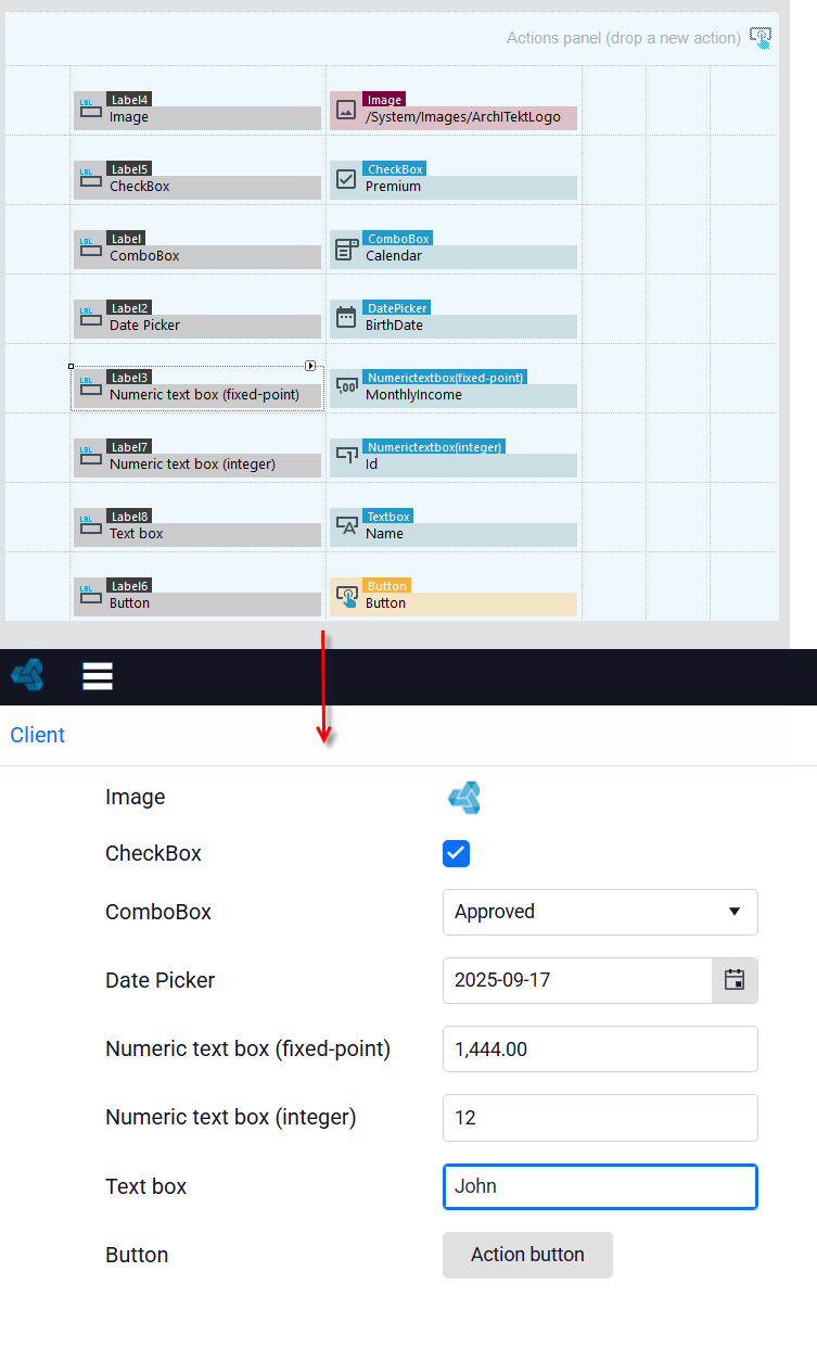
Image
Using the Image component, the user can add an image to the form by selecting it through the Path to picture property, as well as configure its width and height. If the source of the picture is to be a field from a data structure, then a binary field must be added to the data structure.
- On the Properties panel, point from the data structure to the data source fields where the file name (text field) and the file content field (binary field) are located.
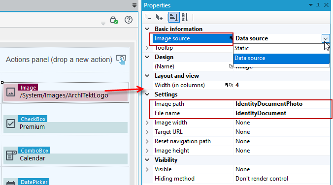
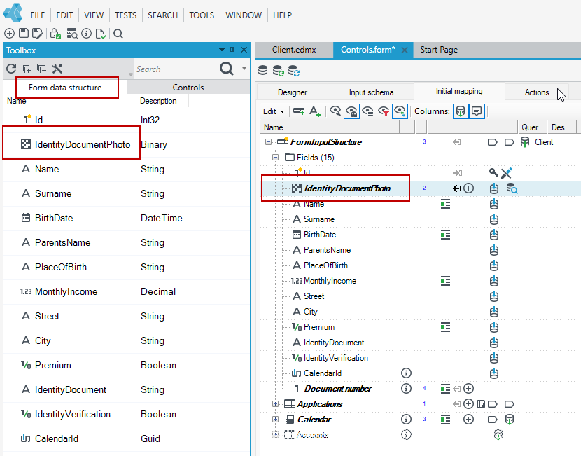
If you have added a binary field in the data structure, then on the form you must add it in the Initial mapping because the field is not yet visible in the form data structure.
- Go to the Initial mapping tab, right-click on the field, and select Fix>Add element from the context menu.
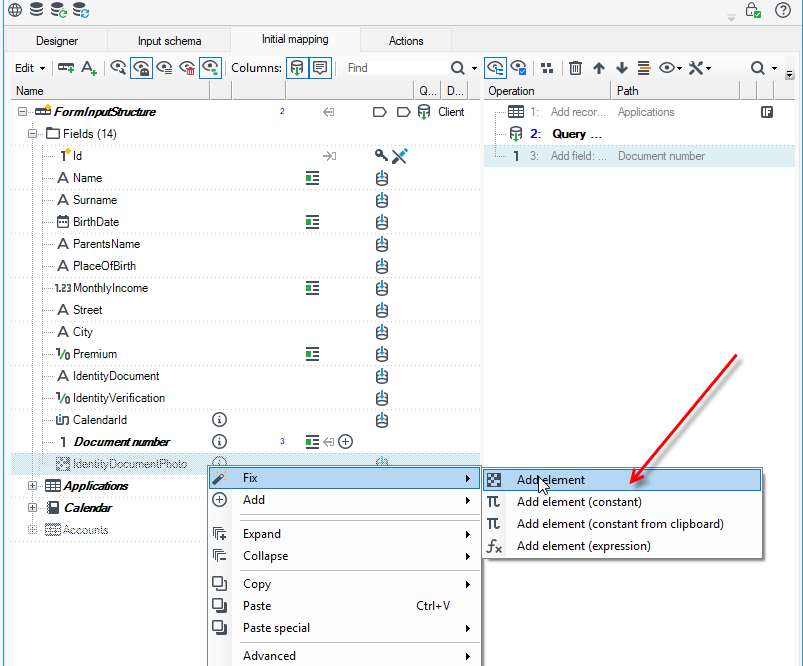
- When you complete the action, the field will be added to the Form data structure.
Properties
- Image source – Defines image source type.
- Path to picture – Defines path to picture.
- Image width – Defines image width.
- Image height – Defines image height.
- Target URL - When set the image will act as a navigable link to the specified URL.
- Reset bavigation path - Should the path in the navigation bar be reset when link is clicked (Target URL property must be set).
Label
The component is used to display text, specified through the Text property, in the form preview. The most common use is to add a description or name to fields placed in the form.
Properties
- Text – Text that will be displayed.
- Encode special characters? – Encode html entities with use of HTMLEncode method.
- Related data source control - Relation used in precising validation messages. A validation message will display the contents of the associated label. It only works within one container.
CheckBox
A control that presents data in the form of a checkbox. The data source for the control is a Boolean field.
Properties
- Display Mode – The way the control is displayed.
- Checkbox – Default option. It displays control as a checkbox.
- DropDownList – Displays control as a drop down list.
- Additional text – Additional displayed text.
- Empty value text – Value displayed when no option is selected.
Date Picker
A control that allows entering date. The data source for the control is a field of the Date and Time type.
Properties
- Range of years backward – Defines displayed range of years backward.
- Range of years forward – Defines displayed range of years forward.
- Buttons visibility
- Show calendar – Calendar button visibility.
- Hide buttons in read only mode - Hide buttons in read only mode.
For example
- If you want the control to be able to select a date from the current year, then enter a value of 0 in the control's range property.

- By clicking on the date control on the form, you will only be able to select a date from the current year.
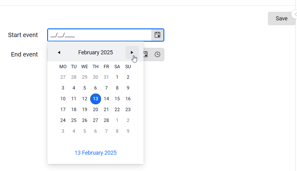
- However, if you enter the date directly in the field, it is possible to enter any date.
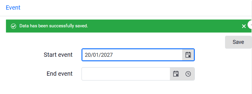
To prevent the user from entering a date outside of the specified time, validations must be implemented. For example, for the date field, we want to specify that the user can enter a current or later date from the current year.
- On the Properties panel, go to Additional validation and Collection editor.
- Select Add to define the validation.
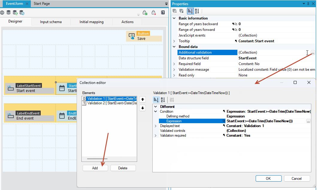
- Define the expression. Validation 1 checks that the entered date is not earlier than the current date.
- To do this, in the expression, use a comparison of whether the date entered on the form is greater than or equal to
>=than the current dateDateTimeNow(). In addition, the current date is truncated to the value of day, month, year. Using the DateTrim() function. TheDateTimeNow()function returns the date with part of the hour. - The entire expression should be defined like this:
StartEvent>=DateTrim(DateTimeNow())
6. Check the validation requirement option to Yes.
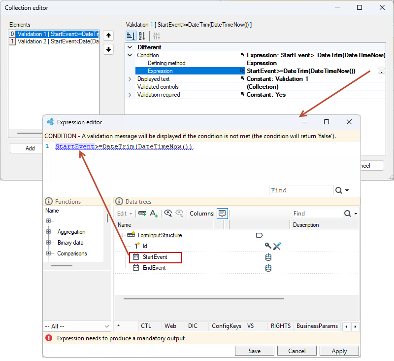
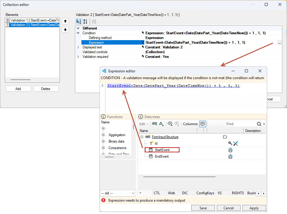
- Similarly, add Validation 2, which will check if the entered date is within the range up to the end of the year.
- To do this, use a comparison in the expression whether the date entered on the form is less than the end of the year. The
DatePart_Year()function takes the year from the currentDateTimeNow()date and adds 1 that is (2025+1). The whole expression creates a date of January 1 of the following year.Date(*DatePart_Year(DateTimeNow()) + 1, 1, 1)
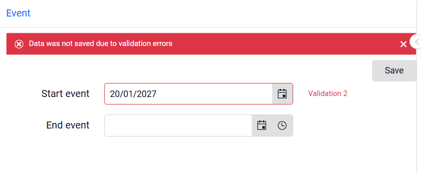
After adding validation, when the user enters a date earlier than the current date or from a year later than the current year and attempts to save the form, the corresponding validation messages will be displayed.
Data format
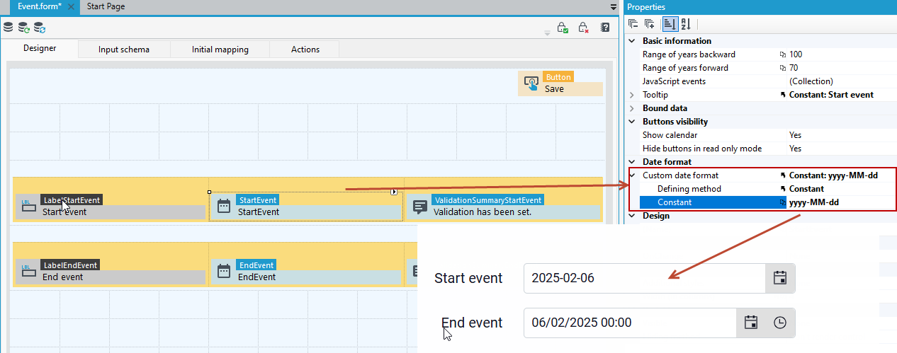
What format the date and time is displayed on the form depends on if a custom date and time format has been specified in the application configuration file - see Application configuration.
For example, if the date format was specified as shown in the figure below, then the date on the form will be presented in this format.
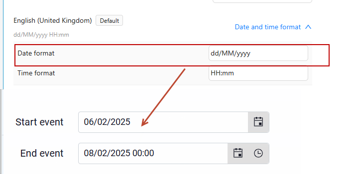
- If you want to use a different date format, then go to the Properties of the Date Picker control and enter Custom date format.
Numeric TextBox (integer)
A control that allows entering values in the form of integers. The data source for the control is a field of the Integer type.
Properties
- Autocomplete – Option determines whether the entered values are to be saved and used as hints. “k-secret-data” is added to the control style.
- View
- Show spinners – Show up and down arrows.
Numeric TextBox (fixed-point)
A control that allows entering values in the form of fixed-point numbers. The data source for the control is a field of the Fixed-Point Number type.
Properties
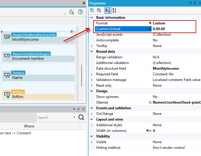
- Format – Data format compatible with Kendo
(https://docs.telerik.com/kendo-ui/framework/globalization/numberformatting). Possible options:
- Standard nX (thousandth separator “”, number of decimal places consistent with the field setting in the data structure),
- Currency (c) - (amount format “c”),
- Custom– set by the user in the User format field.
- You can select a custom data format and enter it in the Custom format field.
- Autocomplete – Option determines whether the entered values are to be saved and used as hints. “k-secret-data” is added to the control style.
TextBox
A control that allows to enter text.
Properties
- Number of lines – Defines number of lines displayed in a field.
- Characters count visible – Visibility of a text indicating the number of possible characters to be entered.
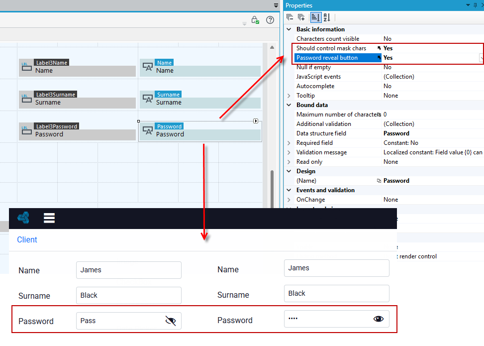
- Should control mask chars – Should control mask entered chars.
- Password reveal button - this option is available if Yes is selected in the Should control mask chars option - this button allows the user to display the entire masked password.
- NULL if empty - The control returns NULL instead of an empty string when the value empty.
- Autocomplete – Option determines whether the entered values are to be saved and used as hints. “k-secret-data” is added to the control style.
- Maximum number of characters – Specifies the maximum number of characters user is allowed to input.
ComboBox
A checkbox control whose values are taken from a specified dictionary. A dictionary field must be added in the data structure to be the data source for the control.
Properties
- Operation mode – Defines the operation mode (tree or list).
- Behavior – mode
- Collection visibility – Defines whether collection visibility happens recursively or only direct children are visible
- Auto-width – The width of the control will be adjusted to the long texts in the list.
- Tree – disable expansion tracking – Enabling this option will disable tracing expanded tree nodes.
- Sort type – Defines sorting type of dictionary elements. In standard mode dictionary elements will be sorted by defined order and name within its types. In ignore types mode all dictionary elements independently of its types will be sorted by order and name. In alphabetical sorting with index ignore, dictionary object will be sported alphabetically (type and index will be ignored).
- Selecting a category – Enables category selection.
- Is searching enabled – Option defines if text search is possible in the control.
- Tree – collection collapsed – Specifies if the displayed tree structure has default collapsed “No” or expanded “Yes” particular categories and views.
- Localization– Defines if the displayed values should be localized.
- Blank value
- Visible – Defines if there is an empty value for the field.
- Text – Text of blank value.
- Bound data
- Invalid value message – Message for a not existing value in the dictionary or on the selected view.
- Narrowing to view – Enables to narrow displayed items to those that belong to the given view.
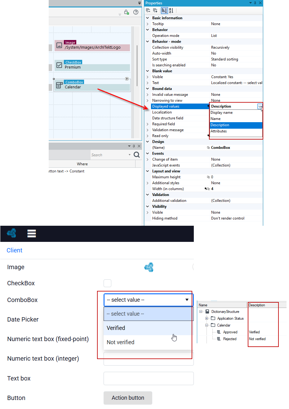
- Displayed values – Indicates if “Display name”, ”Name”, ”Description” or “Attributes of dictionary position” will be displayed.
- Localization– Defines if the displayed values should be localized.
- Layout and view
- Maximum height – Maximum field height with available options (in pixels).
You can specify whether the field should display dictionary item names, item descriptions, or their attributes.
In the example below, Displayed values as Description was selected for the control property. In the resulting application, the dictionary item selection control displays the entered description of dictionary items in the dictionary structure.
Button
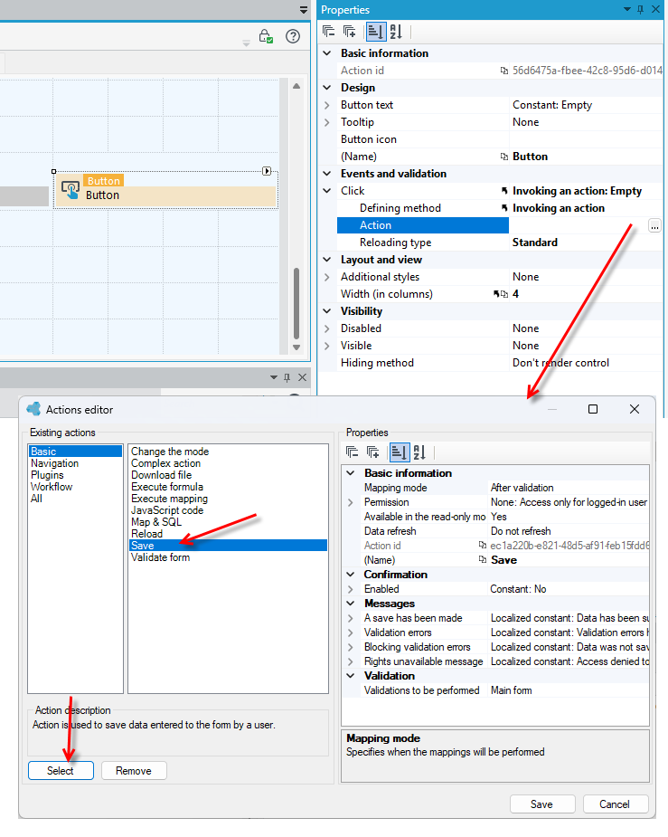
A control launches a specific user action. Buttons and actions can also be added on the Actions tab see: Form Actions. If you add a control in this way, you can place it anywhere on the form. For a control it is necessary to define an action to be performed when the button is pressed.
- Go to the Properties panel and to the Click>Action section and open the Action editor. For more on configuring actions through the action editor, see Form Actions.
Properties
- Action Id - Action id can be used from Javascript.
- Button text – Text that is displayed on the button.
- Button icon – The icon that is displayed on the button.
Container
Container is a basic component that is used to group selected elements within one or more cells of the form grid, thus providing an opportunity to introduce additional column and row division. By default, the Container consists of a grid of two rows. You can increase this number, as well as the width in the columns.
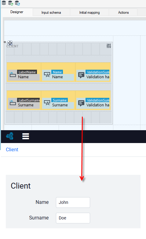
- To quickly change the basic properties of the container, click on the control and select the button
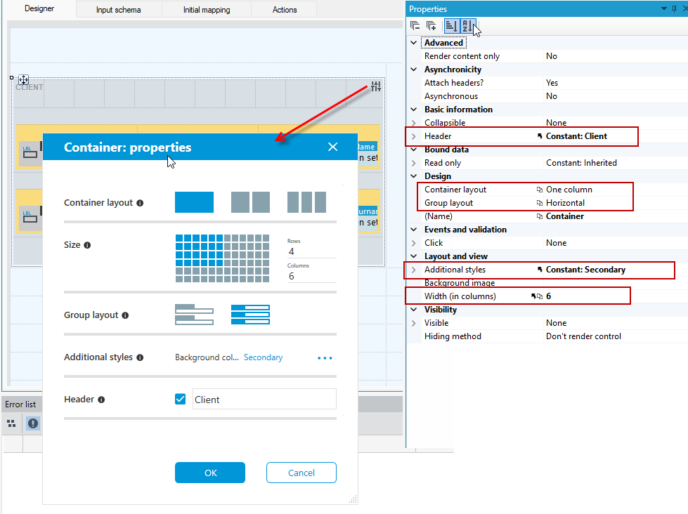
 and in the next window define the layout, size, container styles, as well as the group layout within the container and the header.
 - The above options are also available to change on the Properties panel.
- As with the whole form, only one element can be placed in each cell of the grid.
- Each container can contain other containers. A form can be thought of as a special case of a container, with specific properties such as permissions.
- Each container can be put into asynchronous mode. The Asynchronous property is used to do this. See: Behavior of form components.
Properties
Advanced
- Render content only – The setting will cause that only the contents of the container will be rendered, i.e. the elements defined inside. The container itself will not be rendered.
Asynchronicity
- Attach headers? – Advanced property. It defines if the page header are attached during asynchronous calling, e.g. CSS and JS.
- Asynchronous – Defines if the container may reload its content asynchronously.
Basic information
- Collapsible – Defines whether the container has icon allowing expanding and collapsing a container.
- Header – Container header.
Design
- Container layout – Container layout (design mode only). Affects width of controls dragged from the toolbox.
- Group layout – Form group layout (design mode only). Affects the orientation of the group of controls dragged from the toolbox.
You can change the container background and set your own graphics/icons, for more see Setting the background of containers.
Container (flow)
Container (flow) allows you to add elements "side by side" - there is no grid separating individual controls or dividing them into rows and columns. If a field does not fit on one line, it is moved to the next line.
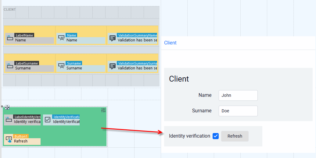
- To quickly change the basic properties of the container, click on the control and select the button and in the next window define the layout, size, container styles, as well as the group layout within the container and the header.
- The above options are also available to change on the Properties panel.
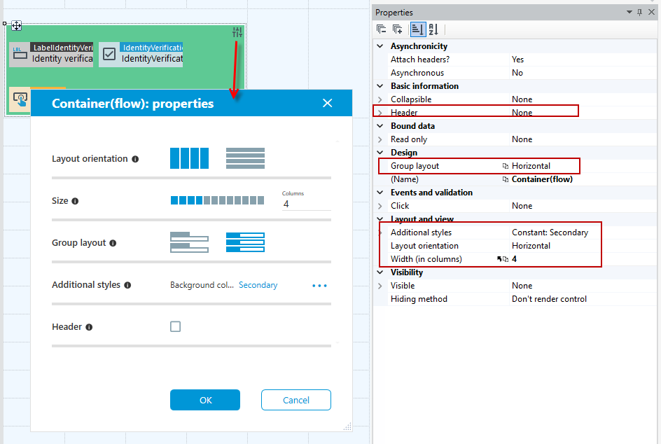
You can define styles for the Container flow in the same way as for a regular container, such as Background color, Header color, Header background, Highlight, Padding, Margins, Hover effect, Background color hover.- see Container styles.
In addition, for the flow container you can set options:
Layout and Item spacing:
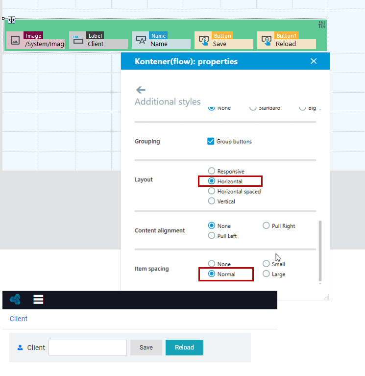
- Horizontal layout (elements are displayed side by side). In addition, the following example uses Normal Item spacing between container elements.
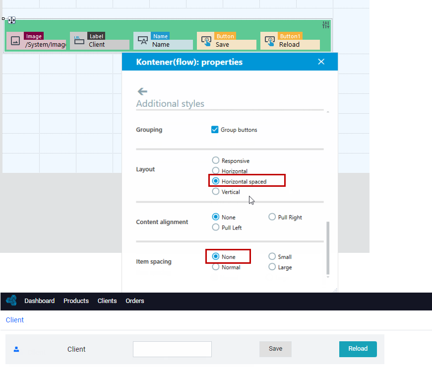
- Horizontal spaced layout (with this layout there will be the same spacing between container elements). The objects inside the container will be separated from each other so that they occupy the entire available area of the flow container. In the following example with the Horizontal spaced layout, defining the spacing will not affect the display of the container elements.
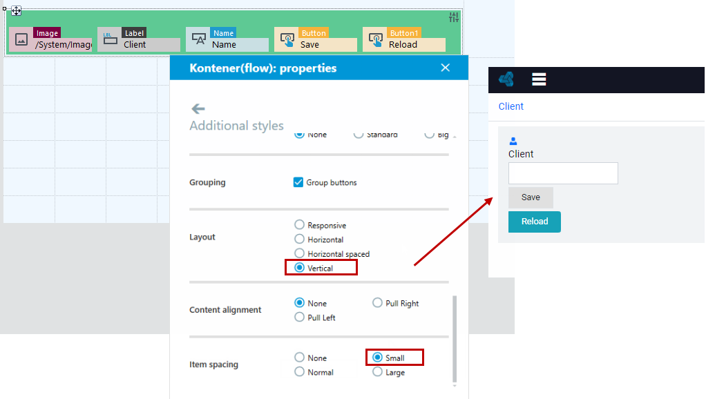
- Vertical layout (elements are displayed one below the other). You can define the size of the spacing between elements.
- Responsive layout allows you to adjust the layout of container elements for display on mobile devices.
- Content alignment - you can force the alignment of the container elements to the right or left side of the form.
Properties
- Collapsible – Defines whether the container has icon allowing expanding and collapsing a container.
- Header – Container header.
Asynchronicity
- Attach headers? – Advanced property. It defines if the page header are attached during asynchronous calling, e.g. CSS and JS.
- Asynchronous – Defines if the container may reload its content asynchronously.
Design
- Group layout – Form group layout (design mode only). Affects the orientation of the group of controls dragged from the toolbox.
- Layout orientation – Determines whether elements should be displayed in vertical or horizontal orientation.
Subform
The Subform component is used to embed another form, located on the version server. To do so, you must indicate the method of specifying the form you want to display (Property: Defining method).
The data structure for a subform:
- Can be the same as the structure of the parent form, in which case the Subform structure path field has an empty value.

- A subform uses a different structure (indicated by the Data structure property) than the structure associated with the parent form, this is possible for two cases:
- the parent form structure contains a list pointing to a subform structure that contains a field of type Relation Data Field,
- the parent form structure contains a field of type Relation Data Field, pointing to the data structure of the subform.
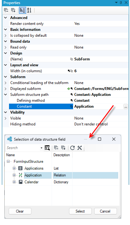
You can define property Conditional loading of the subform – Allows for choosing method of condition under which subform will be loaded.
To perform actions on a subform element, you can place an Action Button in the subform, available in the Toolbox. The button will be visible in the parent form and will make the appropriate action available in the context of the data contained in the subform.
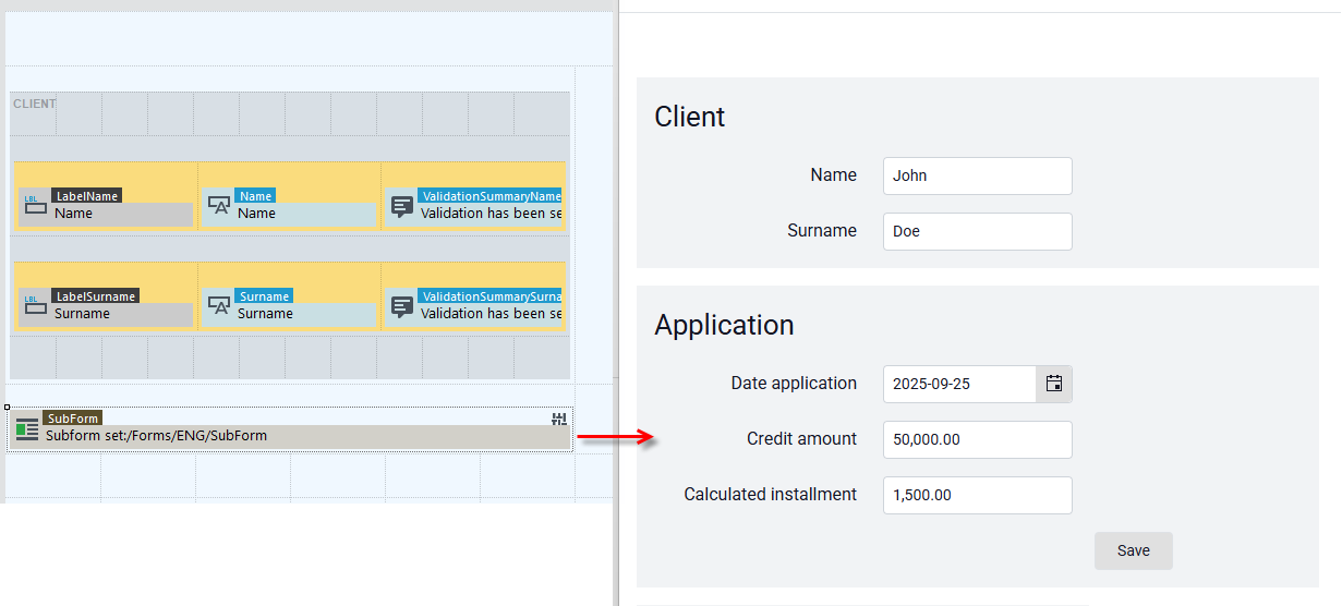
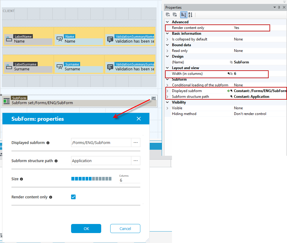
- To quickly change the basic properties of the Subform control, click on the control and select the button and in the next window define the path to the subform structure, subform, size, content rendering, additional styles and header.
- The above options are also available to change on the Properties panel.
Tabs
The Tabs component allows any number of containers to be inserted into a form, between which the user can move by clicking on individual tabs - each tab corresponds to a separate container in which any form elements can be placed in a grid of rows and columns.
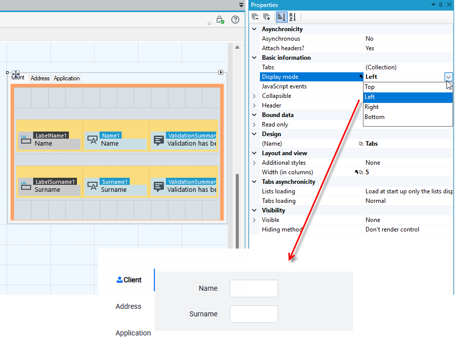
- Adding new (or deleting existing) tabs and configuring them can be done through the Tabs property and the Collection Editor. Each tab has its unique Name and Text properties defined within the Bookmark component.
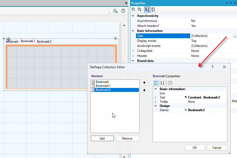
- You can also specify an optional displayed icon for the tab. In the Display mode property it is possible to specify the direction in which the bookmarks will be displayed.
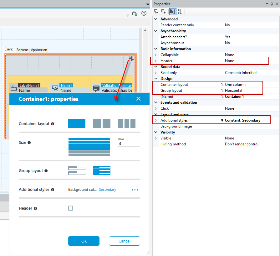
- The Bookmark control is built from a container, so in order to quickly change the basic properties of the Bookmark control, select the control and click the button . In the next window, define the layout, size, and styles of the control, as well as the layout of the group within the control and the header. The same options for change are available here as for a regular container.
- The above options are also available to change on the Properties panel.
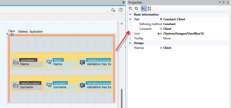
- Additional properties of the control are available in the Properties panel if you select the control together with the orange background.
Properties
Asynchronicity
- Asynchronous – Defines if the container may reload its content asynchronously.
- Attach headers? – Advanced property. It defines if the page header are attached during asynchronous calling, e.g. CSS and JS.
Basic information
- Tabs – Opens TabPage Collection Editor window which allows for adding, removing and editing tabs.
- Display mode – Defines the method of displaying tabs (horizontally or vertically).
- Collapsible – Defines whether the tabs control has icon allowing expanding and collapsing a control.
- Header – Tabs header.
Tabs asynchronicity
- Lists loading – Option controls loading lists that are located in tabs container. Possible options are:
- Load all lists asynchronously – lists from inactive tabs are loaded while activating tab,
- Do not interfere loading list – user defines himself if the list is created and filled in with data,
- Load at startup only the lists displayed for the first time – lists displayed for the first time are loaded at once, the rest of them are loaded not before while activating the tab.
- Tabs loading – Determines how tabs content is loaded.
You can change the background of the container that is part of the control and set your own graphics/icons, for more see Setting the background of containers.
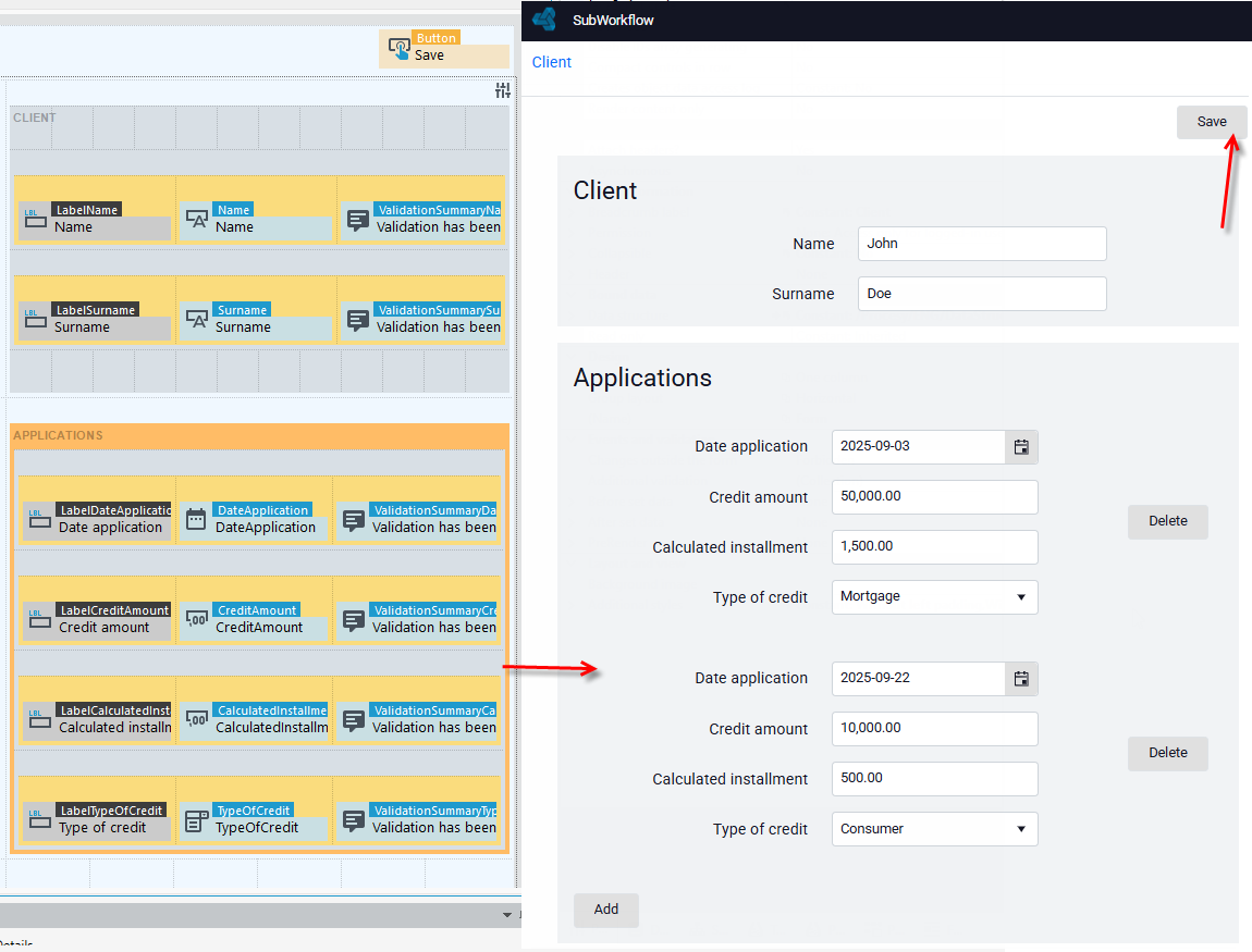
List
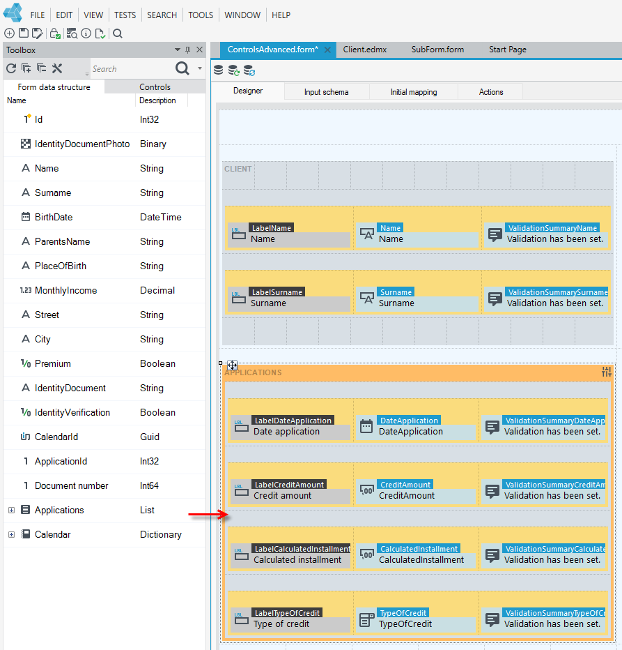
The task of the component is to display a list of business elements stored in a data structure referred to by a field of the List type (a field placed in the parent data structure of the form).
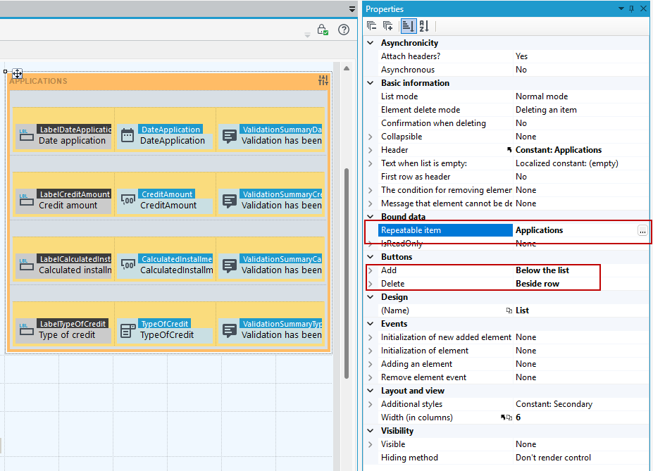
You can define:
- display of Add and Delete buttons - this is enabled by the Buttons property - the Delete button can be displayed under the recurring element or to its right - this is determined by the Position of the Delete button property,
- it is possible to change the text that is displayed on the Web page on the buttons of the Add and Delete,
- the need for additional confirmation of the desire to delete a recurring item.
If the list is on a form, invoked by the user in the context of adding a new business data element, it will not function properly until the user saves the data.
- To quickly change the basic properties of the List control, click on the control and select the button .
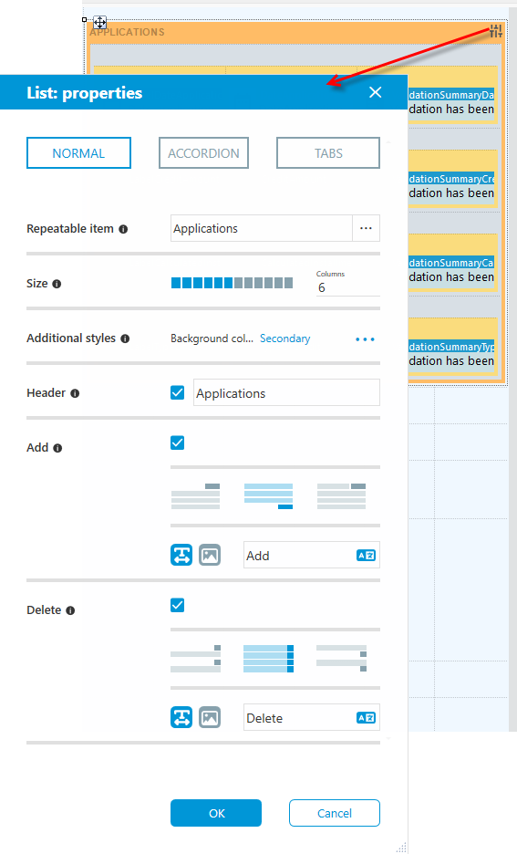
- You can select:
-
list operation mode:
-
Normal - the standard list mode,
-
Accordion - drop-down list mode
-
Tabs - successive list items are displayed as tabs:
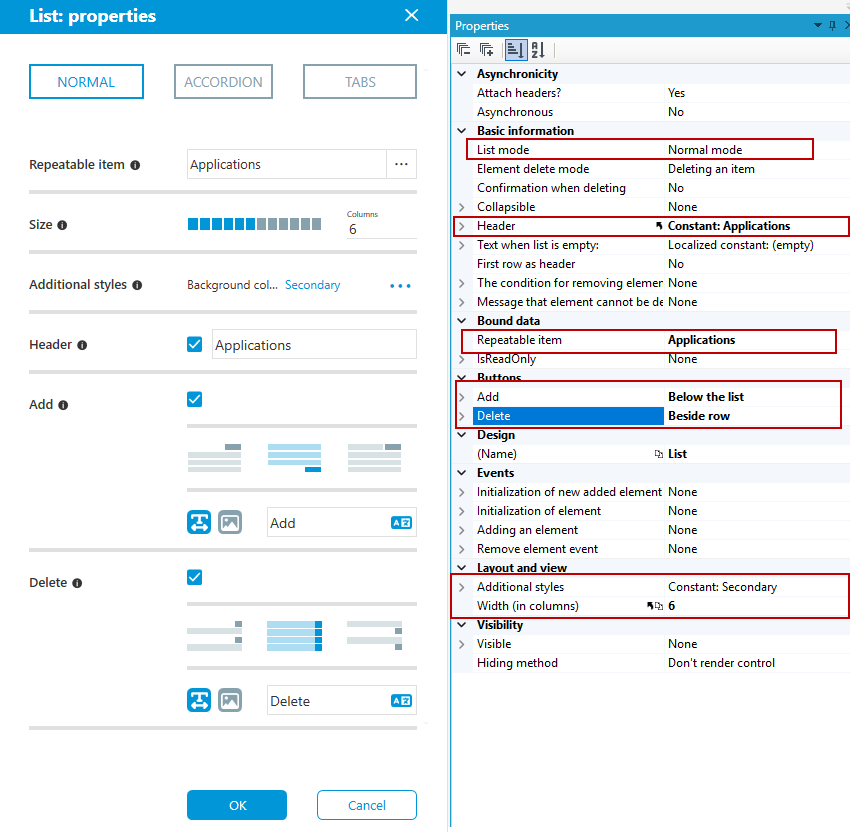
In addition, you can indicate the list's recurring element, control size, additional styles, header, and configure the display of Add and Delete buttons. The above options are also available to change on the Properties panel.
If a List field has been added to the data structure, it must be added to the form in Initial mapping, as the list is not yet visible in the form data structure.
- Go to the Initial mapping tab, right-click on the list and select Fix>Add element from the context menu.
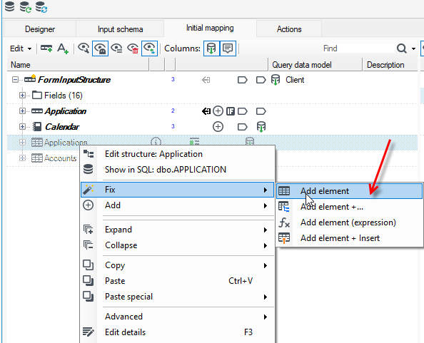
- After performing this action, the list will be added to the Form data structure.
Properties
Asynchronicity
- Attach headers? – Advanced property. It defines if the page header are attached during asynchronous calling, e.g. CSS and JS.
- Asynchronous – Defines if the container may reload its content asynchronously.
Basic information
- List mode – Defines the mode of the list – normal or comment mode (the ability to edit only your own, not saved entries)
- Element delete mode – Item delete mode.
- Confirmation when deleting – Defines whether a confirmation window appears after pressing the delete button.
- Collapsible – Defines whether the list has icon allowing expanding and collapsing a list.
- Header – List header.
- Text when list is empty: - Defines a text for an empty list.
- First row as a header – The first row of a container (repeating list item) will be trated as a list header. It will be displayed only ONCE – for the first repeating list item (then will be skipped for other elements).
- The condition for removing element – The condition for removing element of repeatable list.
- Message that element cannot be deleted – A message that element cannot be deleted.
Bound data
- Repeatable item – Indicates item that will be repeated in a list.
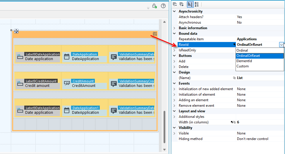
- RowId - property determines the control's operating mode and how list rows are identified. You can specify row identification by order — the Ordinal option, by order with detection of any data violations — the OrdinalOrReset option, or by an Id element from the list — the ElementId option.
Buttons
- Add /Delete
- Show button – Defines whether button is visible or not.
- The inscription on the button – Text on the button that adds a new element to the list.
- Tooltip – Tooltip that appears after hovering with a mouse pointer over and action button.
- Icon – Icon for a button on list.
- Position – Specifies the location of a button with relation to the row that is to be deleted (In row header – in the header of the recurrent element).
- Styles – Styles for button. Selected styles combine.
You can change the background of the container that is part of the control's structure and set your own graphics/icons. For more information, see: Setting Container Backgrounds.
List (.list file)
This type of element can be used to embed and display any previously created list on a form.
- A list that is displayed within a form can be associated with data displayed on the form using the
@Parentfilter property. As a result, the items displayed in the list will be further filtered for the given relationship. For more see: Predefined filters in SQL queries.
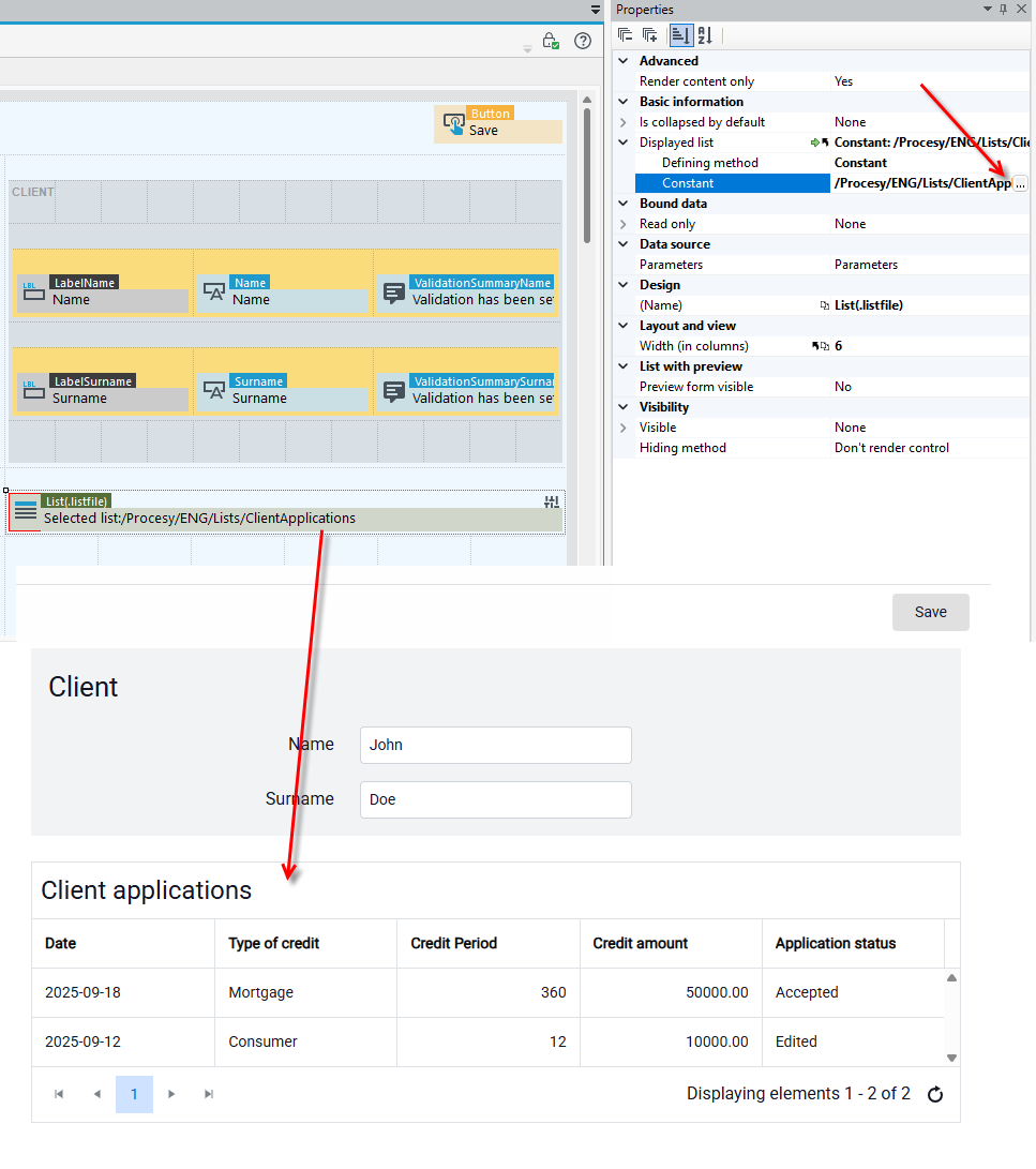
- To quickly change the basic properties of the List (.list file) control, click on the control and select the button .
The above options are also available to change on the Properties panel.
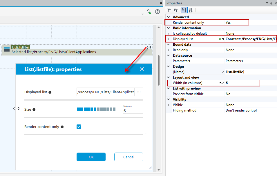
Properties
- Render content only – The setting will cause that only the contents of the container will be rendered, i.e. the elements defined inside. The container itself will not be rendered.
- Displayed list – List that will be displayed.
List with preview
- Preview form visible – Allows for displaying preview of a form of selected record from the list in a PreviewControl control.
- The name of the Ajax Page Loader control – Name of the control that will display preview of a form.
- Form element ID – The form that will be displayed in the preview.
Vertical List
Similarly to the List component, the task of the Vertical List component is to display a list of business elements stored in a data structure.
- The elements of the vertical list are displayed in consecutive columns - vertically next to each other, and not in rows set one below the other - as in the case of the List component.
- The width of the fields for a single list item matches the number of list items (which are displayed in columns in a single row, side by side), so when designing a vertical list, consider the number of list items that will be displayed.
- To quickly change the basic properties of the Vertical Listcontrol, click on the control and select the button .
- The above options are also available to change on the Properties panel.
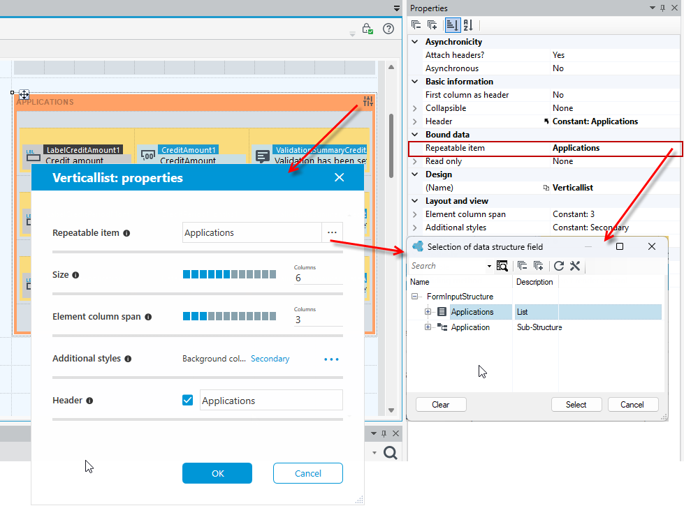
Basic information
- Collapsible – Defines whether the control has icon allowing expanding and collapsing a control.
- Header – List header.
Layout and view
- Element column span – Specifies column span for a single recurring element.
Asynchronicity
- Asynchronous – Defines if the container may reload its content asynchronously.
- Attach headers? – Advanced property. It defines if the page header are attached during asynchronous calling, e.g. CSS and JS.
The Vertical List presents data in read-only mode and does not have Add and Delete buttons for adding/removing items from the list like the regular List control.
You can change the background of the container that is part of the control and set your own graphics/icons, for more see Setting the background of containers.
Group
A container that groups controls on a form.
- If you drag fields from the Form data structure panel then they are immediately placed in a group along with the label and the Validation Summary control.
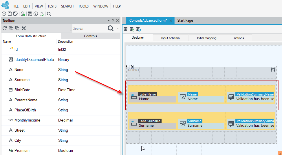
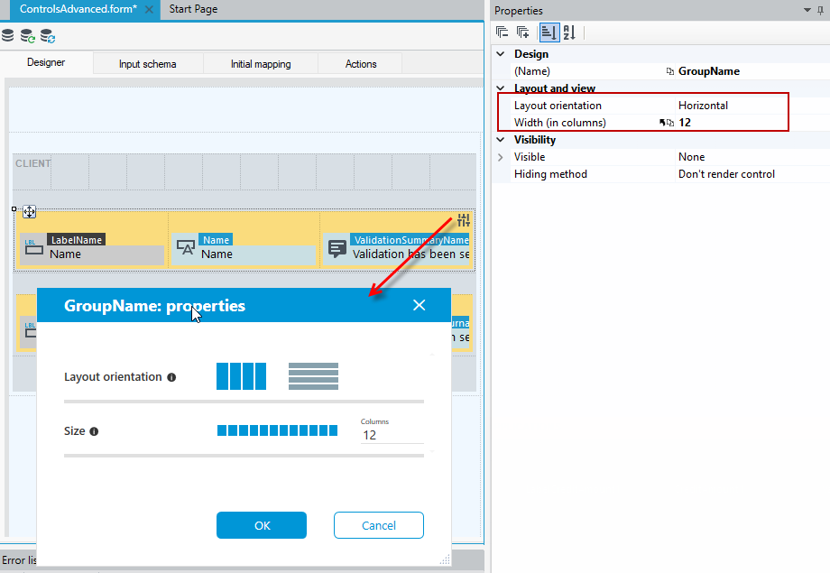
- Select the Group control and choose the option to change the layout or size.
- These options are also available to change on the Properties panel in the Layout and view section.
Text editor
Enables user to format text (font, font size, bold, italic, text alignment, lists, etc.)
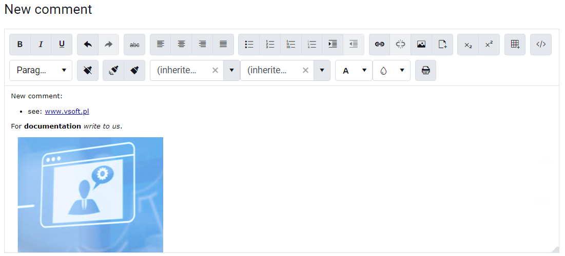
Depending on the selected mode of the control, it allows:
- to edit a formatted text (edit mode) - then the control is displayed with all editing options,
- to display it (the "read-only" mode) - only the saved content is presented.
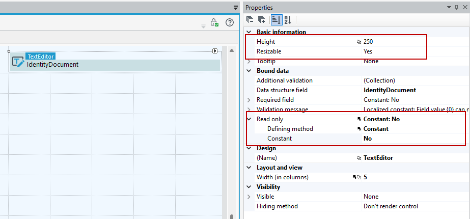
Properties
- Height – Editor height in pixels.
- Resizable – Displays the resize handle.
Scheduler
The Scheduler control can be fed with event data from any list defined in the system and allows you to configure the handling of calendar events.
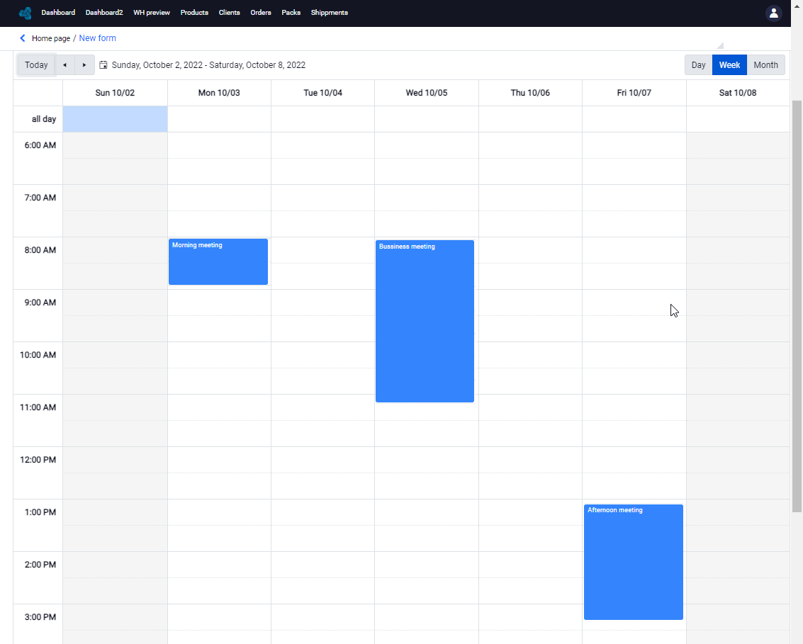
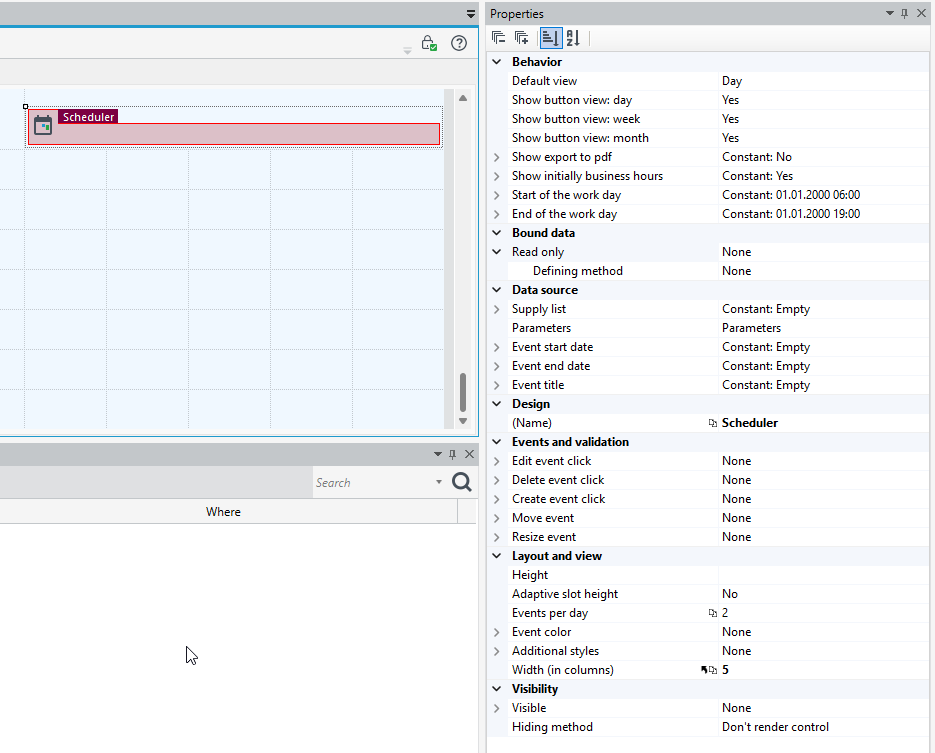
On the Properties panel, you can specify the parameters of the control:
Beahavior
- Default view: day, week , month, the ability to show or hide individual buttons, specify the beginning and end of the working day.
- Show button view: day
- Show button view: week
- Show button view: month
- Show export to pdf
- Show initially business hours - If set to true the view will be initially shown in business hours mode. By default view is displayed in full day mode.
- Start of the work day - Sets the start of the work day when the Show business hours button is clicked.
- End of the work day - Sets the end of the work day when the Show business hours button is clicked.
Data source
- Supply list - List the results of which will be displayed in control.
- Event start date- The data source with event start date.
- Event end date - The data source with event end date.
- Event title - The data source with event title.
Events and validation
The ability to specify the action to be performed after the execution of a specific event on the control.
- Edit event click - Event raise when edit was clicked.
- Delete event click - Event raise when delete was clicked.
- Create event click - Event raise when create was clicked.
- Move event - Fired after moving an event.
- Resize event - Fired after resizing an event.
Layout and view
- Height - Examples of valid unit strings are '1px' and '5in' (em, ex, %, px, cm, mm, in, pt, pc).
- Adaptive slot height - Increases the slot height when containing events up to views.eventsPerDay and reduces its height if there are less events for that specific day. Only works with month view.
- Events per day - Indicates how many events could be listed for a day. When there are more events for a specific day a "more" link will be placed at the bottom of the day slot and will navigate to the day view if clicked. Only works with month view.
- Event color - you can specify color for events (saving the RGB palette color in HEX format).
For example:
The following case will describe how to configure a calendar control to enable event registration functionality.
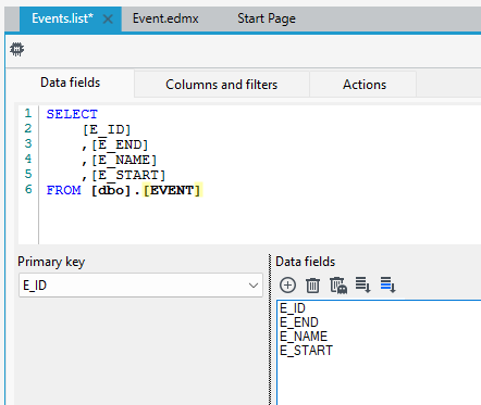
- Add a data structure that contains basic event data (name, date along with start and end time).
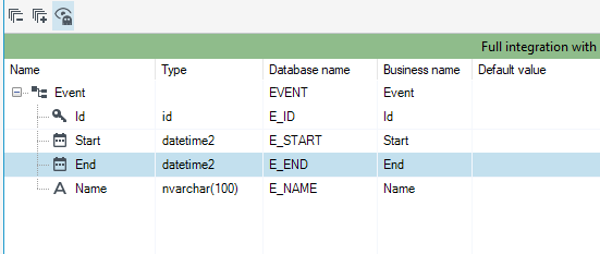
- Create a list based on the Event data structure.
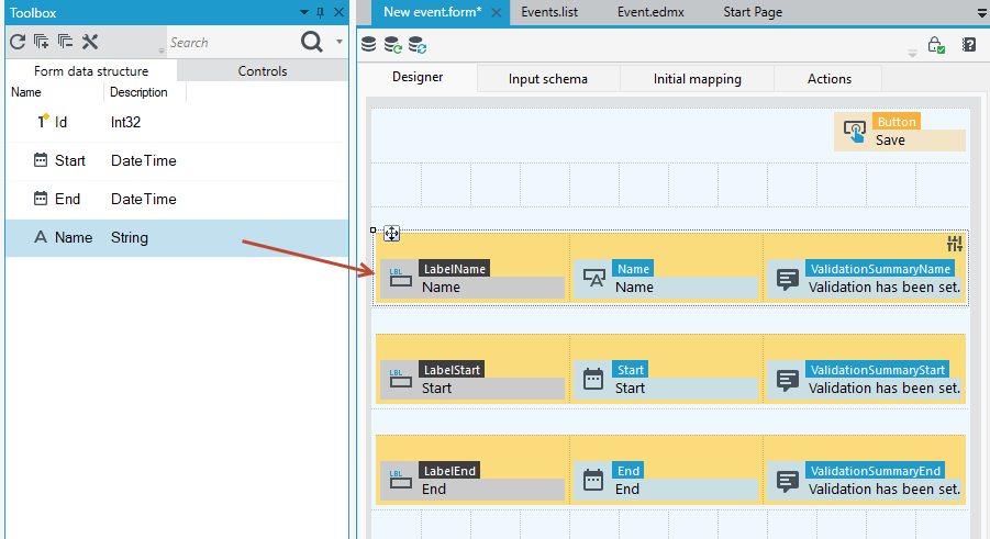
- Create a form based on the Event data structure. Drag from the toolbox controls onto the form and add a Save button on the Actions panel. This form will be used to define a new event its start time and end time.
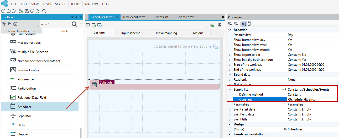
- Add another form on which the Calendar control will be embedded. The form does not have to be based on any data structure.
- Drag the Calendar control onto the form.
- On the Properties panel, indicate the supply list for the control i.e. it is the Events list.
- Specify the Event start date. Choose the way to specify as Expression and go to the expression editor.
- Then go to the List data tree, the list that powers the control.
- Select the
E_STARTfield with a double-click or drag it to the expression definition window.
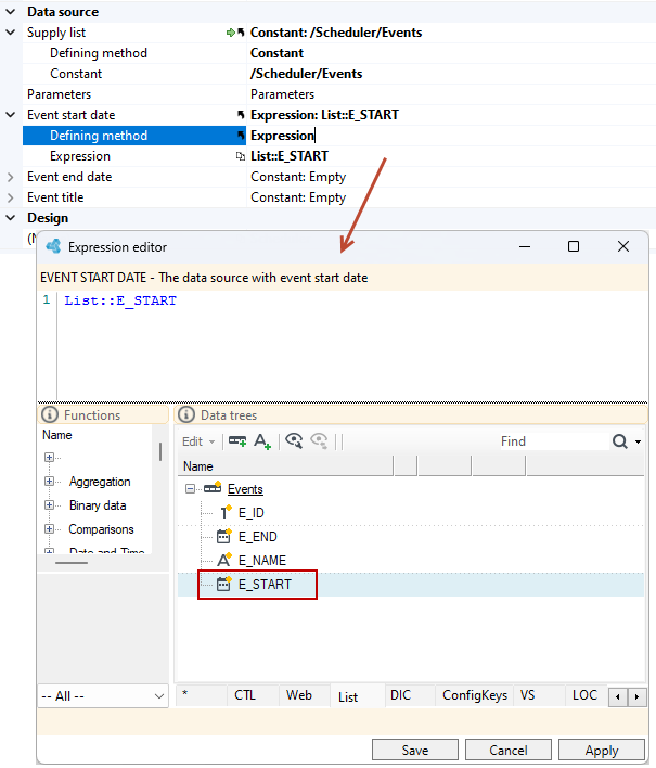
- Perform analogous operations on the Event end date and Event title options.
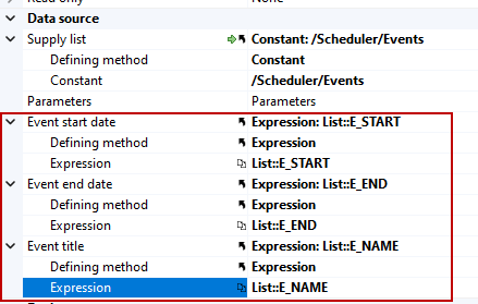
Configuration of adding a new event
- Define the events for the Scheduler control. Double-click the control and you will be redirected to the Actions tab and the section for defining the event for the control.
- In the Create event click section, drag the New event form from the version server. When you click on the calendar in the selected place, the indicated form will be opened and you will be able to enter the event data.
- Add a opening method as a Popup and refresh the entire page.
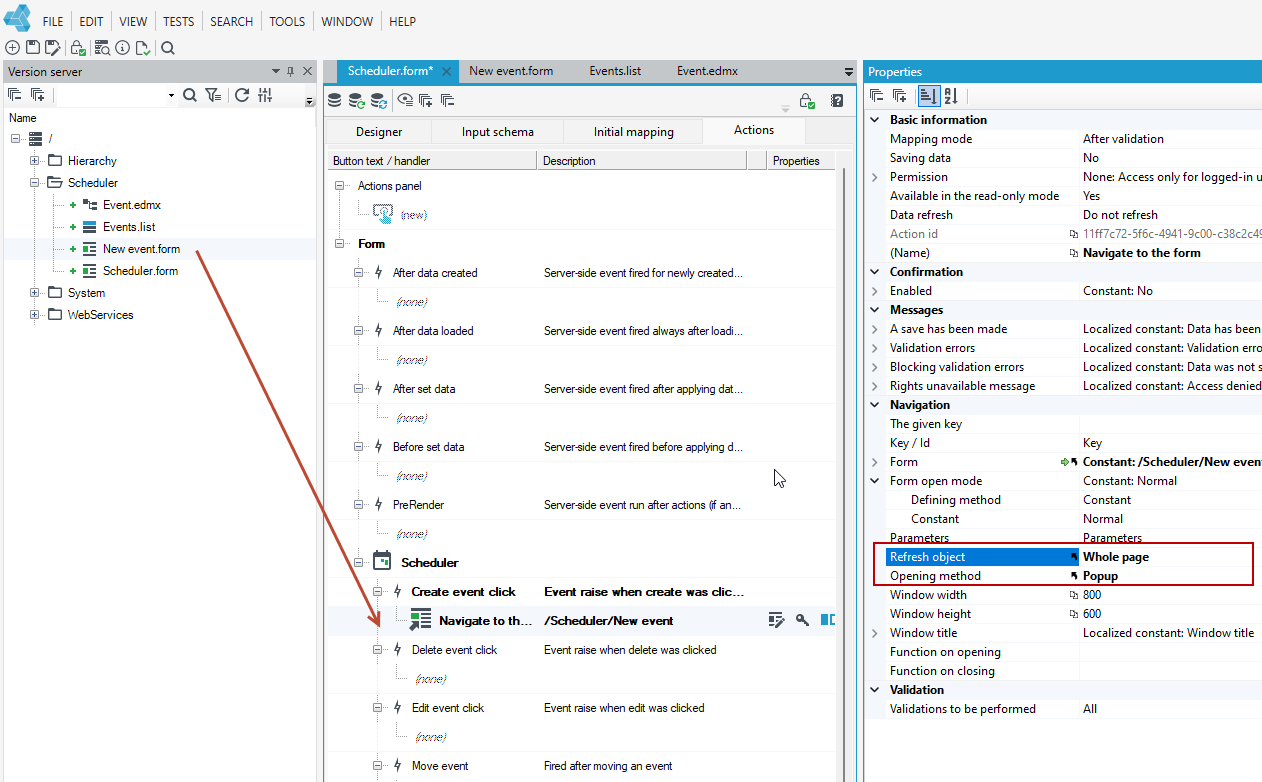
- To open the window for defining an event in the context of a given hour from which we open the form, you need to pass parameters to the form.
- Select the action Navigate to the form and go to the Parameters property.
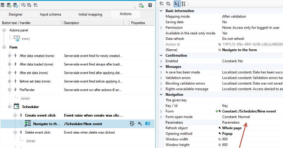
- Define the parameters you want to pass. In this case, it is the beginning and end of the event. In the List of parameters window, add 2 parameters of type Date and time.
- Give names to the START and END parameters.
- In the Value section, select Expression as the defining method and go to the Expression editor.
- From the CTL tree, select the CurrentEventStartDate control property for the START option.
- Similarly, for the END option, select the CurrentEventEndDate property.
- On the CTL tree, you will find all the parameters, functions and methods for handling the given control.
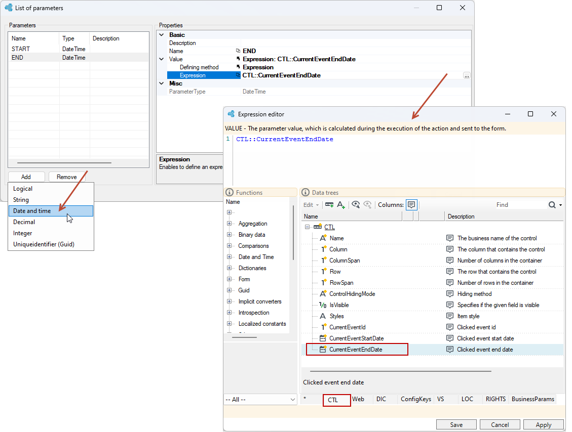
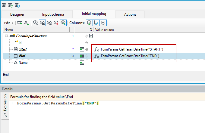
- Go to the New event form, to the Initial mapping tab, where we will feed the structure through predefined parameters, so we will assign specific values for the Start and End fields of the event.
- Add an Expression annotation to the Start field from the context menu. Use the
FormParamsfunction and thenGetParamDateTimeto retrieve the parameter. In parentheses and in“ ”, enter the exact name of the param as you entered in the previous form. - Perform analogous operations for the End field.
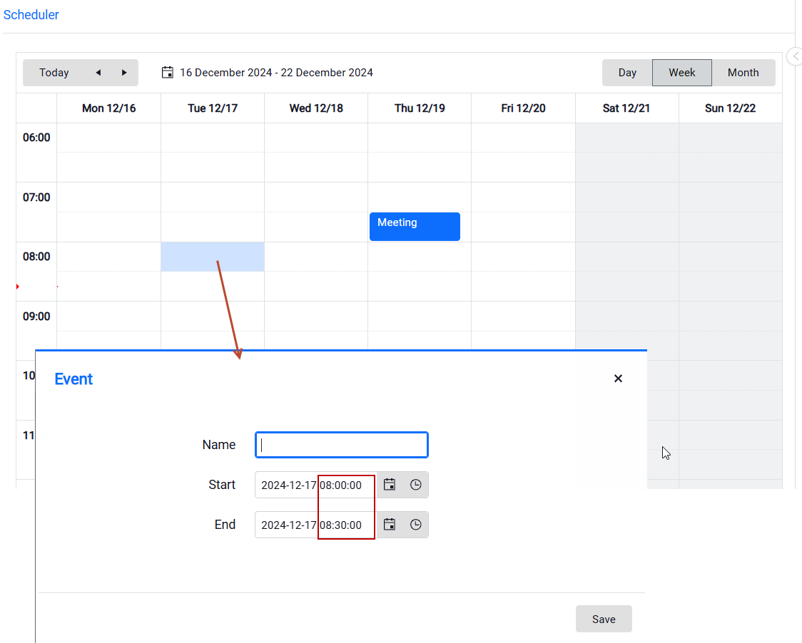
- Now, when you go to the calendar and click on a particular hour, an event definition window will be displayed with a default date and time for the start and end of the event. By default, the event duration is set to half an hour.
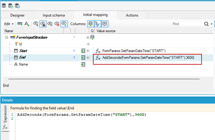
- To change the default event duration setting go to the expression to the End field. Change the expression using the
AddSecondsfunction, then add seconds to the start date of the event, that is, to the START parameter taken. In this case, 3600 seconds are added, i.e. the event lasts one hour by default.
Configuration of event editing
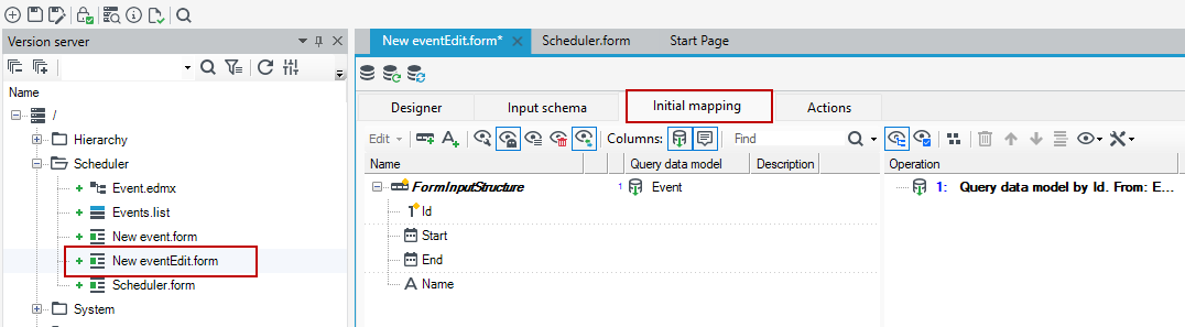
Create a form to handle the editing of the event.
- You can copy the form to define the event by adding Edit to its name.
- Remove all mappings from the Initial mapping tab.
- Navigate to the form where the Scheduler control is.
- Drag the edit form to the Edit event clickon the Scheduler control.
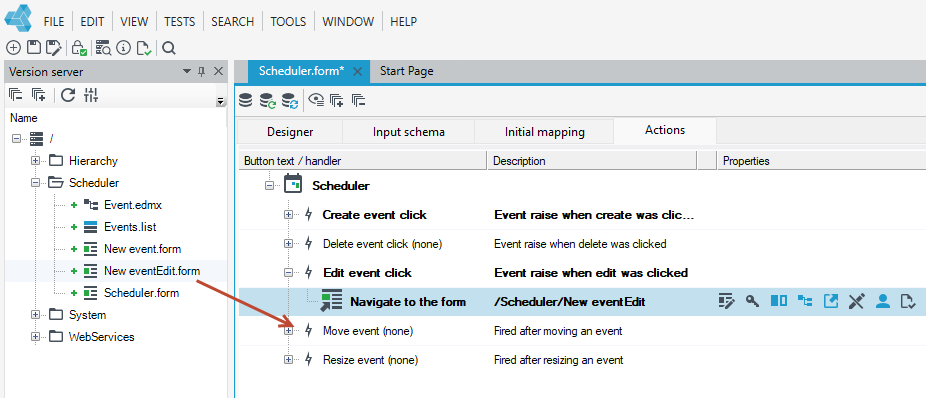
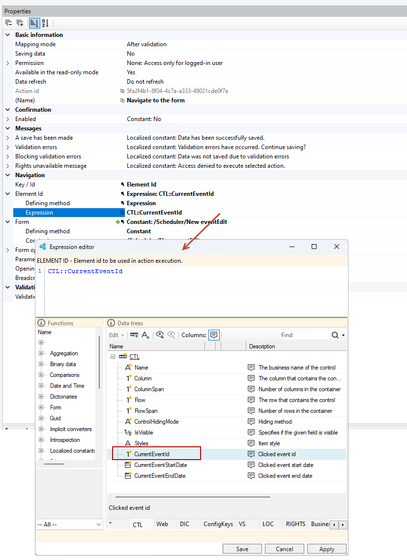
- Pass the identifier of the data element in the context of which you want to open the form to edit the event, that is, the identifier of the clicked event.
- Go to the properties of the action and in the Key/Id option, select Element Id.
- In the Element Id section, select the way to specify as an expression and in the expression editor from the CTL tree, point to CurrentEventId.
Configuring deleting events
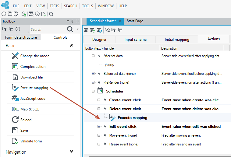
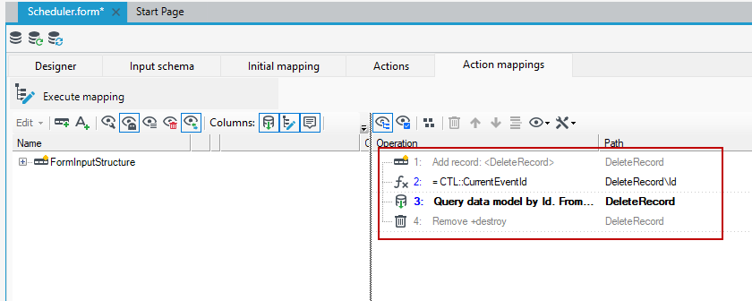
- Deleting an element is done by mapping, where you first read the corresponding record and then indicate the id of the element to be deleted.
- On the form where the Scheduler control is embedded, navigate to the Delete event click and add a Execute mapping action.
- Double-click on the action and go to action mapping.
- Add a single record DeleteRecord.
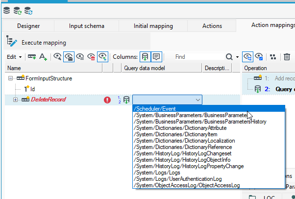
- Select the Query data model annotation from the context menu.
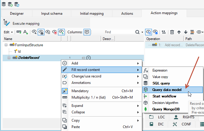
- Select the table from the database to which you want to perform the query. In this case, it is the Event structure.
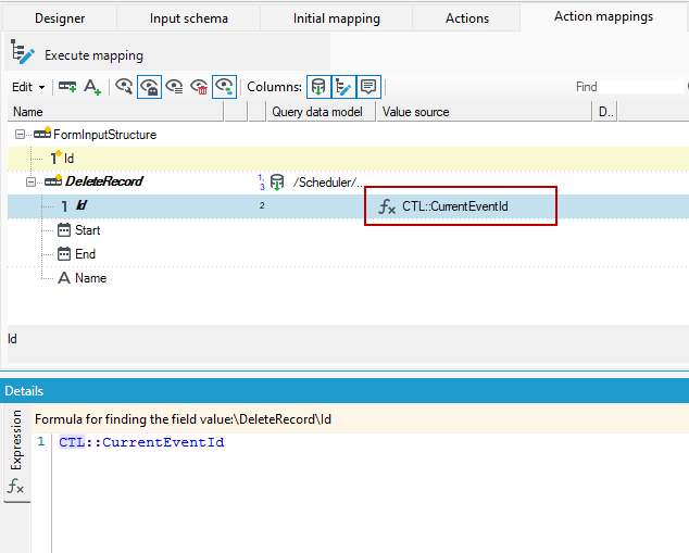
- Add an expression annotation to the Id field and point to CurrentEventId from the CTL tree in the expression.
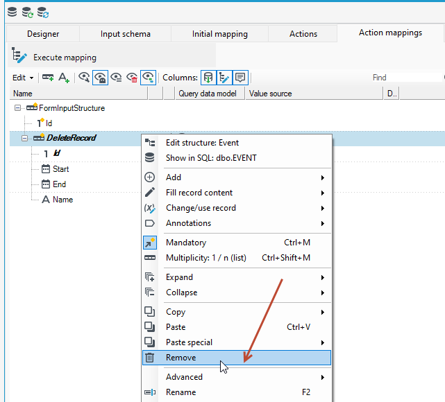
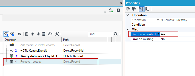
- Perform a delete operation on the added record. Click on the record and select Remove from the context menu.
- After the action is executed, a dialog box will be displayed asking if we want to delete all operations performed on the record. Select No, since we want to delete the record, not the operations.

- In the next dialog box, select Yes. Here the deletion of the record takes place. All operations are still kept on the operations tree.
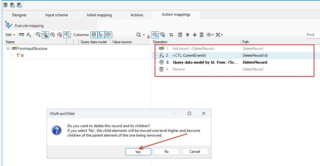
- Select the remove operation on the operations tree and on the Properties panel, select Yes in the Destroy in context option, which means that the record will be removed from the database.
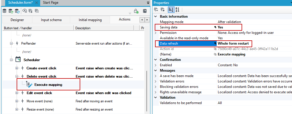
- The last thing is to set the record's properties on the Execute mapping action and refresh the data. If we perform mapping operations as in the case of deleting a record, we still need to save it.
- To refresh the form, select Whole form restart.
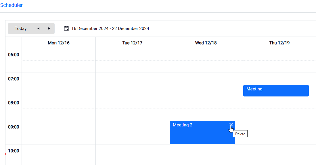
- Now you will be able to use the delete event option.
Event moving configuration
Similar to deleting an item, moving an event is also configured by mapping.
- Add a mapping action to the Move event.
- Set the parameters on the Properties panel in the Saving data and Data refresh option (as with the delete action).
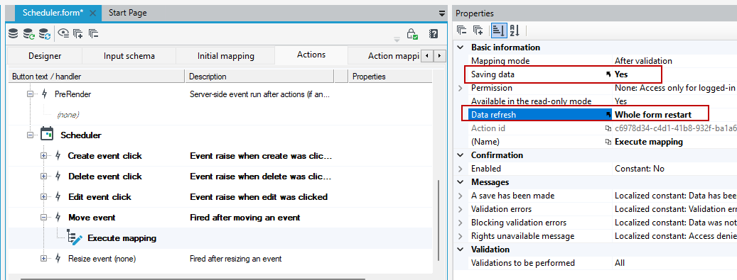
- Since some of the operations are analogous to those used when defining event deletion, then you can copy these operations and use them in the move action mappings.
- Go to the delete event action mapping, select and copy all operations.
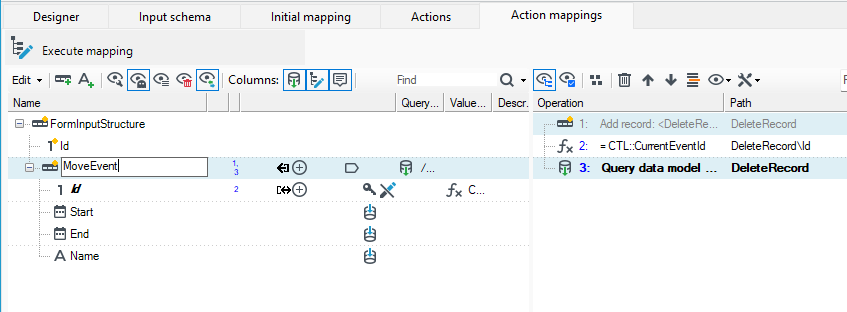
- Go to the move event action mapping with a double-click and paste the operations on the operation tree.
- Delete the last operation Remove... and rename the record.
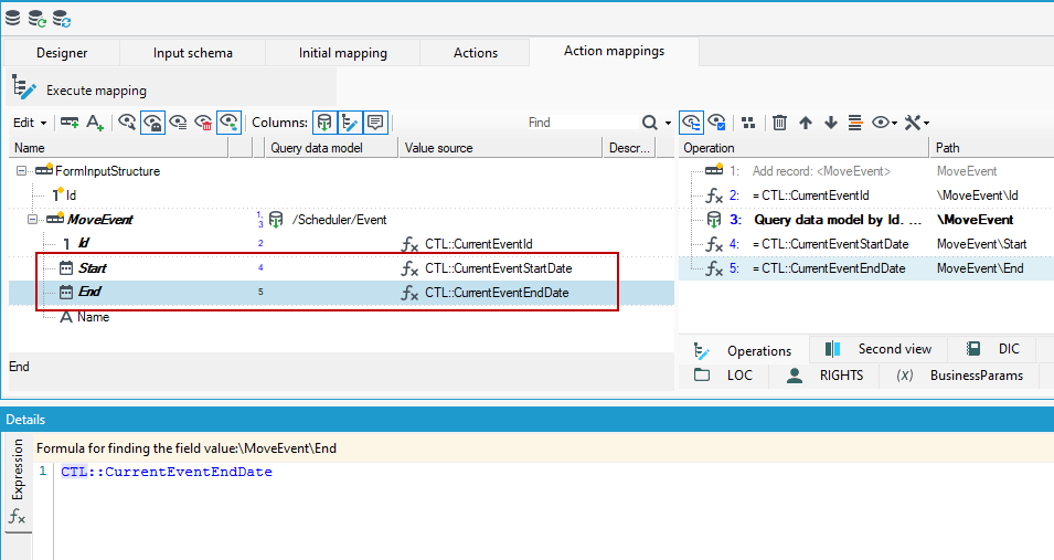
- Before saving the data, pass new values to the start and end fields of the event.These values are also stored on the CTL tree, which defines the parameters of the schedule control.
- On the action mapping, add an expression to the fields and select the option from the CTL tree CurrentEventStartDate and CurrentEventEndDate.
Configuration of event resizing
Similar to deleting and moving an item, the resize event is also configured by mapping.
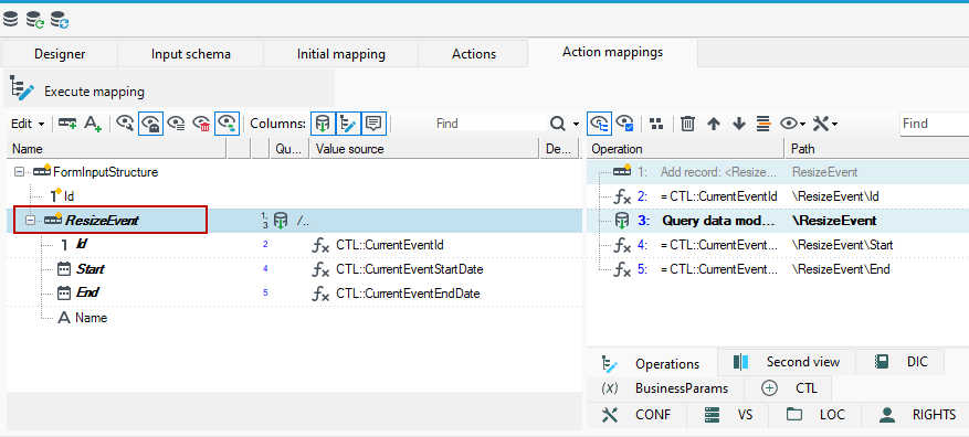
- Add a mapping action to the Resize event.
- Set the parameters on the Properties panel in the Saving data and Data refresh option (as with the delete and move action).
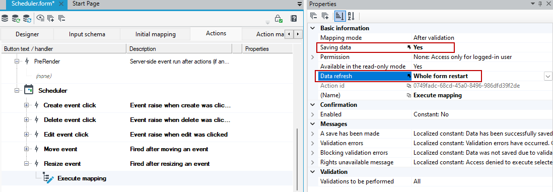
- Here, too, some of the operations are analogous to those when defining the event move, in which case you can copy these operations and use them in the resize action mappings.
- Go to the event move action mapping, select and copy all operations.
- Go to the resize event action mapping with a double-click and paste the operations on the operation tree.
- Rename the record.
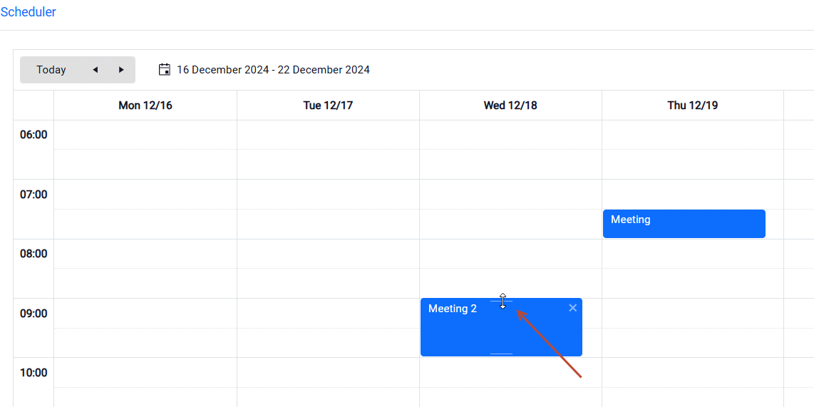
- Now when you hover over an event, there will be an option to increase or decrease it.
Tree
A control that presents data in the form of a tree.
- It is necessary to define tree levels and data lists for the control.
- Go to the collection editor on the Properties panel . In the collection editor, select Add.
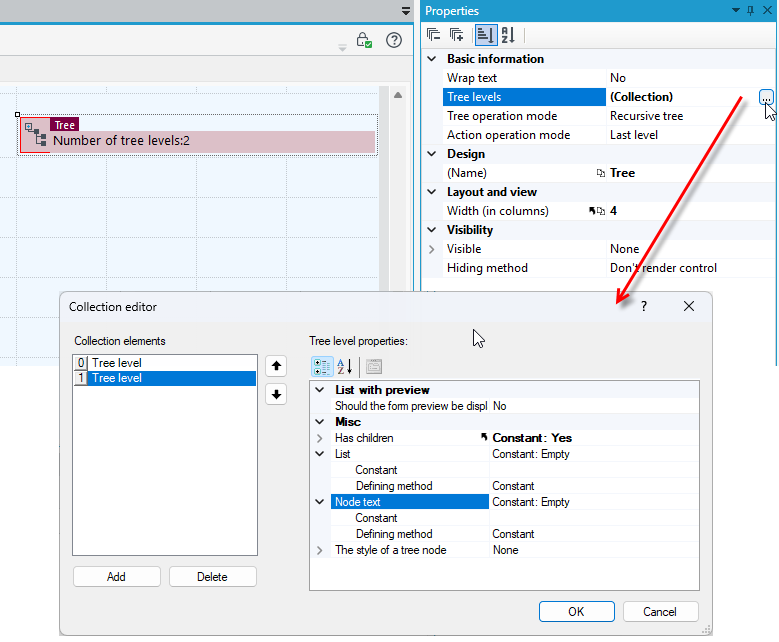
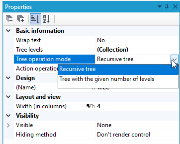
- You can also specify the mode for the tree. There are 2 modes: recursive, where the last defined level is repeated, and normal, where we have a defined number of levels.
Basic information
- Wrap text – Enabling the option will collapse long description of tree leaves.
- Enable expansion tracing – Enabling this option will disable tracing expanded tree nodes.
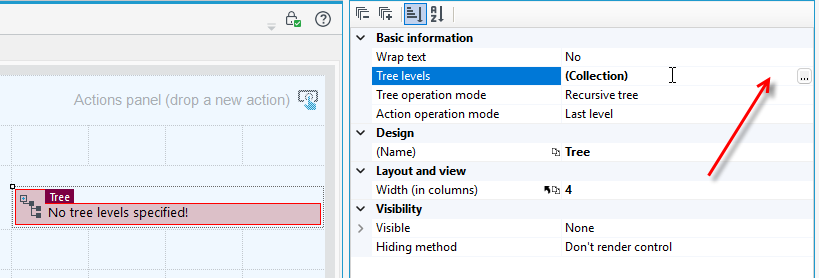
- Tree levels – List of tree levels.
- Tree operation mode – Two modes are available. Recursive mode where the last-defined level is repeated, and normal mode where number of levels is defined.
- Action operation mode – The mode specifying if actions cooperate with the nodes of the last or each level of the tree.
Example of using and configuring the Tree control
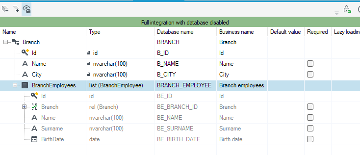
- A branch data structure with a list of employees has been created in the system.
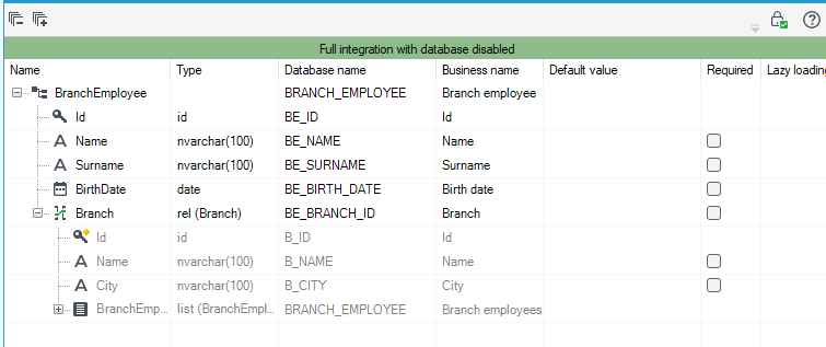
- The branch employee structure has a relation to the branch structure.
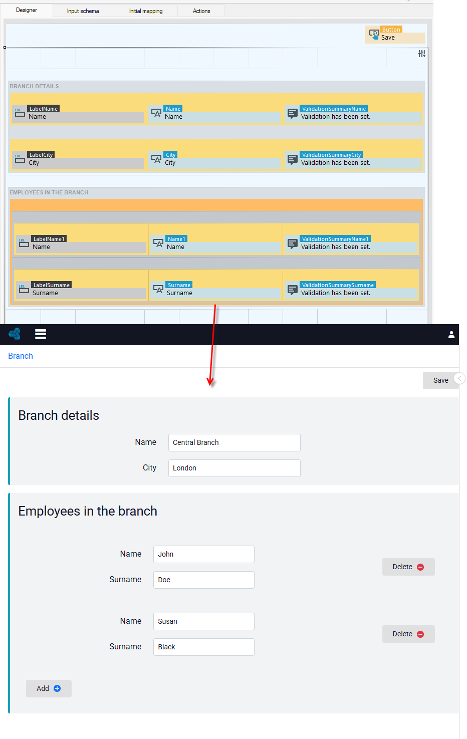
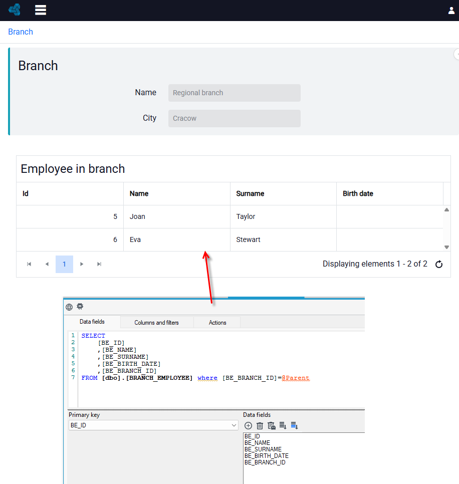
- An example form with details of a given branch and defining branch employees may look as follows:
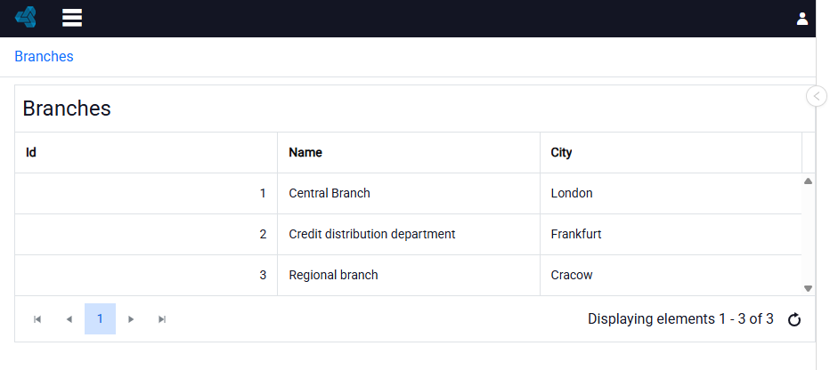
- Next, create a list of branches. Below is an example list of branches.
- Create another list showing the employees assigned to a given branch. In the query, you can use the
@Parentfilter, which inserts the parent object ID. This way, only those employees who are assigned to a given branch will be displayed in the list. - You can place the created list on the details form for a given branch.
- Using the Tree control, you can present the data in a different way. Go to defining tree levels in the Tree levels property.
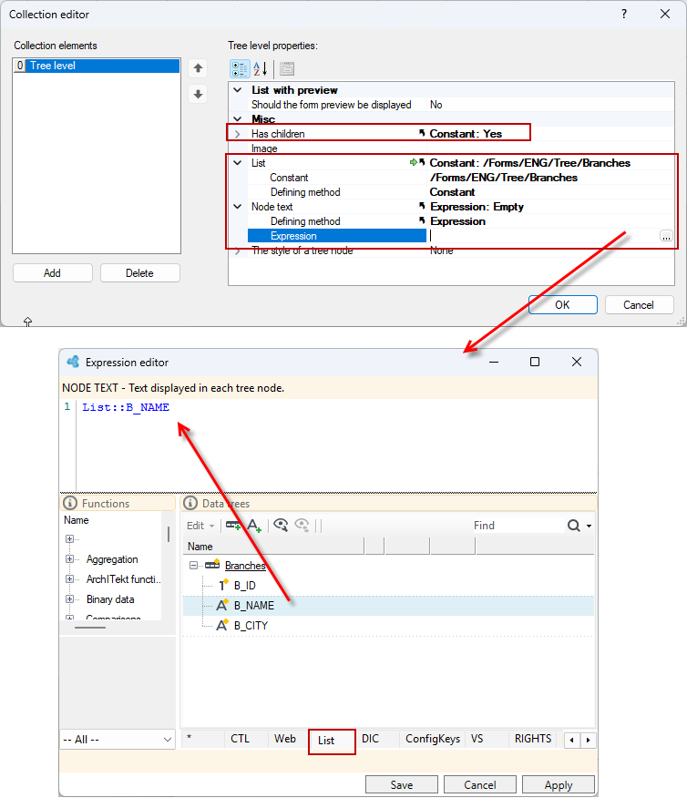
- Define the first level of the tree. Select Yes in the Has children property (the tree is two-level and presents branches and employees assigned to the branch). Select the list that will feed the control - in this case, it is the previously created list of branches.
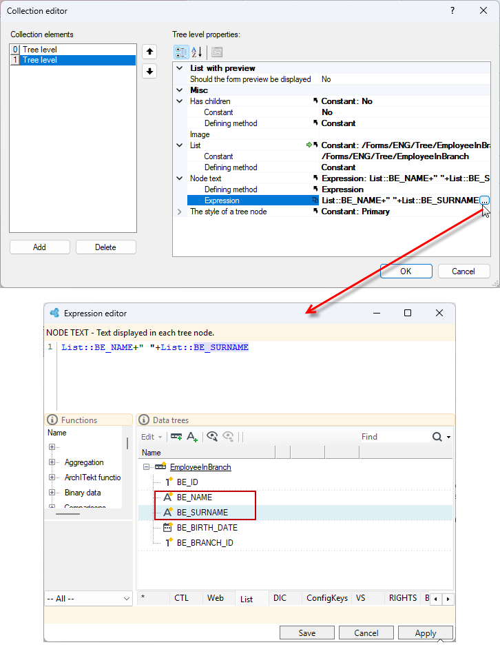
- Next, define the Node text. It can be a constant text or a value specified by an expression, as in the following case.
- Go to defining the expression and select the
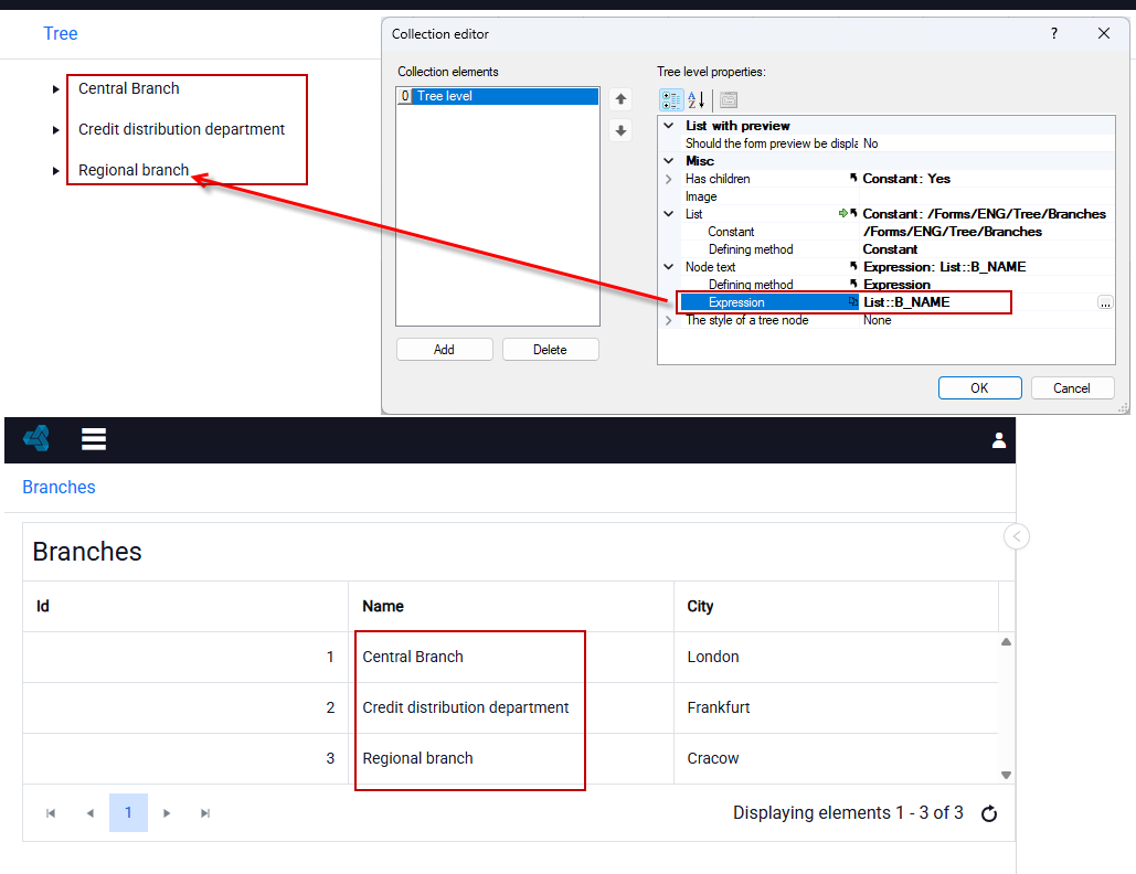
B_NAMEfield from the List tree. The appropriate branch name will be displayed on the control node.
- The first defined tree level looks like this:
- Define the second level of the tree.
- In this case, the feed list will be the list of employees in a given branch. The node text also uses an expression that has been defined to display the employee's first and last name.
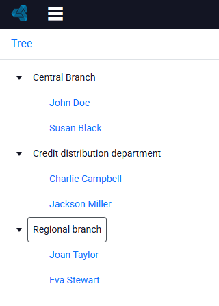
- In the Has children property, select No because there are no further levels of the tree.
- The control with the two defined levels looks as follows:
Html Control
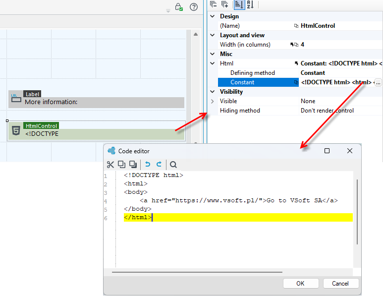
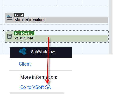
This control allows you to display the html content you have entered.
Preview Control
A control that displays detailed information about a selected record from a list.
- Use the control together in conjunction with the list display control.
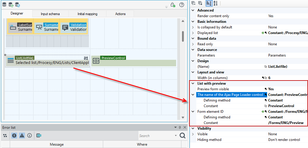
- Drag the List control (list module) to the workspace and indicate in the properties the list to display.
- Drag the preview control and place it next to the list control.
- In the properties of the list control, select Yes in the Preview from visible to display preview form visible.
- Next, enter a name for the preview control, in this case it is: PreviewControl and indicate the form that will be displayed as part of the preview of the record in the list.
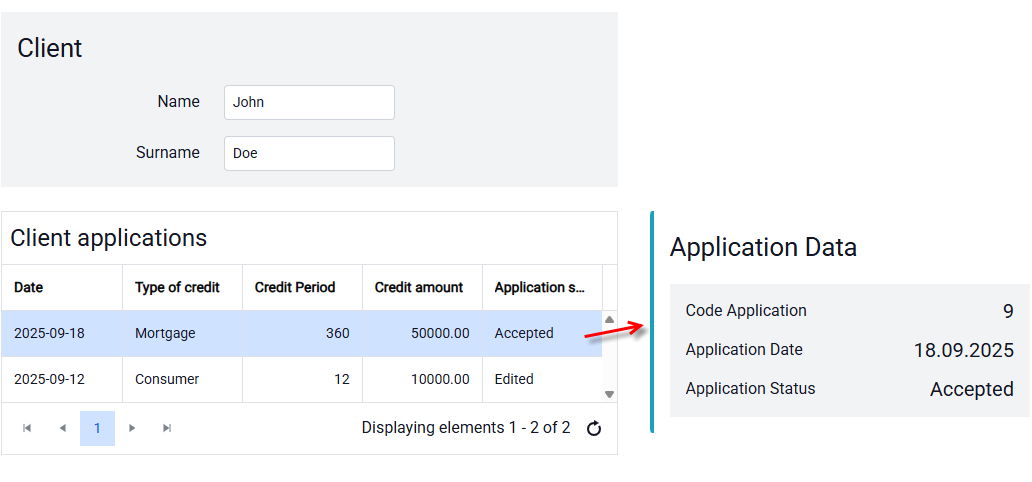
Now when you click on a record in the list where the Preview Control is located (here to the right of the form) the form attached to the record preview will be displayed.
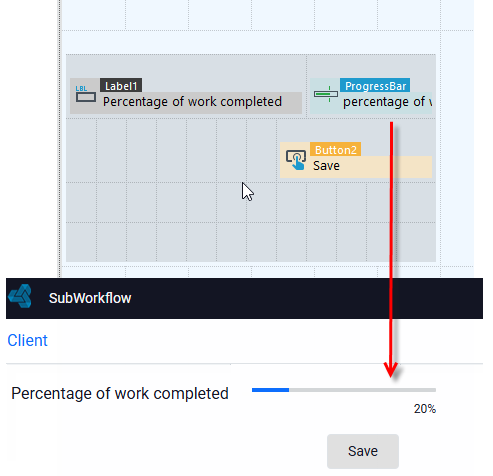
Progress bar
This control shows the progress of the operation. It is necessary to specify a field from the data structure as the source for the control.
- In addition, you can specify the maximum and minimum values as well as the orientation and other data to configure the control graphically.
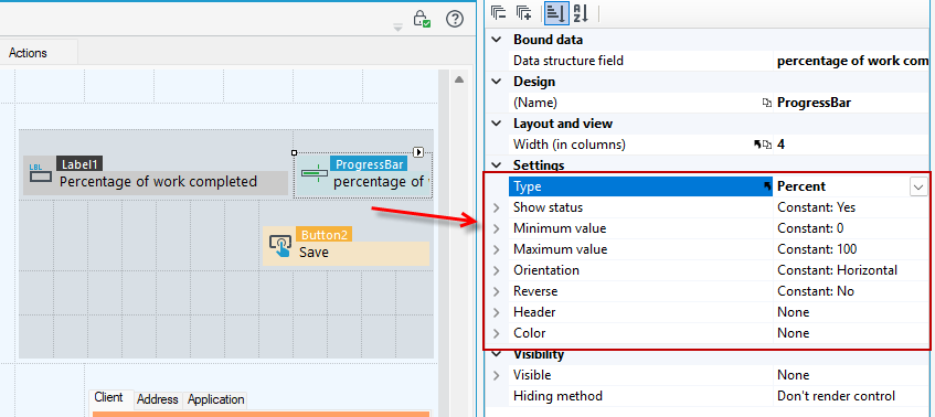
Settings
- Type – Control type (value, percent, blocks).
- Show status – Show control status.
- Minimum value
- Maximum value
- Orientation - Horizontal or vertical orientation.
- Reverse – Reversal of value.
- Header
Binary Preview
The component allows you to preview files stored within the data structure.
- To configure the display we use the two properties File name and File content.
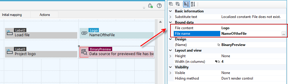
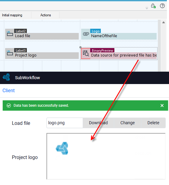
- You can display PDF files, image files, or text documents through Binary Preview. You can use the control together with the File Selection control to display the contents of an attached file. For more about the control for attaching binary data, see File Selection.
Properties
- Substitute text – Text displayed when a file does not exists.
- Height – Examples of valid unit string are ‘1px’ and ‘.5in’ (em, ex, %, px, cm, mm, in, pt, pc).
If you have added a binary field in the data structure, then on the form you must add it in Initial mapping, because the field is not yet visible in the form data structure.
- Go to the Initial mapping tab, right-click on the field and select Fix>Add element from the context menu.
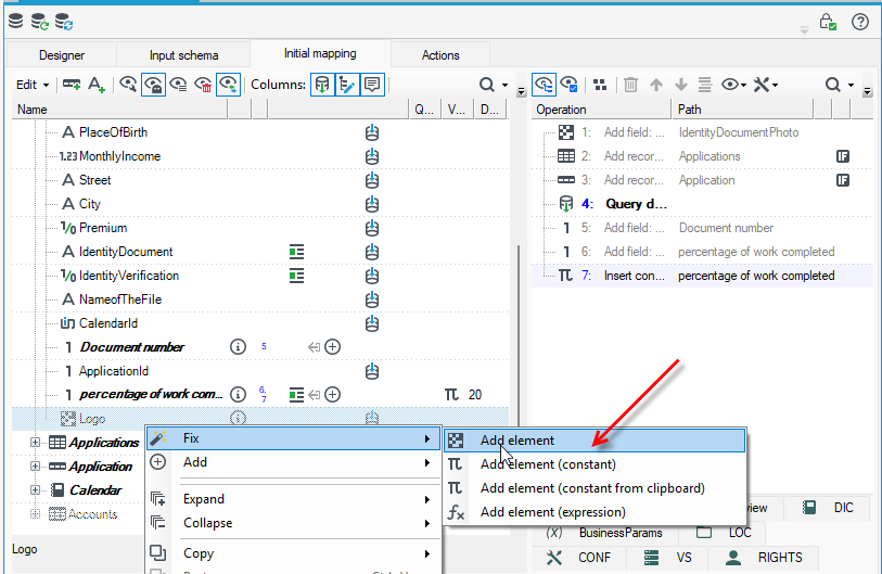
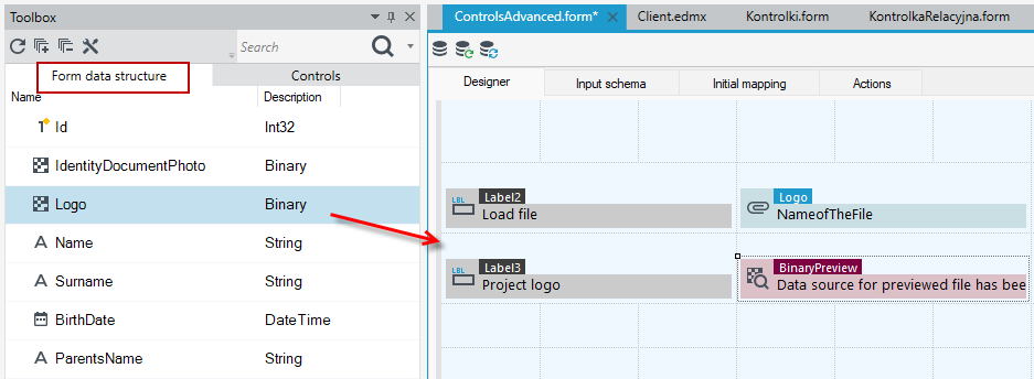
- When you complete the action, the field will be added to the Form data structure.
Validation Summary
The control presents a validation summary next to the field. For the validation message to be displayed, you must also indicate that the field is required.
- Drag a field from the data structure into the workspace - then the Validation Summary and Label controls are immediately attached to the field from the data structure and you do not need to insert them separately.
- You can also drag the Label, Text Box, and Validation Summary controls from the Controls tab. Then you must enter names for the labels and set up data sources for the text boxes.
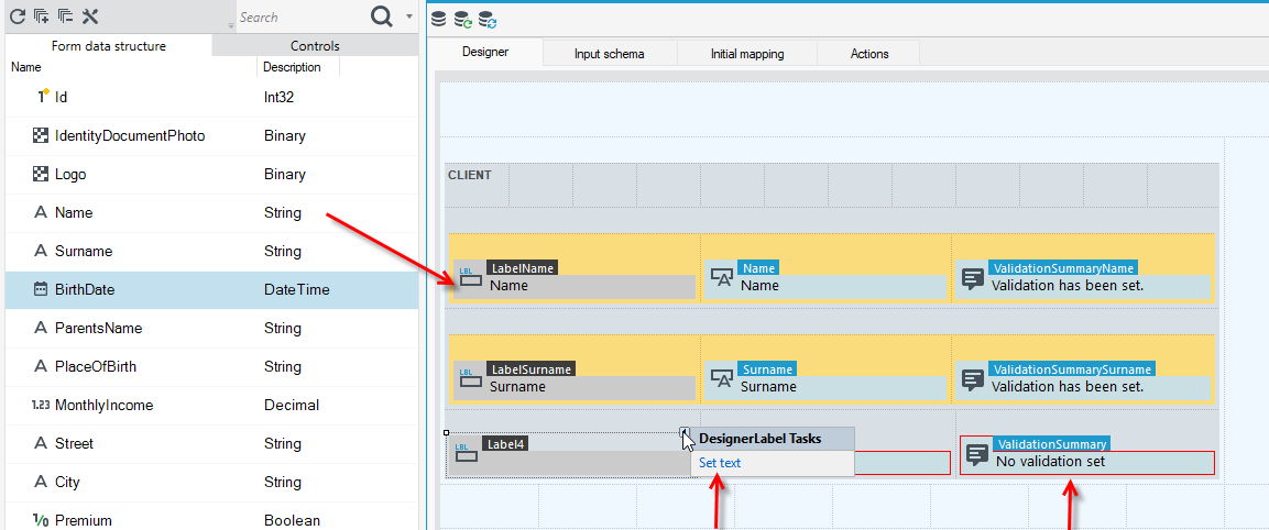
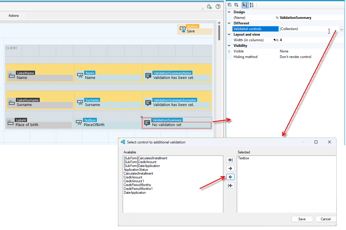
- Select the Validation Summary control and go to the Properties panel and click Control validation.
- In the next window, use the arrow and select the field for additional validation and move it to the Selected section.
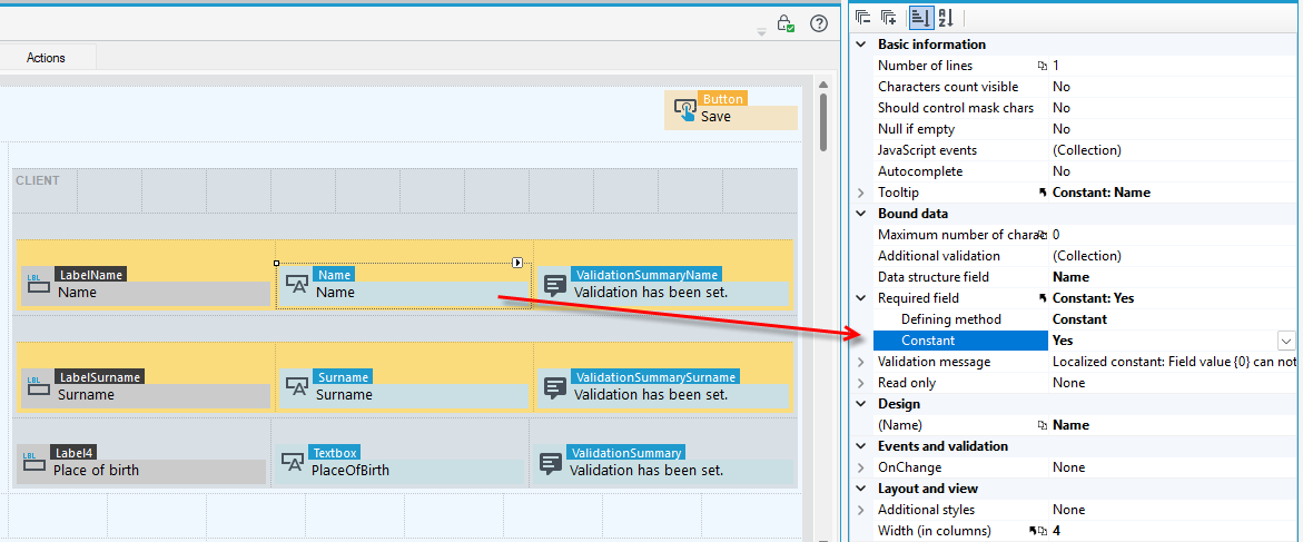
- Mark the fields used on the form for which you want to display an additional validation message and on the Properties panel, select the Yes option in the Required field section.
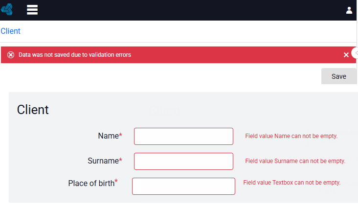
When you attempt to save the form without completing the fields, you will see a main validation error message and additional messages next to the required fields to be completed that you have set up with the Validation Summary control.
Relational Data Field
The control allows you to change an element that is related by a relationship. A relationship to another data structure must be included in the data structure, and a list must be created to be displayed to change the element.
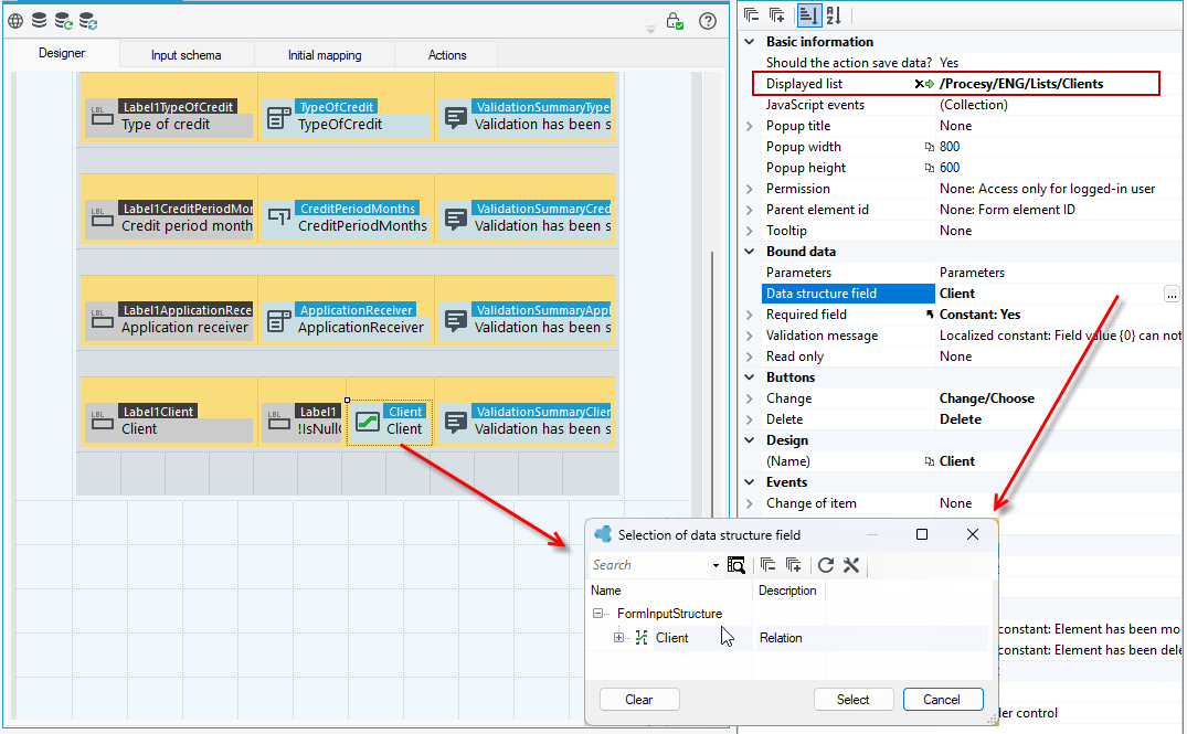
- Drag the control to the workspace and on the Properties panel, point to the list that will be displayed when you select the relational element change control.
- Point to the Data structure field.
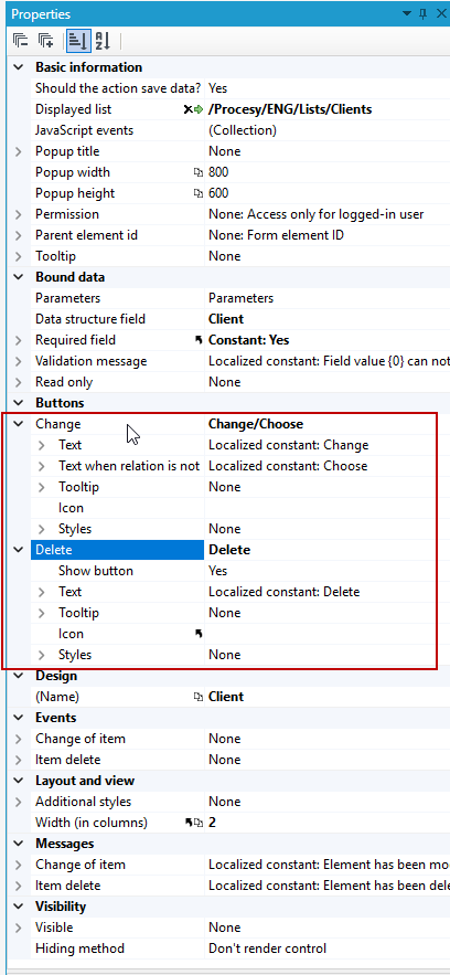
- You can also configure the buttons that appear on the form before and after you select data from the list.

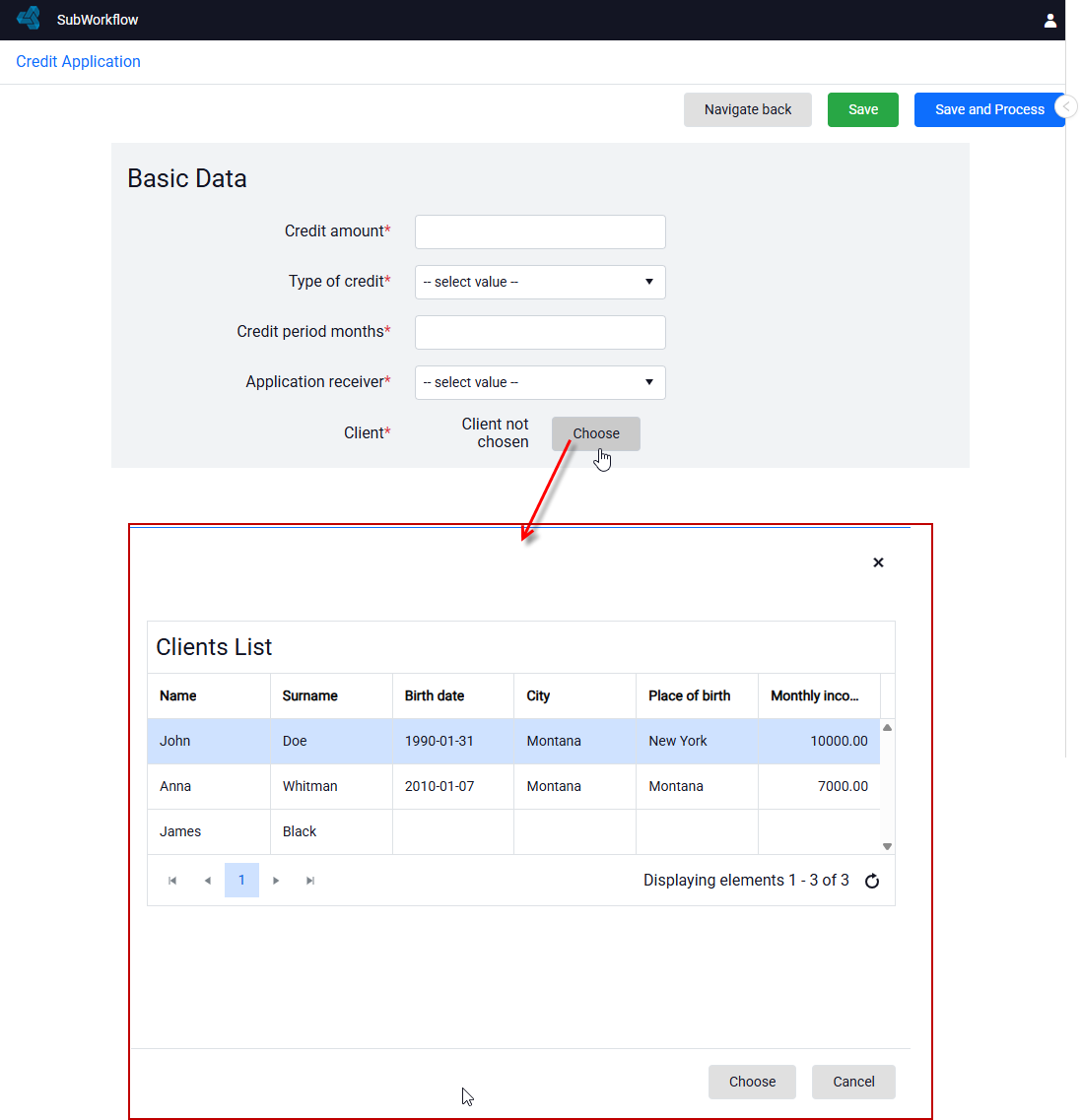
- On the form, when you press Choose, the list that you specified in the Properties of the control is displayed.
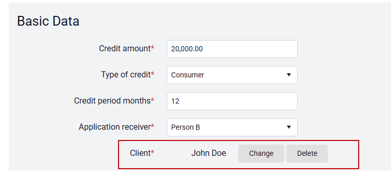
After selecting a record from the list, you can modify or delete it.
In the relational control, only the list is displayed without defined actions on the list.
For example:
The client list has defined actions such as adding or removing an item from the list and editing data for a particular record in the list - an action defined in the action column.
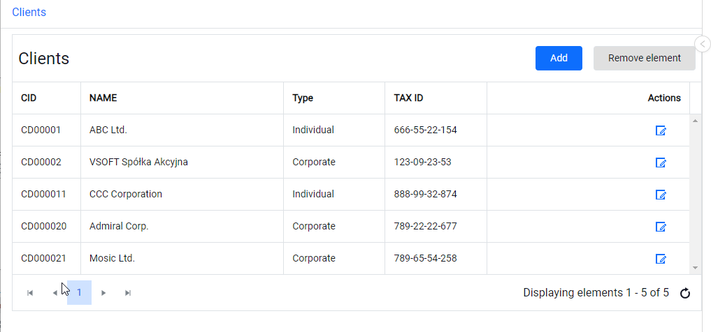
When the list is used in a relational control on a form, the list does not display the actions of the list, only the action to select the record Choose or Cancel.
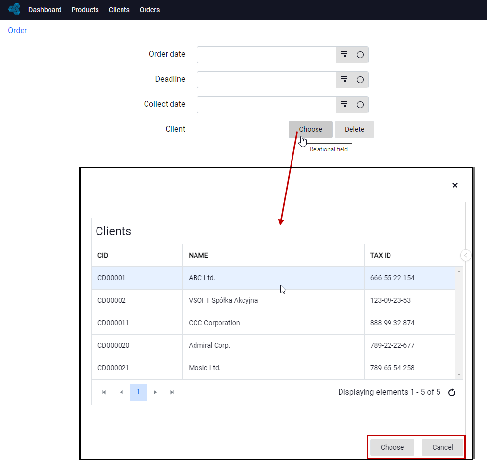
After selecting a record from the list, you can change or delete it.
Properties
- Displayed list – List that will be displayed.
- Popup title - The title of the popup window.
- Popup width and height - the ability to specify the width and height of the popup window in pixels or percent. A value without a unit entered is treated as pixels.
- Permission – Selecting the definition of a permission to change or delete the relational item.
- Parent element Id
- Parameters – Parameters passed to the list.
Buttons
- Change
- Text – Caption that appears on the button used to change relation when any relation is selected.
- Text – when relation is not selected – Caption that appears on the button used to change relation when any relation is not selected.
- Tooltip - Tooltip that appears after hovering with a mouse over an action button
- Icon – Icon for a button on list.
- Styles – Additional styles for the relational element change button.
- Delete
- Text – Caption that appears on the button used to change relation when any relation is selected.
- Tooltip - Tooltip that appears after hovering with a mouse over an action button
- Icon – Icon for a button on list.
- Styles – Additional styles for the relational element change button.
Messages
- Change of item – Message that is displayed after a change is made.
- Item delete – Message that is displayed after the relational element is deleted.
If you have added a relationship to another structure in the data structure, then on the form you must add it in Initial mapping because the relationship is not yet visible in the form data structure.
- Go to the Initial mapping tab, right-click on the record, and select Fix>Add element from the context menu.
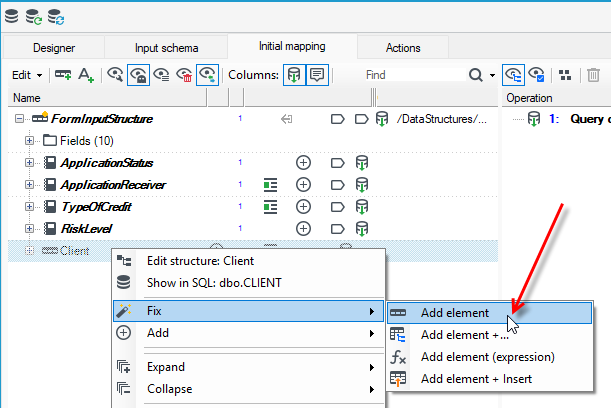
- When you complete the action, the relationship will be added to the Form data structure.
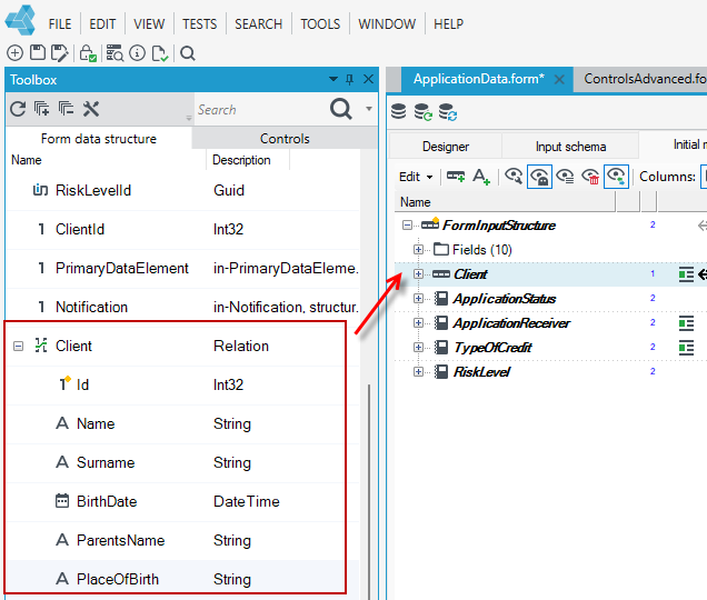
Date Time Picker
The control allows you to specify the date and time. On the Properties panel, you can indicate the format of the displayed date and time.
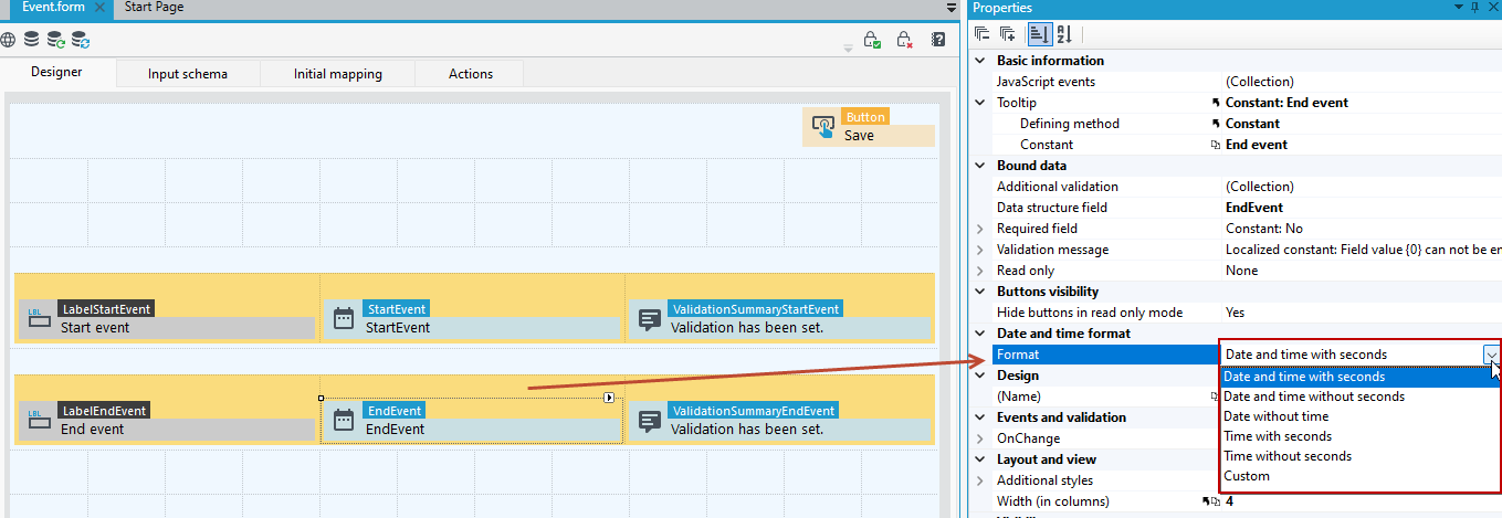
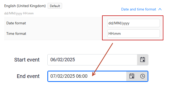
What format the date and time is displayed on the form depends on if a custom date and time format has been specified in the application configuration file - see Application configuration.
For example, if the date format was specified as shown in the figure below, then the date on the form will be presented in this format.
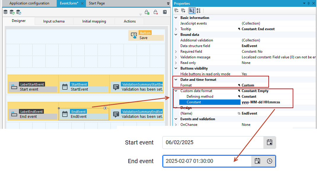
- If you want to use a different date and time format, then go to the Properties of the Date Time Picker control and select the Custom format.
- Then enter the format in the Custom date format section.
GUID Field (unique identifier)
The control allows you to enter the GUID value. The data source for the control is a field from the GUID type data structure.
Numeric TextBox (percentage)
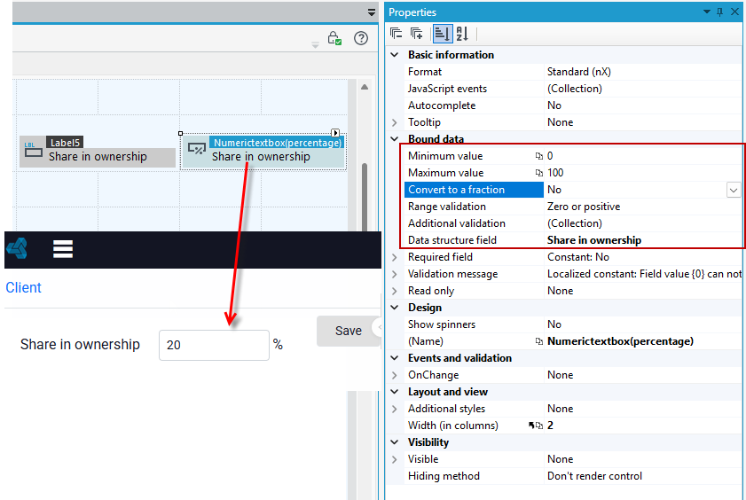
A control that allows entering percentage values. The data source for the control is a field of the fixed point number type.
Properties
-
Format – Data format compatible with Kendo
(https://docs.telerik.com/kendo-ui/framework/globalization/numberformatting).
Possible options:
- Standard nX (thousandth separator “”, number of decimal places consistent with the field setting in the data structure),
- Currency (c) - (amount format “c”),
- Custom – set by the user in the User format field.
- Autocomplete – Option determines whether the entered values are to be saved and used as hints. “k-secret-data” is added to the control style.
- Minimum value – Minimum allowed value expressed in percentage.
- Maximum value – Maximum allowed value expressed in percentage.
- Convert to a fraction – Saving the fractional value in the database (100% on the control will save the value 1 in the database).
- Show spinners – Show up and down arrows.
Option field (Radio Button)
A checkbox control for selecting one of the options. It is necessary to indicate a data structure field of dictionary type, whose values will be displayed on the form.
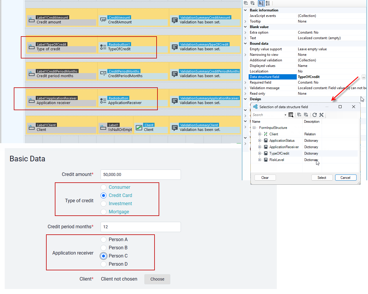
Blank value
- Visible – Defines if there is an empty value for the field.
- Text – Text of blank value.
Bound data
- Empty value support – The way the control behaves when you need to “display” an empty value
- Narrowing to view – Enables to narrow displayed items to those that belong to the given view.
- Displayed values – Specifies which value of dictionary will be displayed.
- Localization– Defines if the displayed values should be localized.
Masked text box
A control allows masking the entered value. It is used to enter numbers such as NIP, REGON, PESEL.
- Go to Properties panel and select Field type and indicate a field from the data structure as a data source for the control.
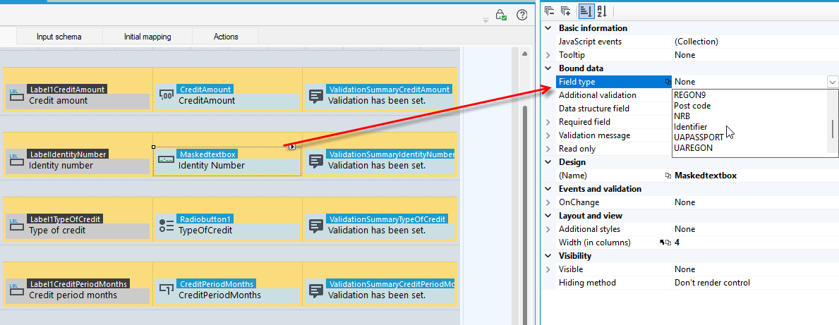
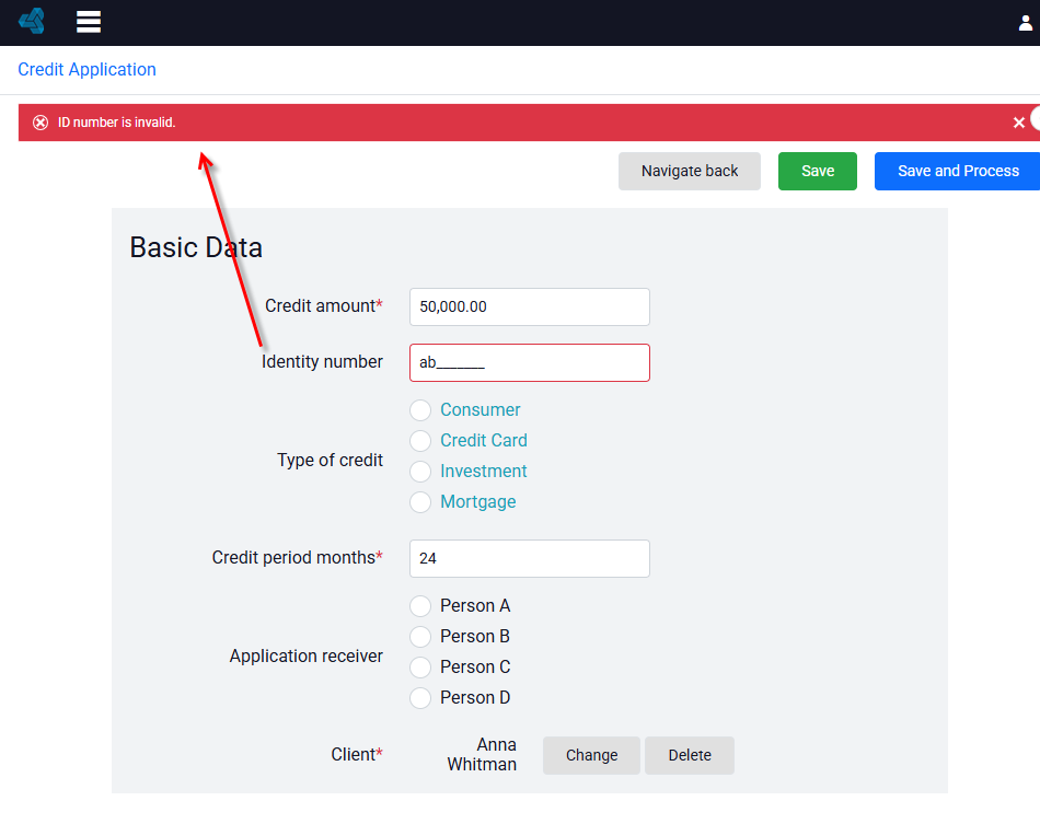
The control has built-in validation that makes it impossible to save the form if the PESEL, REGON, or NIP numbers are incorrect.
You can also enter a custom/own format for the control. All available options for configuring a mask can be found in the kendo documentation: https://docs.telerik.com/kendo-ui/api/javascript/ui/maskedtextbox/configuration/mask
On the Properties panel you will also find information on basic custom formats.
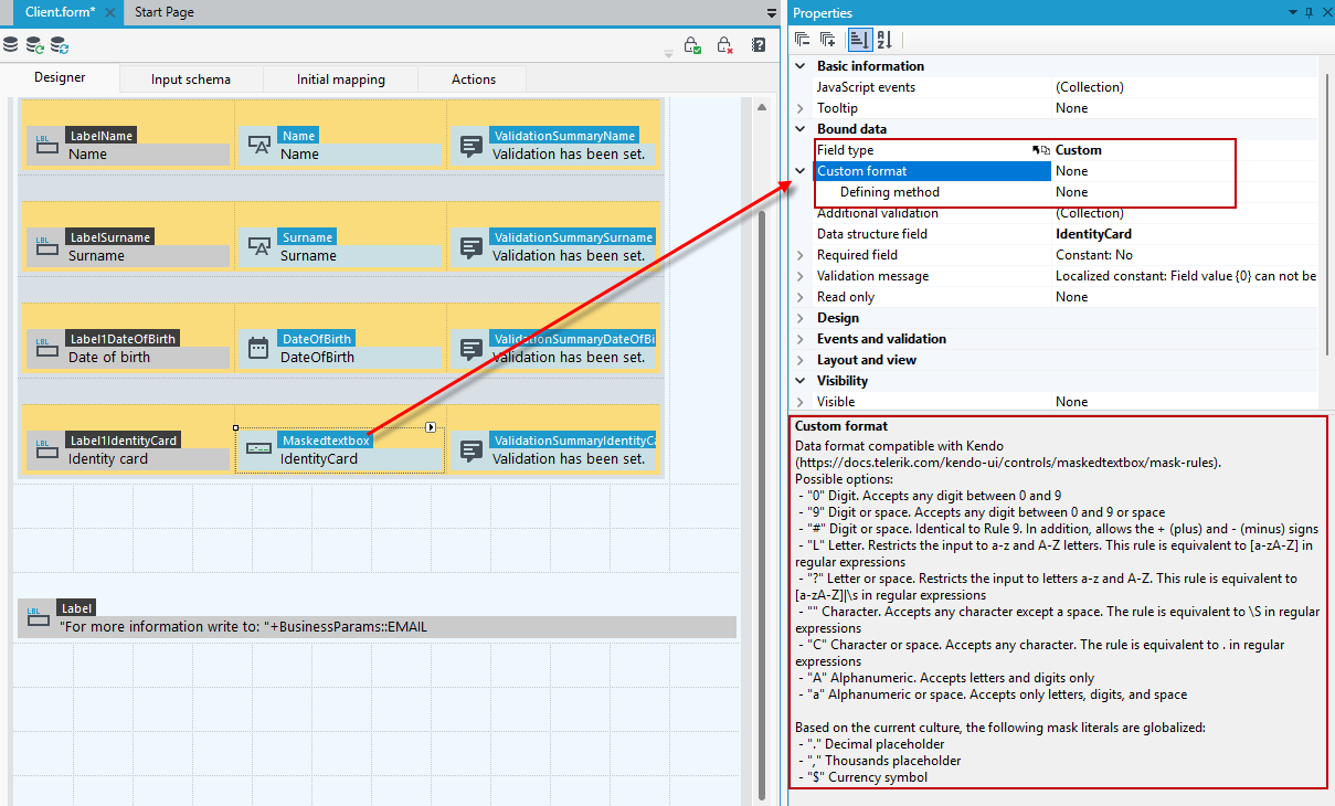
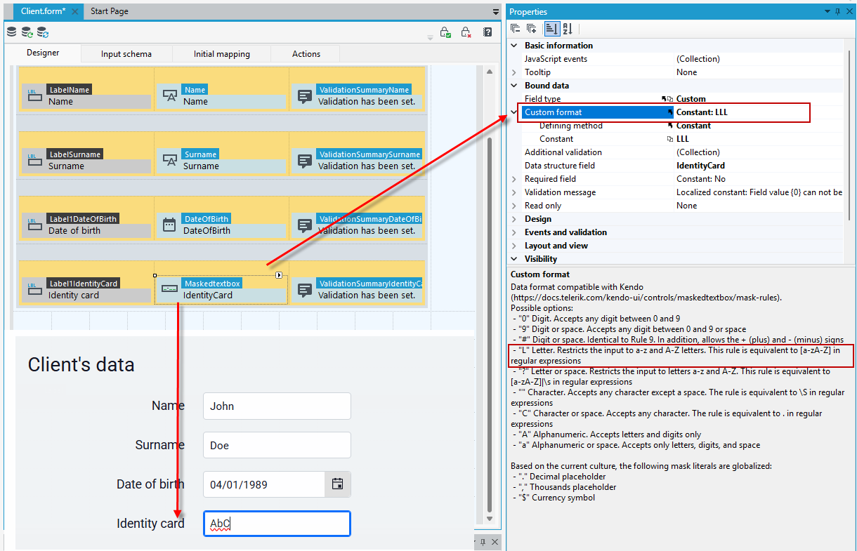
In the example below, with the custom format for the field defined in this way: LLL, it will only be possible to enter 3 letters in the field.
If you would like to make it possible to enter a certain amount of numbers in the field in addition to the letters, change the data format.
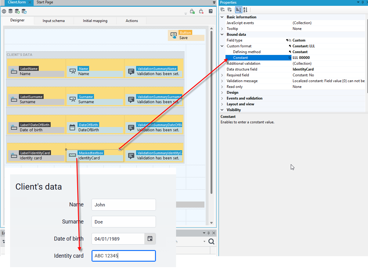
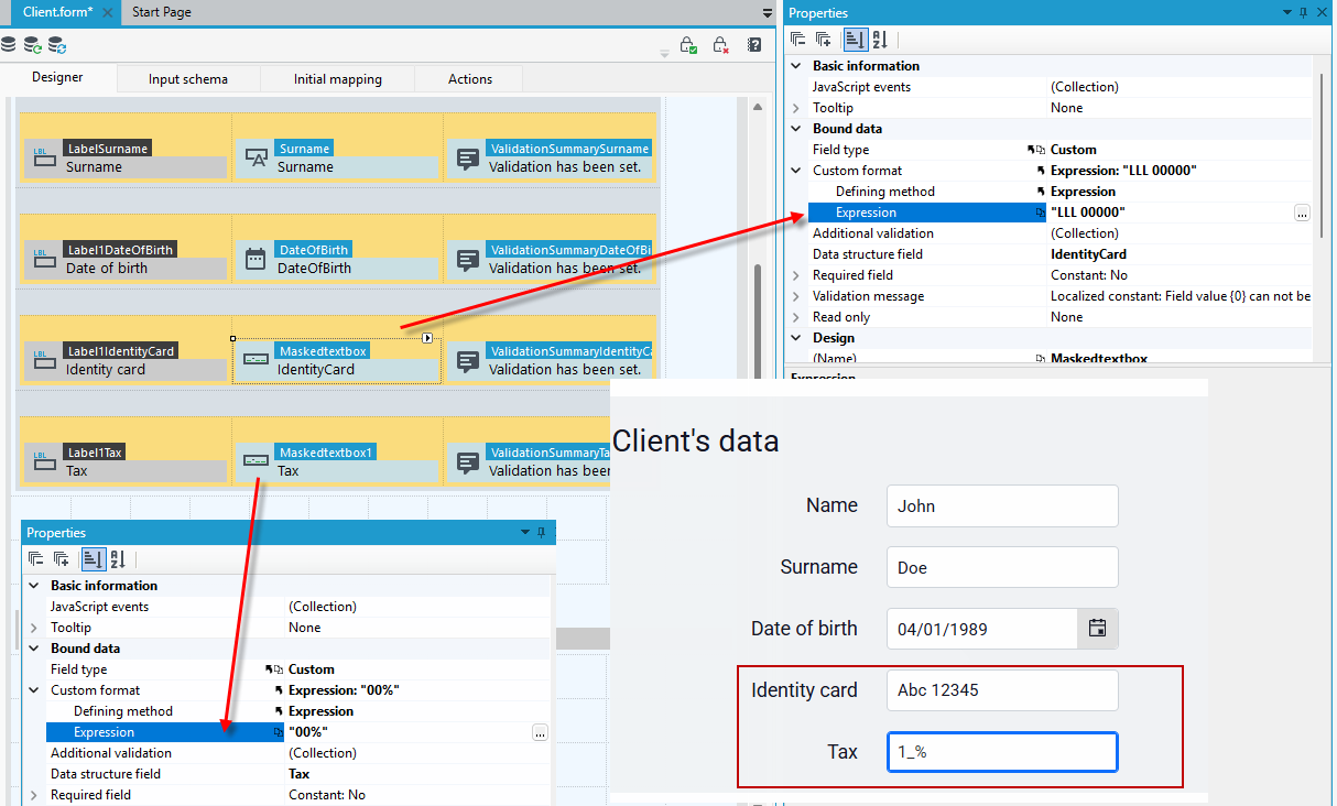
You can specify the format by a constant or by using expressions:
It is also possible to configure a custom mask using Java Script according to the rule described in the kendo documentation: https://docs.telerik.com/kendo-ui/api/javascript/ui/maskedtextbox/configuration/rules.
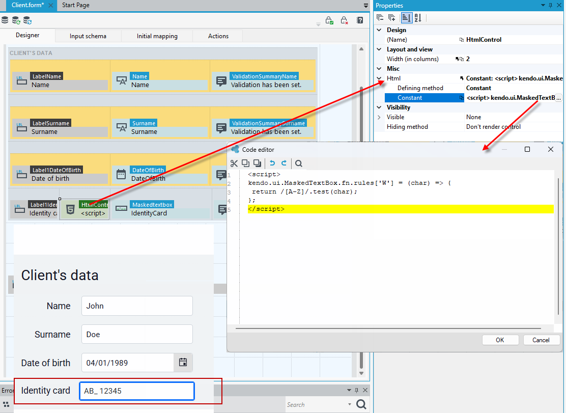
Below is a mask where the W rule only allows uppercase characters A-Z.
- Drag the masked text box control onto the form.
- Specify a custom format via a constant or expression. Capital letters are represented here by the W rule.
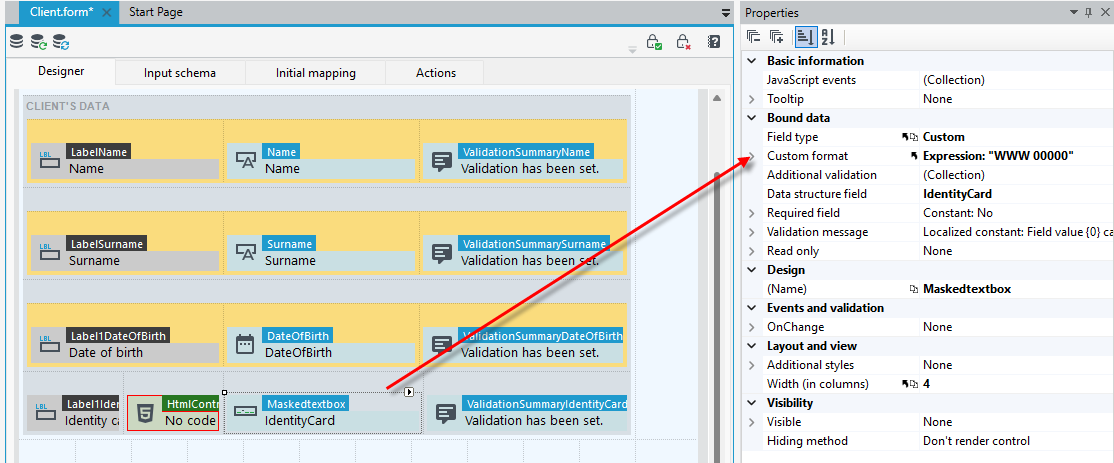
- Drag the html control onto the form and place it in front of the text box with mask.
- Go to the Html property and enter the script. The following example uses a rule that allows only uppercase letters to be entered.
ComboBox to change relational item
The control allows to change a relational element. A relationship must be created in the data structure to the data structure that you want the control to use. To add a relationship to a data structure, see:Defining Relationships in a Data Structure.
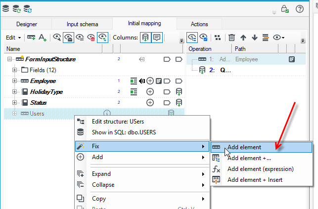
- Before designing the form, remember to add the relationship to another structure on the Initial mapping tab.
- Go to the tab, right-click on the record, and select Fix>Add element from the context menu.
- After you complete the action, the fields from the relational structure will already be visible on the Form data structure panel.
- Now you can proceed to designing the form using the control.
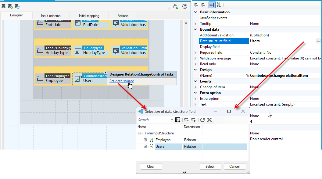
- Drag the control to the workspace.
- On the Properties panel, point to the relational field from the data structure.
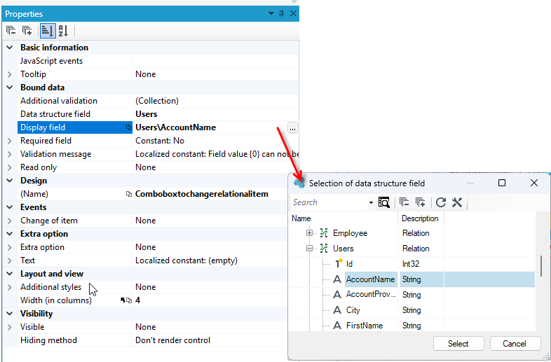
- Then point to the field from the relational structure that will display in the control. In this case, we want to display available users who can submit a holiday request (based on their account name).
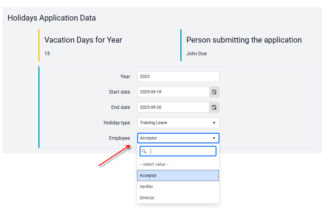
On the form, the field displays as a checkbox with the option to expand and select the option.
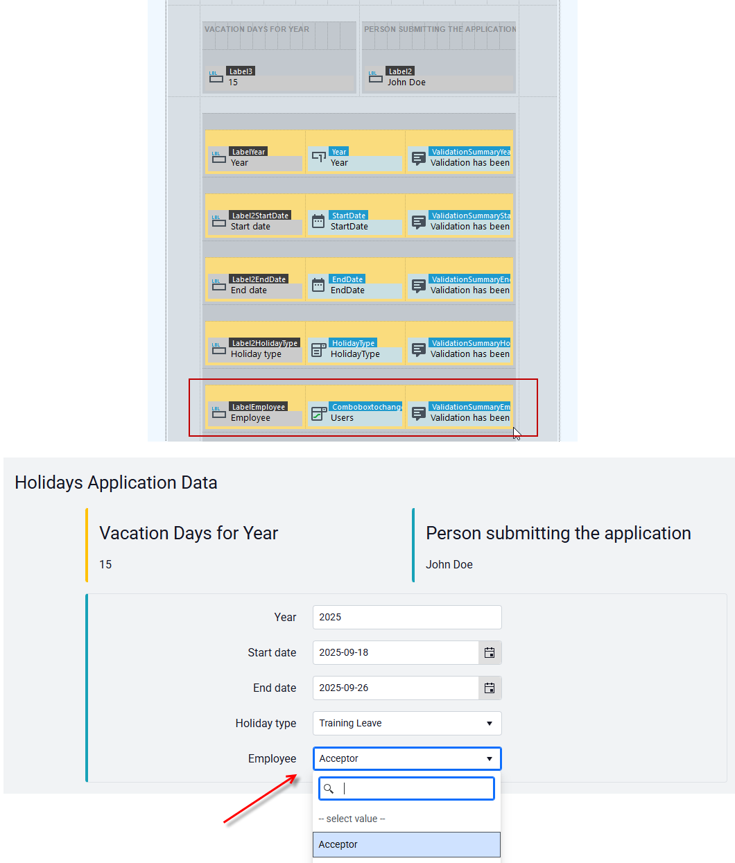
Extra option
- Extra option – Defines if there is an empty value for this field.
- Text – Text of blank value.
ComboBox powered by list
A control whose available values are taken from an associated list.
- You must first create a list whose values will be displayed in the ComboBox. See: Creating a list.
- Drag the control to the workspace.
- On the Properties panel, point to the data structure field whose values will appear.
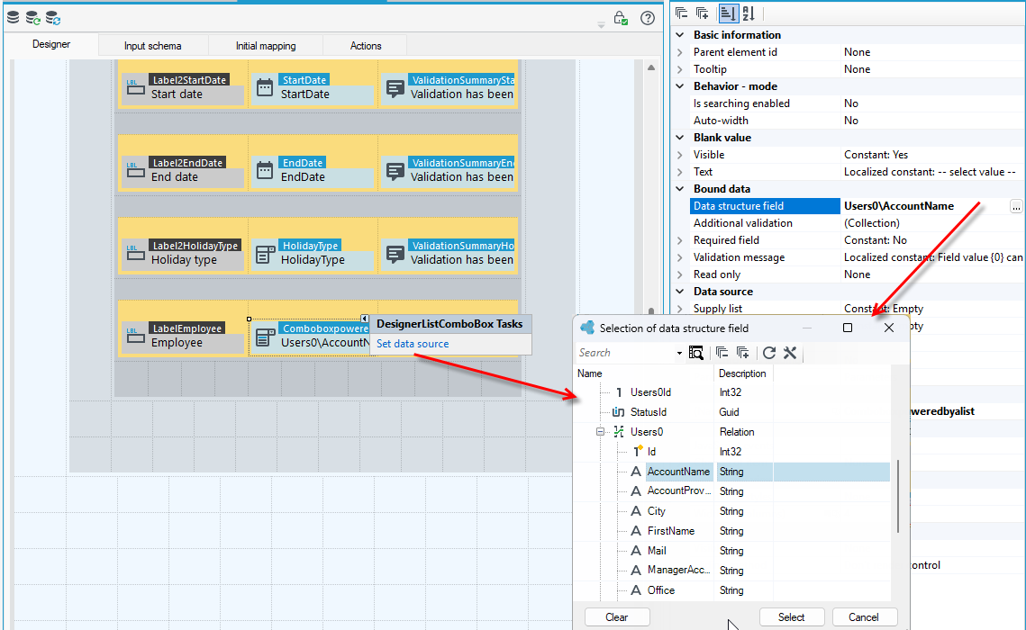
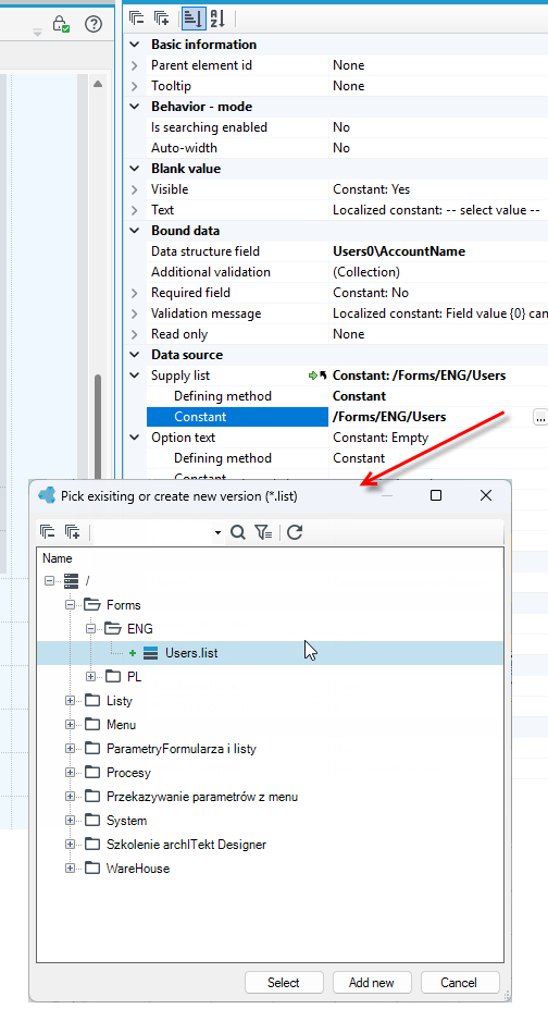
- Then, in the Supply list section, select the list from the version server whose contents will appear in the check box.
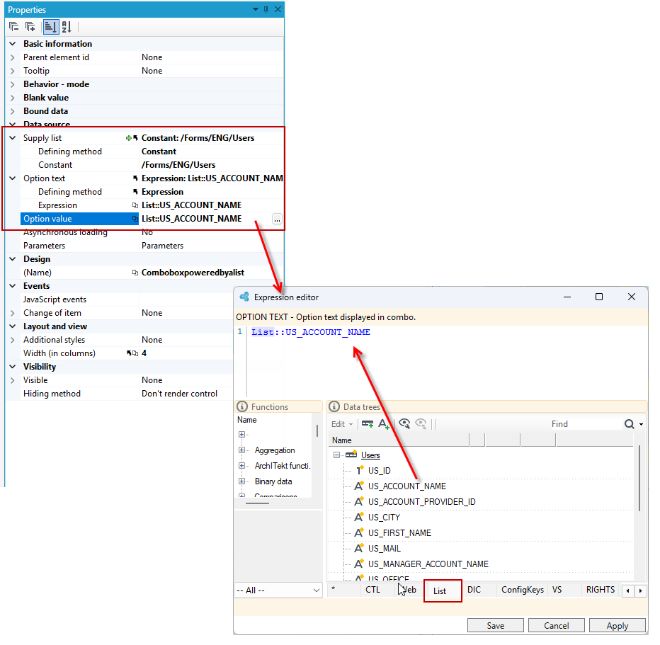
- In the Option text and Option value fields, go to the Expression editor and specify the text and value of the option to be displayed in the checkbox - you must indicate the names of the data fields from the SQL query of the list on the basis of which the options in the checkbox are generated.
- In the expression editor go to the List tab and drag the field into the editor.
The field on the form looks similar to the ComboBox to change relational item.
Basic information
- Parent element id – Parent element id.
Behavior – mode
- Is searching enabled – Option defines if the text search is possible in the control.
- Auto – width – The width of the control will be adjusted to the long texts in the list.
Blank value
- Visible – Defines if there is an empty value for the field.
- Text – Text of blank value.
Data source
- Supply list – List the results of which will be displayed in control.
- Option text – Option text displayed in combo.
- Option value – Formula defining the option value In combo. Formula type is compatible with a data item type.
- Asynchronous loading – Asynchronous data loading.
- Parameters – Parameters passed to the list
Separator
The control allows you to insert a break (hr tag) on the form in the form of a horizontal line.
On the Properties panel, you can configure basic parameters like the control's width and visibility as well as the control's looks: size, color and margins.
- Add a control to a form.
- Go to the Properties panel and to the details of the Additional styles option.
- Specify the separator size, color and margins.
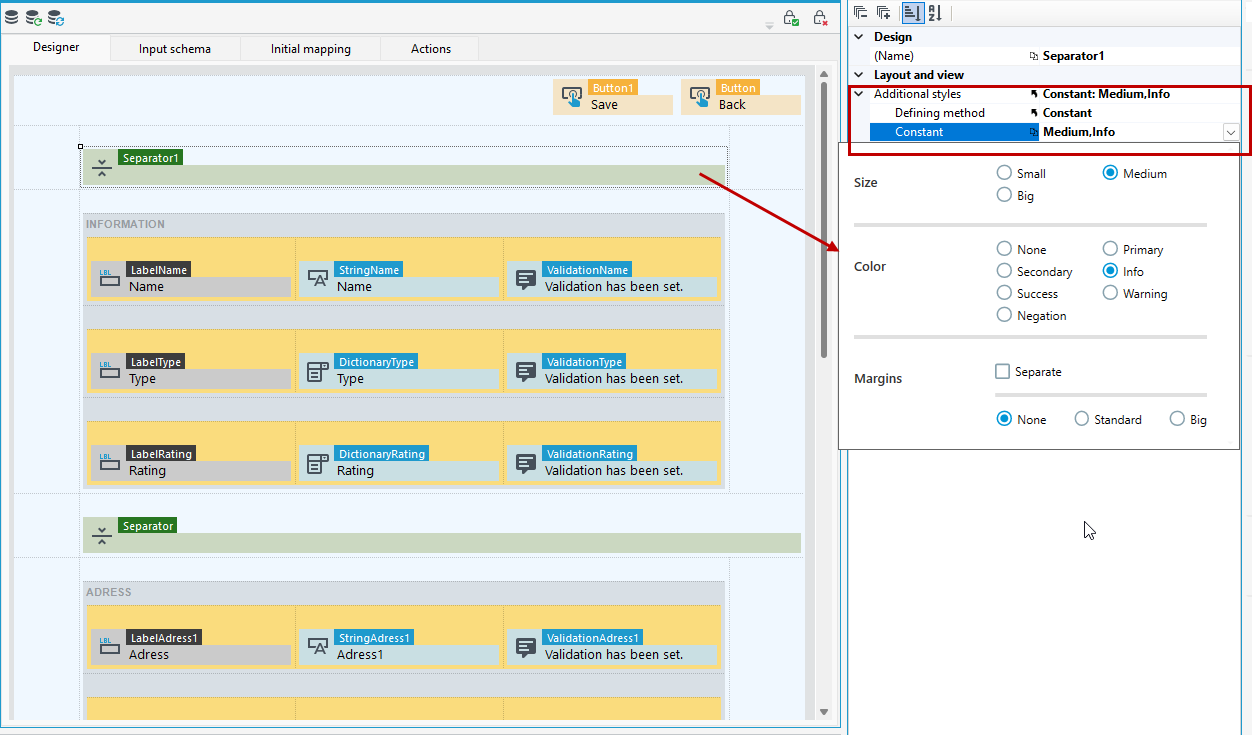
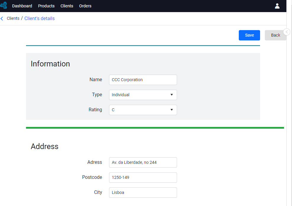
The following example uses 2 Separator controls, for which different width, size and color are defined.
Stepper
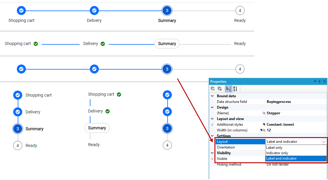
Stepper allows you to visualize activity progress by displaying a sequence of logical steps.
- For the control, the data source is a dictionary field.
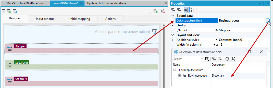
- On the Properties panel, in addition to standard settings like Visibility or Width, you can also specify:
- Layout: Label and indicator, Label only, Indicator only - determines whether the steps in the stepper will display their indicator (an icon or number placed in a circle above the step label) or label (text placed below the step indicator circle).
- Oreinatation: Horizontal or Vertical.
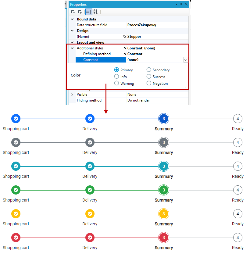
- You can change the color of the control by selecting one of the available options in the Additional styles property.
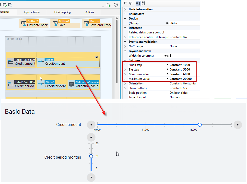
Slider
A control allows you to set a value by moving a pointer. The data source for the control can be an integer or a fixed point number.
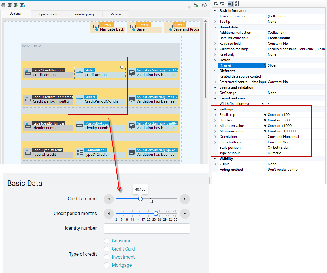
On the Properties panel, you can configure the appearance of the control and its characteristic settings like:
- Configure the value to be added or subtracted when the add/subtract button is clicked.
- Enter the minimum and maximum value for the scale.
- Change orientation to horizontal/vertical.
- Hide or show buttons next to the scale.
- Indicate the position of the scale.
- Select the input type as numeric or percentage.
The Slider control in both vertical and horizontal orientations may not display the scale of the slider if its data cannot fit within the control.
For example:
If the width of the control has been set to 4 columns, and the data we want to present in it has a scale from 1 to 200, with the additional specification that the small step is, for example, 1 then the scale may not be displayed.
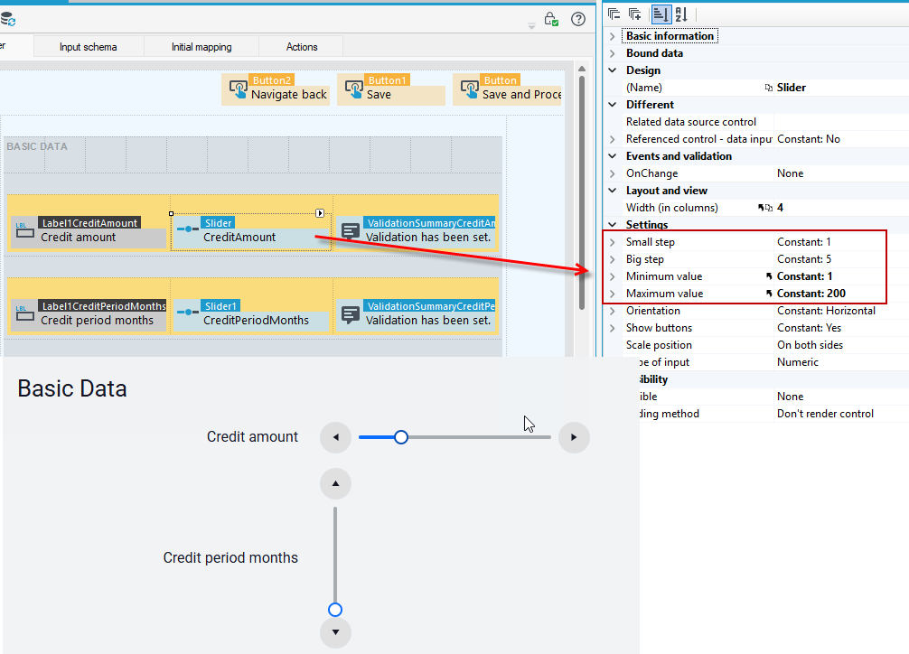
In this case, you can:
- increase the skip options in the Small step and Big step properties or increase the width of the control.
Different
- Related data source control – Control whose value will be related to the value of the slider.
- Referenced control – data input – Block entering values by associated control.label
Settings
- Small step – The value to be added or subtracted after clicking the add or subtract button.
- Big step – The value to be added or subtracted after pressing PageUp or PageDown.
- Minimum value – Minimum value
- Maximum value – Maximum value
- Orientation – Horizontal or vertical orientation.
- Show buttons - Enable or disable the add and delete buttons.
- Scale positions – Scale positions.
- Type of input – Numeric – takes a numerical value, Percentage – saves a value in the form of a fraction (100% - 1).
File selection
File Selection is an element interacting with the Binary Preview, allowing the User to select a file stored on his disk and place it on the server (in the data structure associated with the form). For a file to be stored in the data structure, there must be fields storing the file name (Text field) and its contents (Binary field).
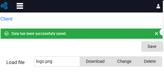
- In addition to indicating the files name and contents, you can also configure the display of the Change, Delete, and Choose filebuttons to be displayed next to the control, as well as the option to display the file name.
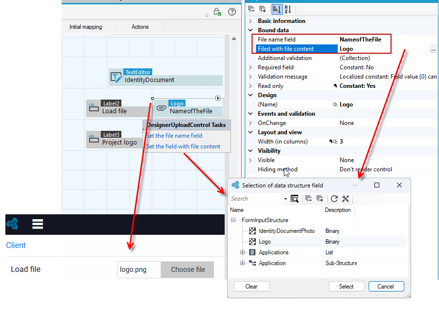
When you select a file from disk, it is stored in temporary memory until you save the entire form. Once the form is saved, the file can be downloaded changed or deleted.
Basic information
- Show filename – Defines if filename is visible.
- Change button visibility – Defines visibility of Change button. Default value is visible.
- Choose file button visibility – Defines visibility of Choose file button. Default value is visible.
- Maximum size of file (in bytes) – Defines maximum size of file (in bytes).
- Delete button visibility – Defines visibility of Delete button. Default value is visible.
- Allowed file extensions – Comma separated list of allowed file extensions. For the extensions from the list below, the file content is checked if matches to the extension: bmp, xlsx, xls, exe, gif, jpg, msg, pdf, png, ppt, rtf, tif, docx, doc, xps, zip, img, jpeg, tiff.
If you have added a binary field in the data structure, then on the form you must add it in the Initial mapping because the field is not yet visible in the form data structure.
- Go to the Initial mapping tab, right-click on the field and select Fix>Add element from the context menu.
- After you complete the action, the field will be added to the Form data structure.
Multiple file selection
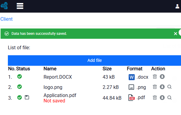
Multiple File Selection is a control used to add multiple files simultaneously. Once the files are added, the control allows you to view, download, and delete the files.
A List must be added to the data structure, which will contain binary type fields to store the file contents and text type fields to store the file name. To add a list to a data structure, see: Defining a List in a Data Structure
- Drag the control to the workspace.
- On the Properties panel, in the List Structure field, point to the path to the file name field and to the file field.
- In the window that appears, lists from the data structure to choose.
- Click on the list, then select the desired fields and choose OK.
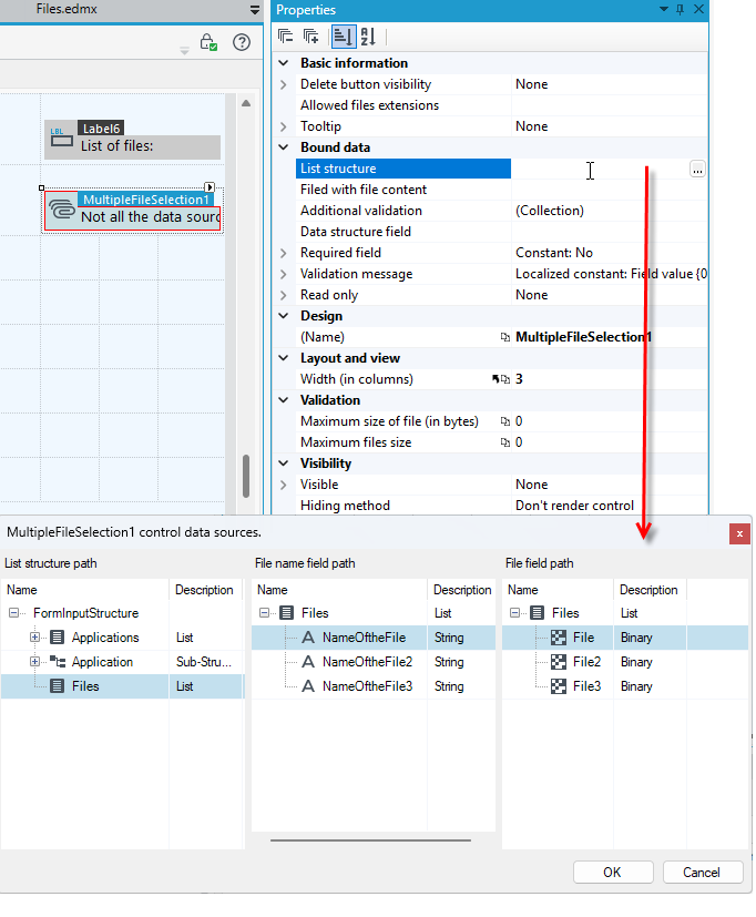
On the form, the successively added files are presented in table form. After saving, the status of the file is changed. Using this control you can also delete, download or preview the files.
Basic information
- Delete button visibility – Defines visibility of Delete button. Default value is visible.
- Allowed file extensions – Comma separated list of allowed file extensions. For the extensions from the list below, the file content is checked if matches to the extension: bmp, xlsx, xls, exe, gif, jpg, msg, pdf, png, ppt, rtf, tif, docx, doc, xps, zip, img, jpeg, tiff.
Bound data
- List structure – The list that will be used by the control.
- Filed with file content – Data structure field which file content will be saved to.
Validation
- Maximum size of file (in bytes) – Specifies in bytes the maximum size of file.
- File size validation message – A message that appears when the file size is exceeded. Acceptable variables:
#file#- file name,#fileSize#- file size,#maxSize#- maximum file size allowed.
- Maximum files size – Maximum allowed files size.
- Aggregated files size message – A message that is displayed when the total file size exceeded. Acceptable variables:
#filesSize#- total file size,#maxFilesSize#- maximum file size allowed.
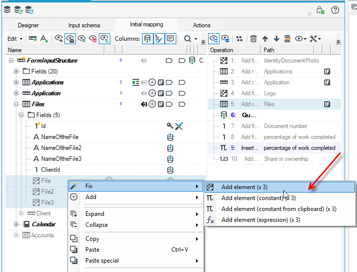
If a binary field has been added to the data structure, then on the form it must be added in Initial mappin g, as the field is not yet visible in the form data structure. Similarly, if a field of type List has been added to the data structure you also need to add it in Initial Mappings.
- Go to the Initial mapping tab, right-click on the field and select Fix>Add element from the context menu.
- When you complete the action, the field will be added to the Form data structure. Do the same with the List element.
Chart
The Chart control allows you to display data as a chart.
The range of data to be entered in the Properties panel depends on the type of chart you have selected.
Data series
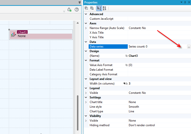
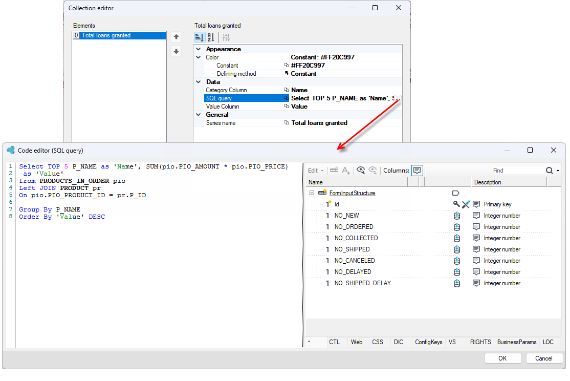
To set up a chart, enter the data you want to present on the chart in the Data Series property.
- Go to the Properties panel and click in the Data series field.
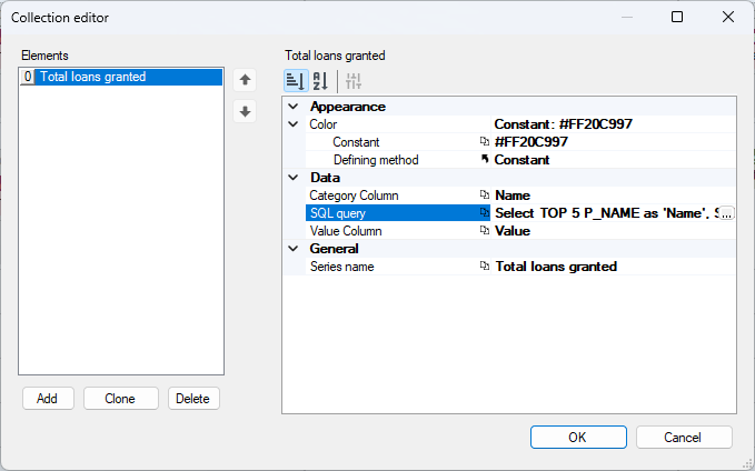
- In the Collection editor window that appears, select the Add button and specify the color for the chart, the caption column - select a field from the database.
- Also specify the value column (description displayed).
- Open the SQL Query window and specify the parameters to be displayed on the chart. On the left side, you define the query, and on the right side, you have access to data trees. This is similar to defining an expression. You can also use syntax hints by pressing Ctrl+Space. For more information about expressions and the expression editor window, see: Expressions.
Data format danych
- Depending on the chart type, you can specify the value axis and category axis formats and the data format. Go to the Format section and specify the properties in the fields:
- Value Axis Format – Data format for values presented on Value Axis (Y).
- Data Label Format – Data format for values presented on chart.
- Category Axis Format – Data format for values presented on category Axis (X).
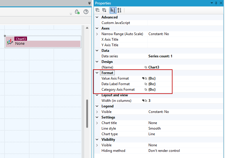
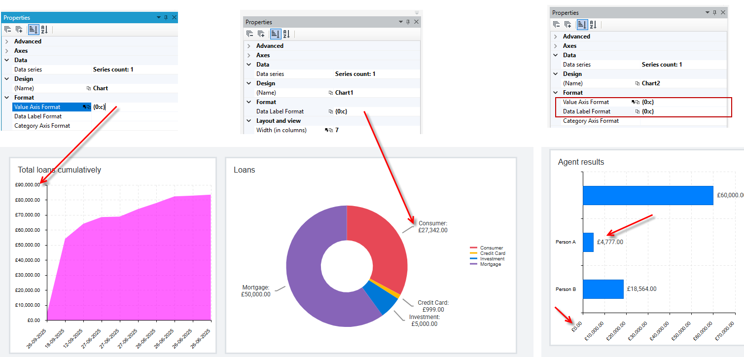
- To enter the data format, use the string .format syntax to give the numbers a specific caption.
For example:
- To display currency values, use the format
{0:c}
Other data formats:
- decimal -
{0:d} - number with commas to thousands -
{0:n} - rounding-
{0:r} - percent-
{0}%
Settings
- Chart title
- Line style - defines the drwaing style:
- Normal – Default option.
- Step – Line of the chart will be drawn in step manner.
- Smooth – Line of the chart will be smoothed.
Axes
- Narrow range (Auto Scale) - if you enable this option, the axis range will adjust to the minimum/maximum data. If you disable it, the axis will usually start at 0.
- X Axis title
- Y Axis title
Legend
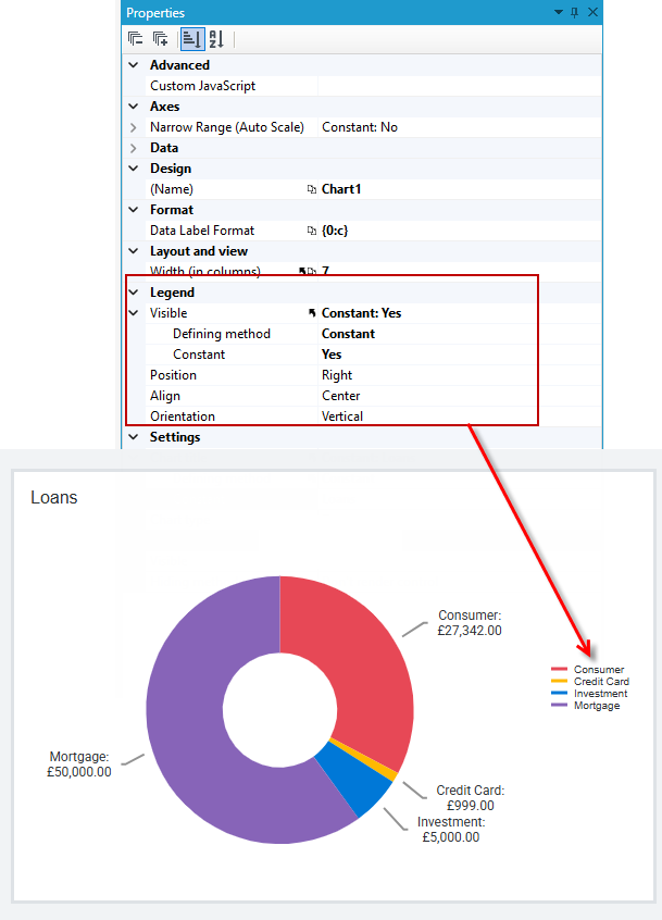
You can specify whether the legend should be visible on the chart. If so, then specify its position.
QR code
The control generates canvas and svg images that represent QR codes. The control accepts a text field as its data source.
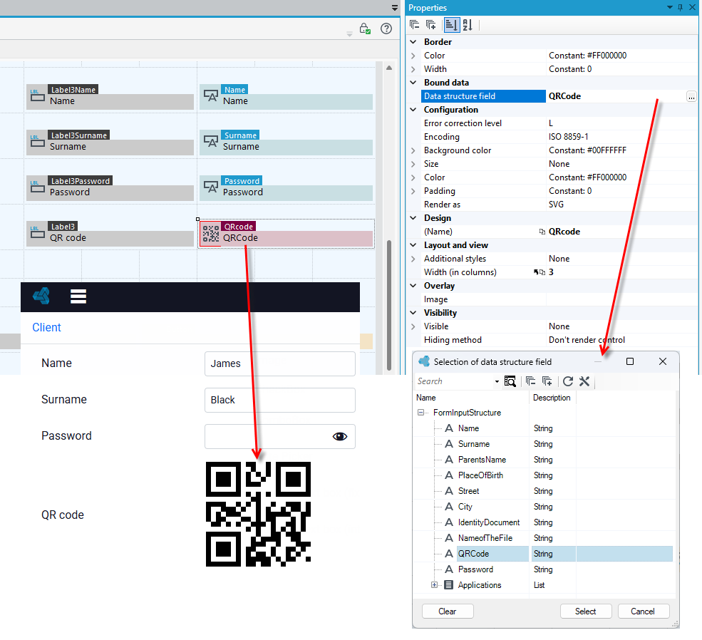
Additionally, you can specify the following for the control:
- Error correction level - The level of error correction used to encode values. Possible values are:
- L - approximately 7% of code words can be restored
- M - approximately 15% of code words can be restored
- Q - approximately 25% of code words can be restored
- H - approximately 30% of code words can be restored
- Encoding - the encoding mode used to encode values (
ISO_8859_1by default). Possible values:
ISO_8859_1- supports all characters from the ISO/IEC 8859-1 character setUTF_8- supports all Unicode characters.
UTF-8 encoding is not included in the specifications and is not supported by all readers.
- Background color - The background color of the QR code. Accepts a valid CSS color string, including hex and rgb (default #FFF).
- Size - Specifies the size of the QR code in pixels (e.g. 200px). Numeric values are treated as pixels. If the size is not specified, it will be set based on the width and height of the element. If the element has a width or height of 0, the default value of 200 pixels will be used.
- Color - The color of the QR code. Accepts a valid CSS color string, including hex and rgb (default #000).
- Padding - Sets the minimum distance in pixels that should remain between the border and the QR modules.
- Render as - Sets the preferred rendering engine. If it is not supported by the browser, the QR code will switch to the first available mode (svg by default). Supported values are:
- canvas - renders the widget as a Canvas element, if available,
- svg - renders the widget as an embedded SVG document, if available.
- Image - The image displayed on the overlay.
- Border:
- Color - The color of the border. Accepts a valid CSS color string, including hex and rgb.
- Width - The width of the border in pixels. By default, the border width is set to 0, which means that the border will not be visible.
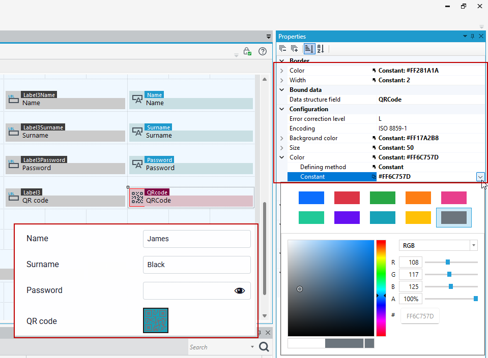
All available options for configuring the control can also be found in the Kendo documentation https://www.telerik.com/kendo-jquery-ui/documentation/api/javascript/dataviz/ui/qrcode
See also
Create a custom header and footer for application site