Creating a form
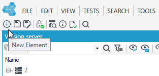
- In the main window, select New, or File> New or the New Elementicon.
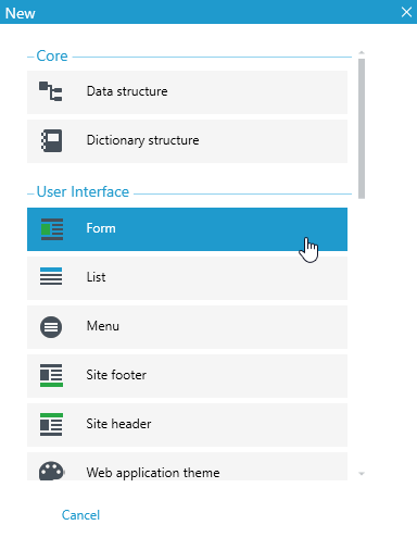
- Select Form.
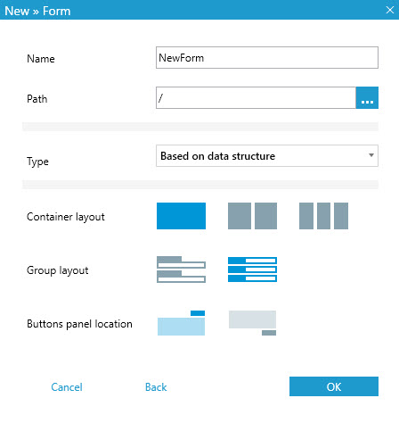
- In the next window, specify the path, that is, in which folder the form should be placed, and the type of form to be based on a particular data structure or not.
- In addition, already at the form creation stage, you can specify some parameters such as the container layout (whether the form should be one, two or three columns), the group layout, i.e. how the controls dragged directly from the Form data structure tab will look, and the location of the panel with buttons.
- If the form is to be based on a data structure, select the data structure in the next window and press Select.
- You can specify the form data structure later, after the form has been created on the Properties panel.
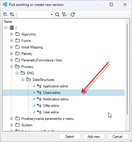
- You can specify the data structure of the form later, after creating the form, in the Properties panel.
- If you choose the standard layout proposed during creation for the individual elements then the form will look like the figure below. Of course, all options, are available on the Properties panel and you can change them - see Changing the default properties of the form.
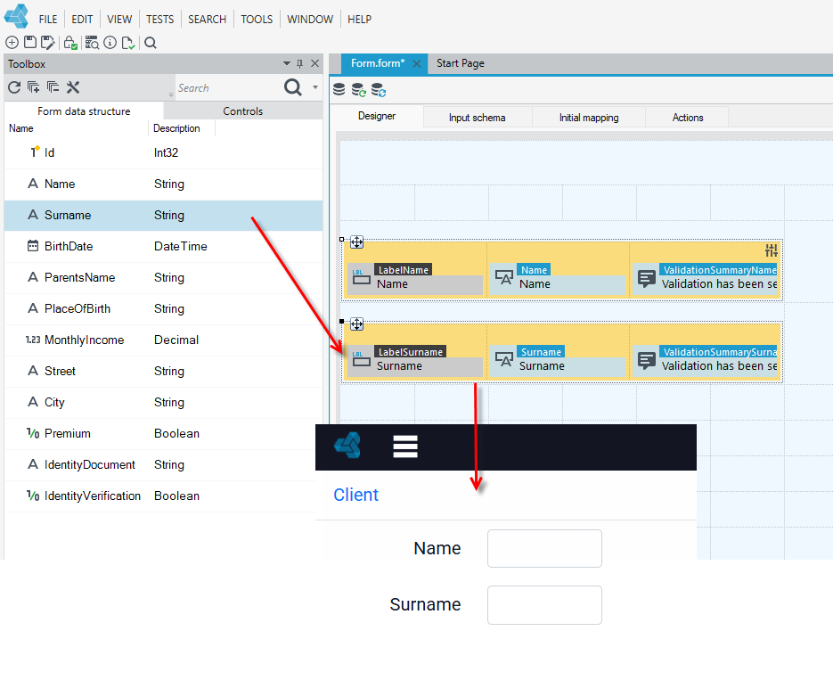
Forms have a tabular structure. The form elements are a grid, consisting of rows and columns, however, cells cannot be joined together.
- Depending on whether you chose the one, two or three column layout option when creating the form, the form will be graphically marked indicating the number of columns.
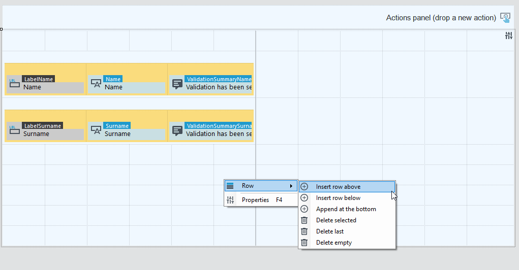
- Right-click on the workspace and from the context menu you can choose to add or remove rows.
A saved form can be opened at any time from the version server and edited or deleted.
The form is built on the Designer tab. Here you add controls, fields, containers, set the width of the added elements and the other styles and properties. - See Designing a form.
Form Properties
To view the form properties, click an empty field in the workspace so that no control or button on the form is selected.
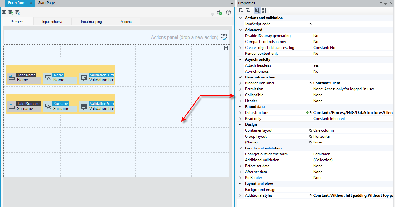
Actions and validation
- JavaScript code - Opens window that allows to enter JavaScript code that is executed while opening the form.
Advanced
- Disable IDs array generating – Disables generation of array mapping of control business names.
- Compact controls in row – The view will be optimally managed for low screen resolutions. The controls from the following rows will fill up the free space in the line above.
- Creates object data access log - Creates object data access log.
- Render content only – The setting will cause that only the contents of the container will be rendered, i.e. the elements defined inside. The container itself will not be rendered.
Asynchronicity
- Attach headers? – Advanced property. It defines if the page header are attached during asynchronous calling, e.g. CSS and JS.
- Asynchronous – Defines if the container may reload its content asynchronously. More about asynchronicity see: Asynchronicity.
Basic information
- Breadcrumb label - form name dispalyed in breadcrumb.
- Permissions – Indicating the definition of permission related to the form.
- Collapsible – Defines whether the form has an icon allowing expanding and collapsing a form.
- Is collapsed by default – Defines whether the form is collapsed by default.
- Header – Form header.
Bound data
- Data structure – Indicates the data structure that the form is based on.
- Read only – Defines whether the form is read-only.
Design
- Container layout – Container layout (design mode only). Affects width of controls dragged from the toolbox.
- One column – Default option. Displays container without splitting it.
- Two-column – Separates container into two equal parts.
- Three-column – Separates container into three equal parts.
- Four - column - Separates container into four equal parts.
- Group layout – Form group layout (design mode only). Affects the orientation of the group of controls dragged from the toolbox.
- Horizontal – Group of controls placed in horizontal order.
- Vertical – Group of controls placed in vertical order.
- Horizontal without validation – Group of controls placed in horizontal order without a validation summary control.
- Vertical without validation - Group of controls placed in vertical order without a validation summary control.
Layout and view
- Background image - sets container background image.
- Additional styles – Additional styles for control. Selected styles combine.
Actions panel
-
Buttons – Opens the Buttons Editor which allows to edit buttons properties, placed in Actions panel in Action tab.
-
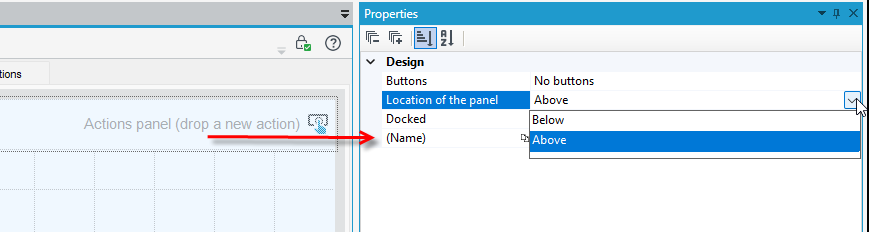
Location of the panel – Specifies the location of the buttons panel relative to the main page element.
-
Docked - defines if the action panel should be docked.
Events and validation
Possibility of defining actions to be performed upon the occurrence of an event, see Event handling and additional validations, see Data validation on the form.
- Changes outside the form – Allow making changes to the data field outside the form (e.g. a workflow or form using the same data field). Allowed values:
- Forbidden – changes are prohibited (by default),
- The same user – changes are allowed by the same user,
- Allowed – changes are allowed.
- Additional validation – Opens collection editor which allows for defining additional validations.
- Before set data - Server-side event fired before applying data-bound controls data into our structure, before actions (if any).
- After set data - Server-side event fired after applying data-bound controls data into our structure, before actions (if any).
- PreRender - Server-side event run after actions (if any), before displaying values. Good place to read in values changed by actions, before displaying them.
Changing the default properties of a form
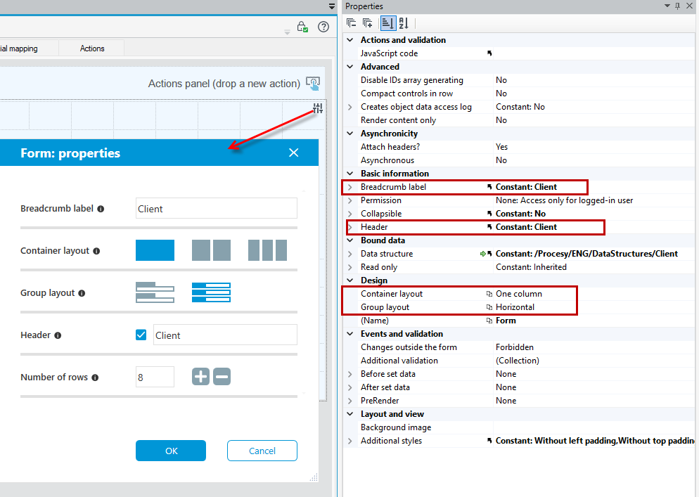
If you have created a form with defaults with a group container and button layout or any other layout you have chosen, you can always change these options on the Properties panel even after the form has been created.
- Select the button
 to go back to the possibility of changing the basic parameters of the form.
 - You can change the layout of a group of controls and container layout, form name, location of the buttons panel and add or remove rows.
- To change the position of the button panel, click on the panel area in the Designer tab in an empty field so that no control or other form element is selected. The properties of the button panel will then be displayed. Change the position in the Location of the panel section.