Create a custom header and footer for application site
The header and footer are essential elements of a Web page, but also the area where basic information should be placed.
The header of a site usually contains the logo, menu and logged-in user information. The footer is the bottom block of a website, which can include links to external sites or resources, references and copyright information, environment, versions, contact information and subscription information and more.
Both the header and footer are designed in the designer window, which is analogous to the form except for the ability to add actions. The set of controls and properties that can be changed has also been limited and adapted to the type of element you are modifying, i.e. header or footer.
If you do not add a custom header or footer, the web page will display the default header and footer that are defined in the platform.
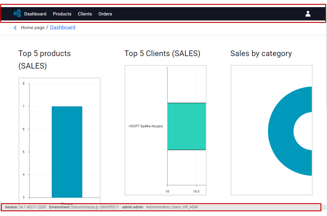
Site header
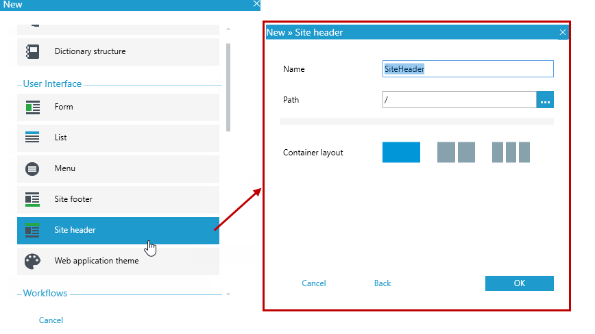
- In the main window, select New, or File>New or the New Item icon.
- Select Site header.
When you create a page header, you have only the components you might want to use in your design. These are analogous controls to those available when creating a form:
- Label - The component is used to display text, see Label
- Image - The user can add an image/logo to the form, see Image
- Hyperlink - Reference is used to run any JavaScript code, when clicking on an element on the form, see: Hyperlink in Controls
- Html Control - A control allows you to display the html tags you enter, see: Html Control
- Container - Container is a basic component, used to group selected elements, see Container
- Container (flow) - Allows you to add elements "side by side", see Container (flow)
Components available only for the page header:
- Application menu - the component allows you to display the application menu, which is set as the default for the system, at a given location.
- User info & logout button - the component presents the data of the logged-in user along with the option to logout from the system.
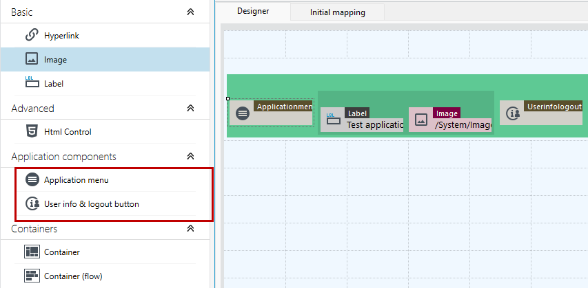
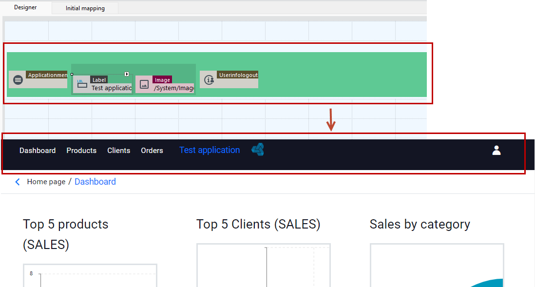
In the following example, to define the header, the application menu is used first, then the Label control to enter the application name, then the Image control to display the logo and the user information.
Site footer
- In the main window, select New, or File>New or the New Item icon.
- Select Site footer.
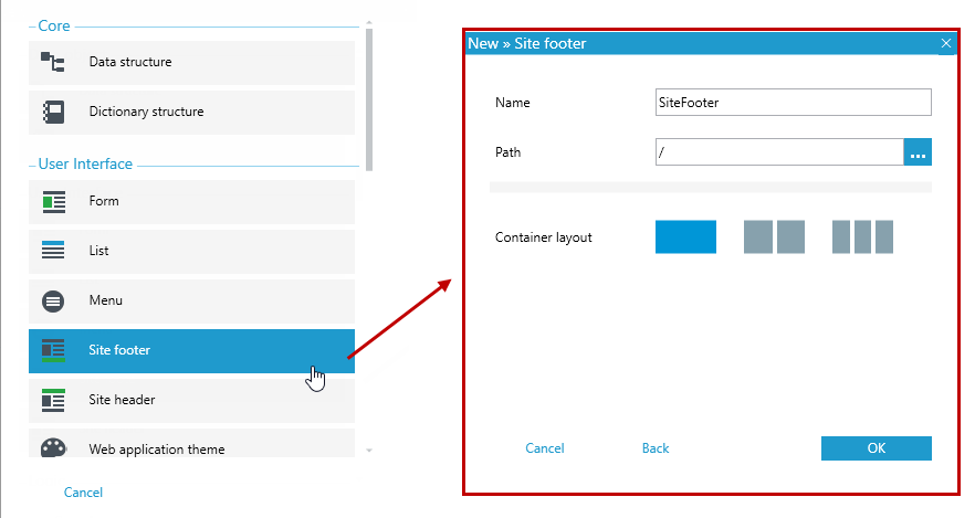
When you create a page header, you have only the components you might want to use in your design. These are analogous controls to those available when creating a form:
- Label - The component is used to display text, see Label
- Image- The user can add an image/logo to the form, see Image
- Hyperlink - Reference is used to run any JavaScript code, when clicking on an element on the form, see: Hyperlink in Controls
- Html Control - A control allows you to display the html tags you enter, see: Html Control
- Container - Container is a basic component, used to group selected elements, see Container
- Container (flow) - Allows you to add elements "side by side", see Container (flow)
For both the header and footer, it is good practice to place the elements in a container or in a flow container that allows you to display the objects side by side. Through additional styles you can set appropriate margins spacing, etc.
In the example below, to define the footer, a Label was used to enter the name of the application, then an Image to apply an icon and Label to enter the email address for the contact. In the right corner Html Control takes you to the web page.
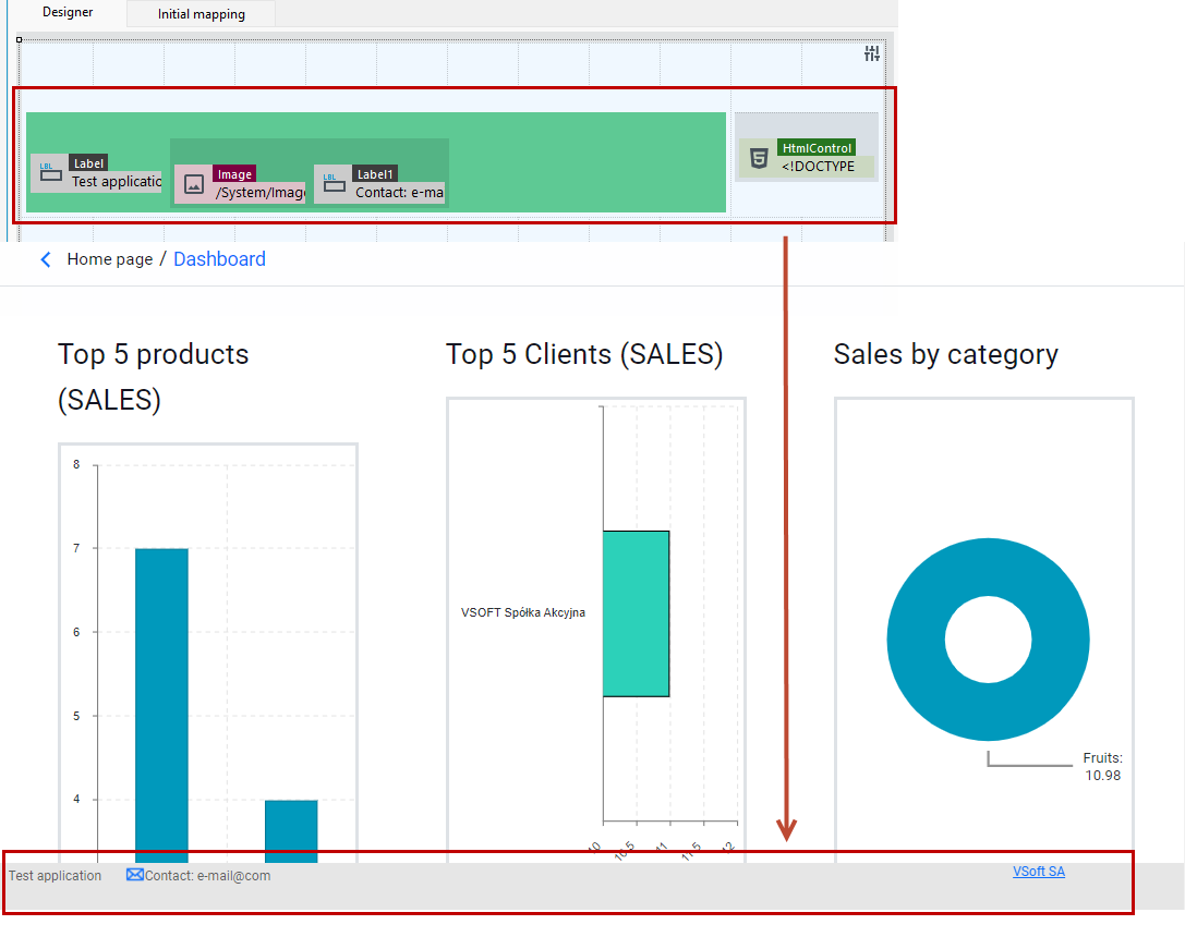
For both footer and header, an additional data tree has been provided, which allows you to display information such as user login, role and environment information via expression.
- Add an label and choose Defining method as expression.
- Go to define the expression and from the Web tree select the information you want to display.
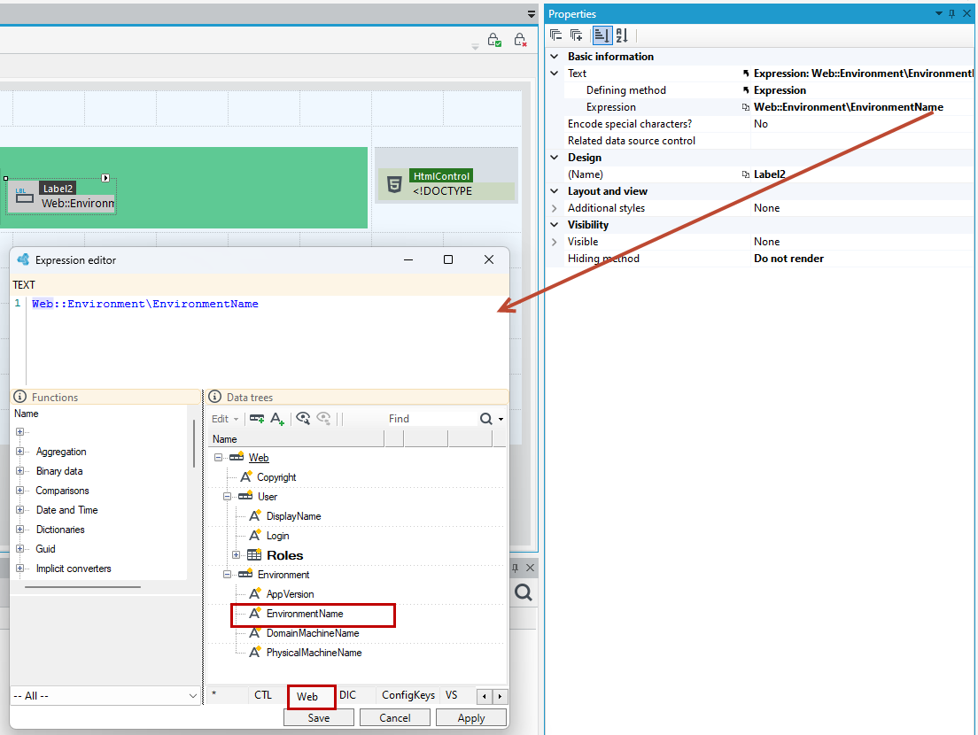
Using the header and footer in the application
- To use a custom header and footer in a web application, go to the version server and right click on the header/footer you created.
- From the context menu, select Use in web app.
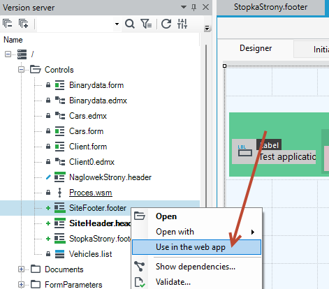
- From now on, every page in the application will display the header and footer you defined.
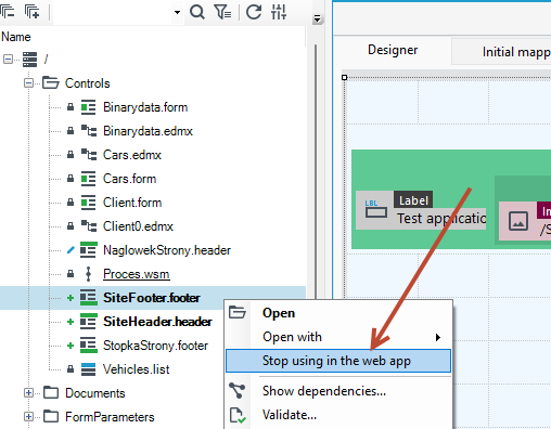
- If you want to return to the default settings, go to the version server and right-click on the header/footer you created.
- From the context menu, select Stop using in the web app.
Good parctics
- You can set the available components for creating the header and footer in any order.
- To have the components displayed side by side use the Container (flow).
- You can use container within container depending on what effect you want to achieve.
- The Image control allows you to add an image/icon. On the Properties panel you can enter a url, then the image acts as a link with the ability to navigate to the specified address.