Lists-related actions
Actions are operations that can be used to change individual rows displayed in a list, to move to other application locations (e.g. forms) and to start or start processes. Each action is represented by a single button. An action is launched by pressing a button.
- Go to the Actions tab and the Toolbox panel.
- To use an action, drag it from the Toolbox panel to the A ctions panel section.
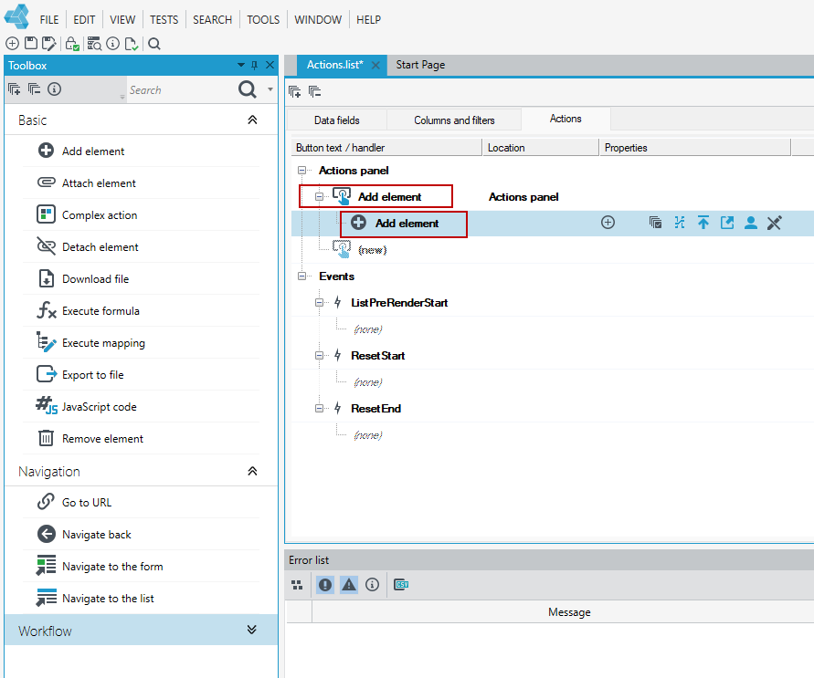
Actions are designed so that you can define the properties of the button and the properties of the action that will be executed when the button is pressed.
Button properties
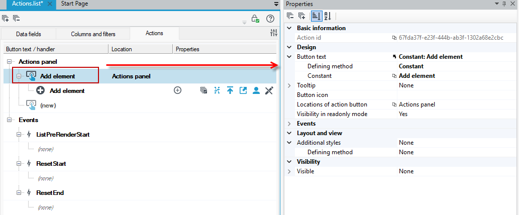
All buttons displayed in lists have the following common properties available in the Properties window.
- Button text - the label of the button.
- Tooltip- text that will be presented in a balloon as a button description.
- Visibility - specifies whether the button will be visible, if this value is unspecified then the button will be visible by default.
- Button icon - a small icon displayed on the button.
- Style - the default appearance, there are styles available in the properties that allow you to modify the appearance of the buttons.
- Events - a link to the event handler.
Position of action buttons
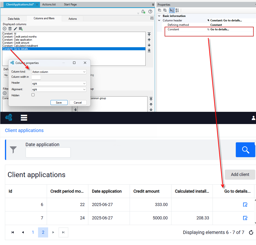
If you have defined an action column at the stage of defining displayed columns in the list, see: Columnsand sorting and action column selection, then you can define button position: on the panel or in action column in the list.
- Select the button and go to the Properties panel.
- In the Locations of action button field, select Actions panel or Action column.
- The Actions panel is located above the list.
- If you choose to place the button in the action column, then on the Properties panel you can configure the button's style to be an icon and select an icon from the available ones as a graphical representation of the action.
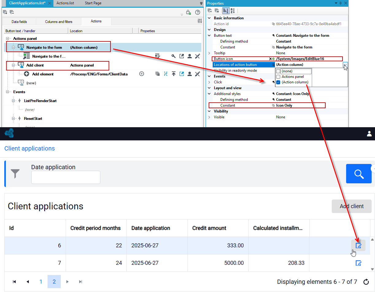
- The action column is added as the last column in the table. By default, the column header is not displayed. If you want the header for the action column to be visible, enter the column name without using brackets.
Action properties
You can define action properties similarly to button properties on the Properties panel.
The range of displayed data is different and characteristic for a particular action. However, there are some properties that are common for all actions:
- Read only acces- the property specifies whether the action should be available to the user when the list is in read-only mode.
- Permissions - this property allows you to control access to the list.
- Messages - the ability to configure the content of messages displayed on the website.
- Confirmation - the confirmation of action execution will be displayed.
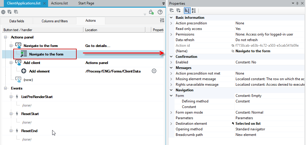
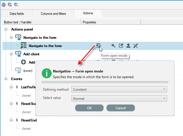
Moreover, the properties that are most characteristic and used for the action are displayed on the workspace next to the action. Click on a property to change its parameters.