List properties
To view properties for a given list, click in a selected workspace, e.g. in the Filters field. The Properties window will display data for the selected area.
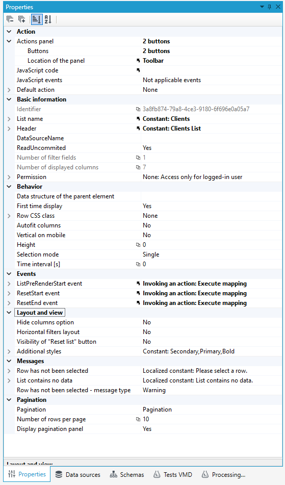
Action - a category that allows you to configure predefined functions and predefined microflows to be executed on lists and available as buttons displayed below the list or in the action column.
- Buttons management is available through the Actions panel property. The Buttonproperty, which leads to the Buttons editor, allows you to create a collection of buttons and define actions or microflows associated with them. For more see: List Actions and Adding Actions from the Properties panel.
- It is also possible to define a Default action on a list, which will be performed when a user clicks on a line in the list (using the Default action property). Configuration of the Default action is done by selecting one action from the predefined actions in the corresponding list. In case of defining JavaScript event, Default action will not be done.
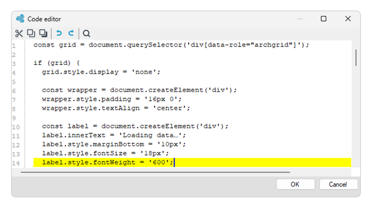
- JavaScript code - JavaScriptCode is done while the list being opened, allowing for additional configuration or modification of list behavior.
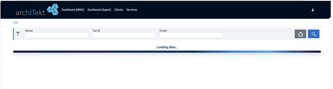
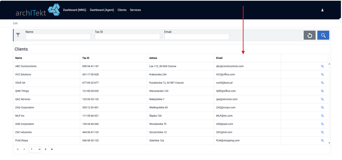
For example, displays a loading bar while the list is being opened and rendered. The JavaScript code hides the list and displays a loading bar while the list is being rendered.
- JavaScript events - List of JavaScript events executed on DataGrid.
Basic Information

- The Number of displayed columns and Number of filter fields properties display automatically generated information, depending directly on the number of fields and filters selected at the list creation stage.
- The List Name property allows you to define the name of the list displayed in the navigation bar when the list is shown in the application in the browser window.
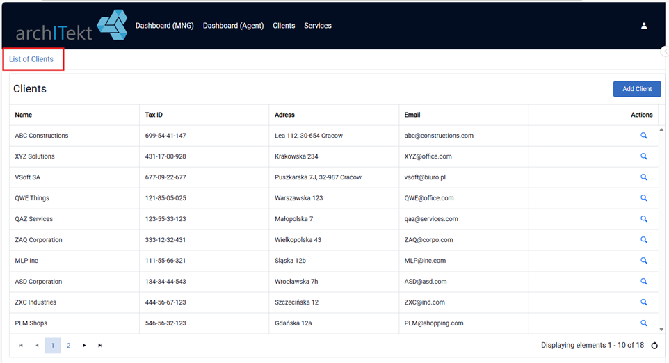
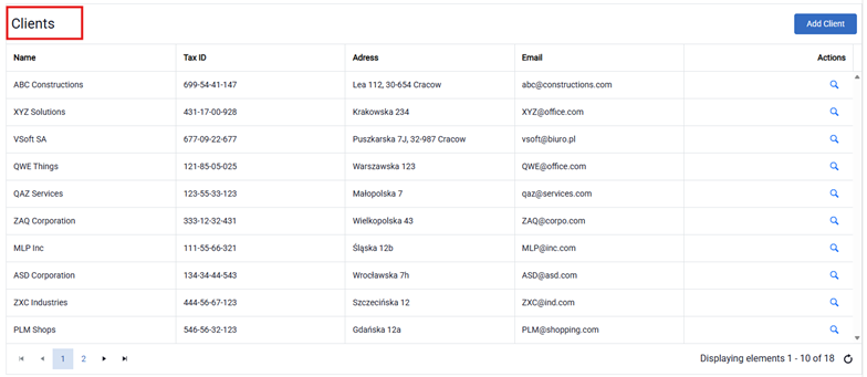
- Header - List header displayed over the list.
- **DataSourceName -**Allows selecting the database within which the SQL query is created from a list.
Permission
- Defines access to the list for a user with a specified scope of permissions.
Premission can be defined using a Constant or a Formula.
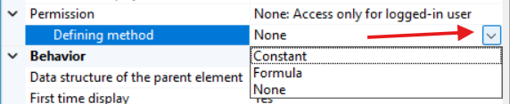
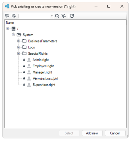
For a Constant, the user can select one of the existing permissions or define a new one.
Pagination

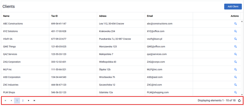
- Pagination - functionality allows to divide displayed elements into pages.
- Number of rows per page - functionality that allows you to specify the number of rows in which the filters defined in the list will be displayed.
- Display pagination panel - displays bottom panel on list (navigation panel information).
Layuot and view

- Hide column options - should the hide column option be enabled to user.
Hide column options - allows users to dynamically manage the visibility of columns in lists. When enabled, a control appears above the list in the web application, allowing selected columns to be hidden or shown. The settings are saved individually for each user and separately for each list.
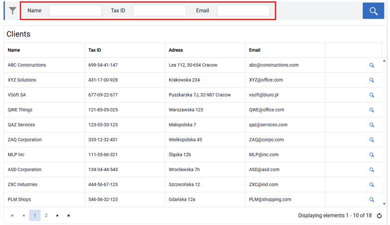
- Horizontal filters layout - filters layout (yes-horizontal, no-vertical).
Vertical filters layout
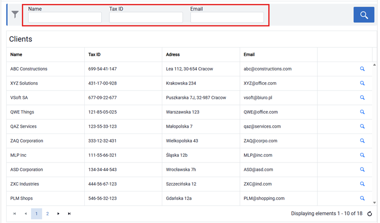
Horizontal filters layout
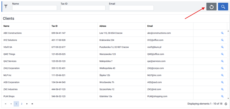
- Visibility of the “Reset list” button - this feature allows you to place a button on the list that will restore the list to the same view as it was displayed the first time.

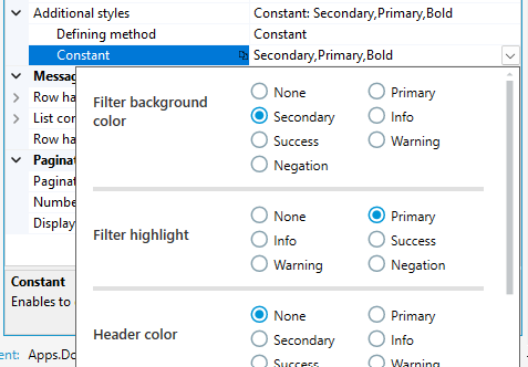
- Additional styles - additional styles for control.
Styles can be defined using constant based on previously defined appearance options or by using an expression.
Defined appearance options
Messages

The Messages property is used to define the content and type of messages displayed to the user in situations where no row is selected in the list or when the list contains no data.
Behavior - this category defines how the list behaves, including the following fields:
- Data structure of the parent element - data structure of the parent element in relation to the list and its element. Used only for lists embedded on the form.
- First time display - if this property is set to False, no data will be displayed on the first display of the list.

- Autofilt columns - enable autosize of the columns with based on headers width.
- Vertical on mobile - one the small screen, the data will be presented vertically.
- Height - specifies the height of the list in pixels.
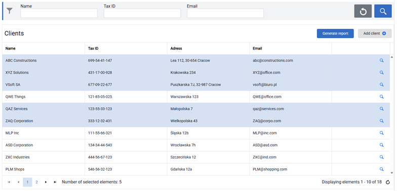
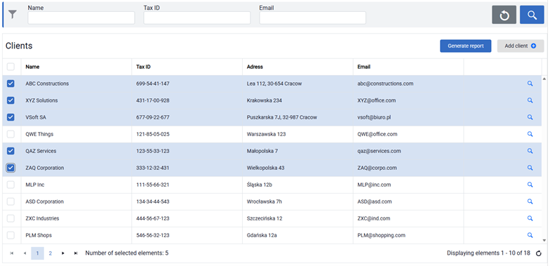
- Selection mode - a feature that allows you to define the way of selecting list rows by left mouse button in order to perform an action on the selected items. There are 3 ways to select rows:
- Single - only one row,
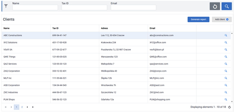
- Multiple (row) - allows selection of multiple elements using the CTRL and SHIFT keys,
- Multiple (checkbox) - allows selection of multiple elements using checkboxes.
- Time interval [s] - defines time between successive list refreshings. Time is presented in seconds.
Events
The following events are available for the list component: ListPreRenderStart event, ResetStart event and ResetEnd event. Each event allows custom logic to be executed at a specific stage. Event handling can be implemented using a formula, an invoking an action or a workflow event handler.

ListPreRenderStart event - triggered immediately before the list is rendered.
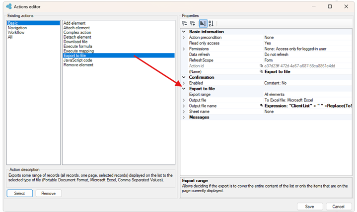
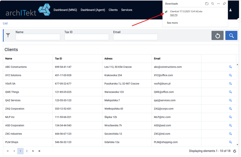
Example of use: automatically generates and downloads an Excel file each time the list is rendered.
- Select a defining method for invoking the action

- Then, in the Actions editor select Export to file.
ResetStart event - triggered when the list reset operation begins.
ResetEnd event - triggered after the list reset operation has completed.